Critique Style Requested: Standard
The photographer is looking for generalized feedback about the aesthetic and technical qualities of their image.
Description
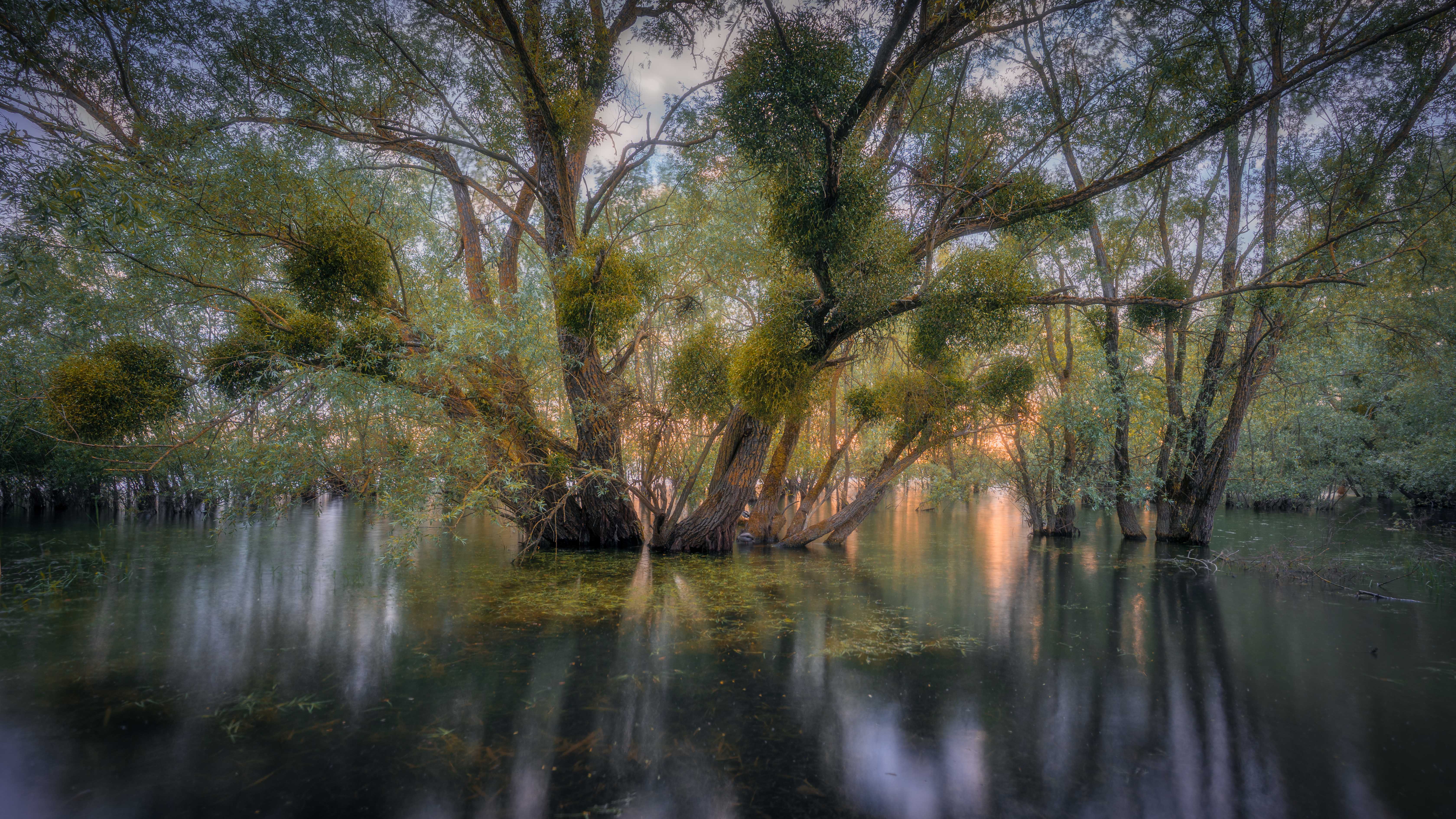
This is an image of flooded trees I shot in France this spring. It was a lovely atmosphere in these mangroves at sunset and the light shining through the trees was really beautiful. However I struggled a bit so create order in the little bit chaotic trees. this big tree in the middle immediately caught my eye and I tried to find a way to frame it and make it stand out more.
Specific Feedback
I have been editing this image of my trip through France this spring and I am struggling a bit to create separation between the main tree and the background… unfortunately there was no fog, which would have helped a lot. Would love to hear your opinions and I am also wondering if that brighter sky is too much of a distraction… thanks for your help!
Technical Details
its a long exposure which made it a bit tricky for me to get sharp leafs in the trees. I didn’t mind too much, as it gives the image a more mystical feeling
Critique Template
Use of the template is optional, but it can help spark ideas.
- Vision and Purpose:
- Conceptual:
- Emotional Impact and Mood:
- Composition:
- Balance and Visual Weight:
- Depth and Dimension:
- Color:
- Lighting:
- Processing:
- Technical:
2 Likes
Quite lovely. I think you’ve composed it nicely, with the tree fanning and reaching out to the corners of the frame. Fog? Eh, who needs fog with this glorious light on the water? I like the wide aspect ratio, maybe even a little more off the bottom. Just a thought. Beautiful work.
1 Like
Thank you Michael, I really appreciate you comment! Great point about the crop, I will try to crop a bit off the bottom  thank you
Ronja,
Interesting subject and the light is working in your favor for sure. That is a tough question about how to create some separation between the FG tree and the BG. Have you tried using a depth map in Photoshop? It tends to work pretty well in creating a mask that separates elements in an image based on the focus or DOF. Then you could use it as a mask to edit the FG separate from the BG.
1 Like
Thank you, Youssef for your comment. That is very interesting. Although I frequently work with luminosity masks I have never used a depth map. I will have to learn more about that! Thank you for the pointers!
Wonderful image. Everything goes into the center. Or comes out of the center, depending on how you look. The separation you were concerned about is pretty good. I actually like that the central group don’t stand out too boldly. There’s a dreamy sense to this image. The textures are somewhat muted. It gives it a great atmosphere. And the see-through bottom in the center adds to it because it too is only partially seen. My only suggestion is that brighter orange area on the right. I would dim it and drop some of its brightness. It does draw the eye.
1 Like
Thank you, Igor, I really appreciate this! Yes that orange spot was also one of my concerns. That settles it, I will tone it down a notch  thank you
I really like this composition, especially its innate brightness.
What caught my attention (in a negative way) is the lower left corner. I would try to darken it considerably.
1 Like
Thank you, Joao  yes you are absolutely right will darken it down
Ronja, This is just so beautiful! Amazing light, amazing colors and composition of an amazing place !! So well made.
1 Like
This is a very ethereal image, so full of light and textures. I agree with others regarding the few minor nits, but regardless, this is very fine work, indeed.
-P
1 Like
Splendid image, it seems that the light springs from the center of the picture, from the tree itself… I like this perspective, which seems to gently but firmly expand from the central element. Personally I do not feel the need for more separation between the FG and the BG, and I think the image works as it is - very well seen and composed.
1 Like
I meant to comment here earlier but got distracted. I think this is a very lovely capture! Fog would have been lovely but it’s quite wonderful as it is. My eye is pulled a little to the top corners – not so much from the brighter sky but due to the detail of the leaves there. The vignette helps, but I wonder about a subtle blur there?
1 Like