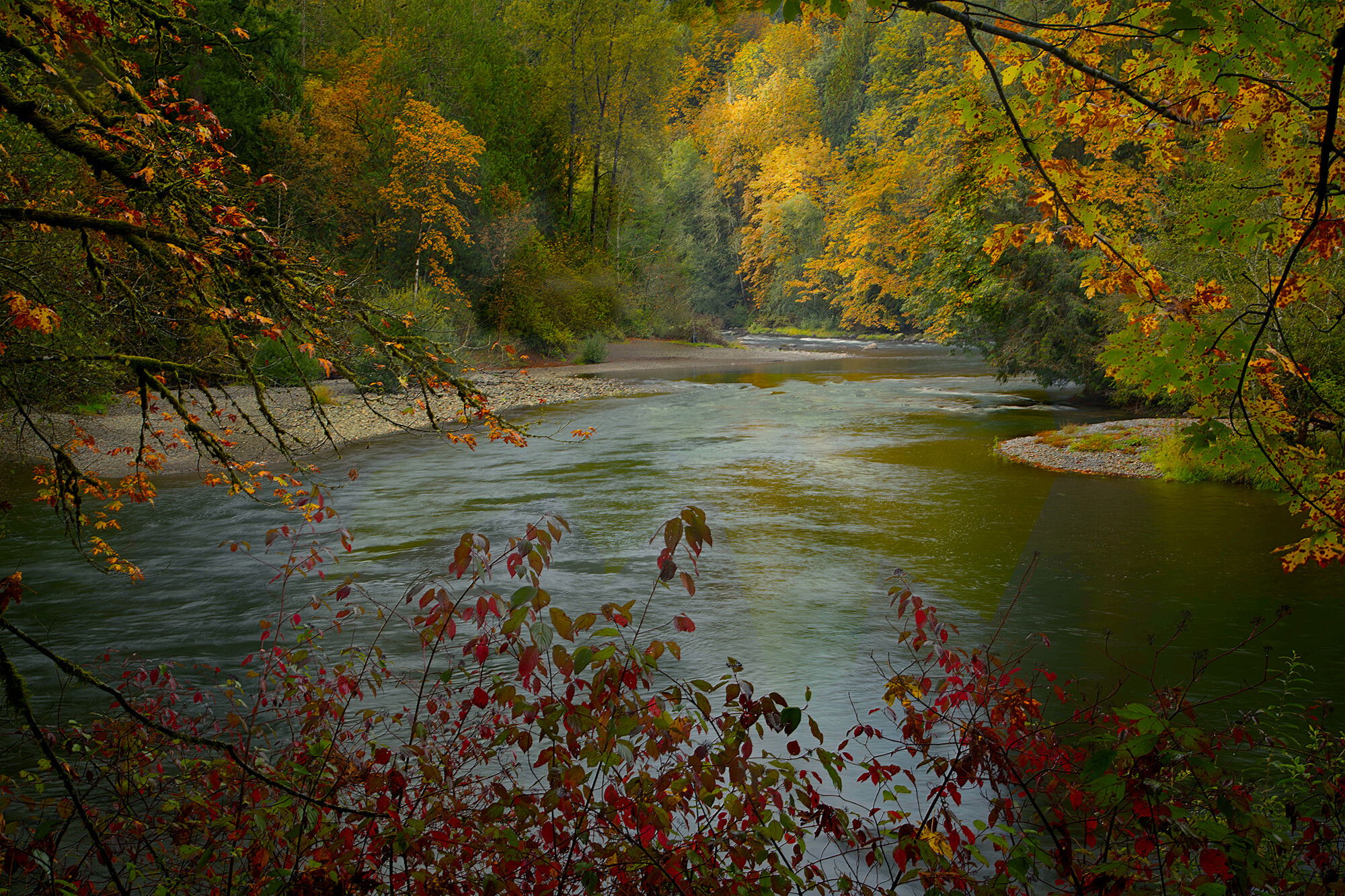
I tried fishing for salmon a week ago at this spot (no luck), and went back yesterday for photography, as the week’s weather generated autumn color. I am pretty sure this is a keeper, but am still working with it, so your suggestions and reactions are very welcome.
Sun was starting a 2-hour long process to work its way through some heavy morning clouds.
Specific Feedback Requested
Technical Details
Is this a composite: No
2-exposure focus stack. Did not have my ND filters, so I used a PL and overexposed as far as I could to get a .8 sec shutter, as I wanted to be rid of some water detail. f/18 Canon 24=105 @ 47mm
I really like the vantage point here. So intimate and inviting. The colors though feel blocked up to me. In my experience very warm white balances can muddy colors, but a slight shift to a cooler tone gives better separation and depth to them. There seems to be a cyan cast overall that could be corrected as well by shifting to the more magenta side of the slider. I don’t think you’d lose the overall warmth of the image, but it may make things more pleasing and dynamic.
I just messed with it in Photoshop. Hope you don’t mind. Let me know what you think.
Hi Dick! This is definitely a keeper. As Mario said, it has a very nice painterly feel. I like Kris’s adjustment - it brings out a bit more detail and balance to the colors. If it was mine I would experiment with just slightly lightening the bottom right corner. It seems a bit darker and shows slightly less detail than the bottom left, Well done!
Thank you @Kris_Smith. I agree that the color cast was goofy, but did not figure out how to address it, so your suggestion is valuable to me. Responding to your comment about blocked colors, this morning I used a LAB technique to find a few more colors in the foliage. This morning I also saw that the lower corners were overly vignetted, and then saw that @Steve_Kennedy also pointed that out, so I brought them back into the image a bit. The re-post is better, for those thoughts. Thank you both.
The rework is a significant improvement. I like how you used the leaves that frame the image to be of the same subject matter as the point of focus: fall color. As a former fly fisherman I can appreciate scenes like this because it’s one you frequently stop and admire as you work the river.