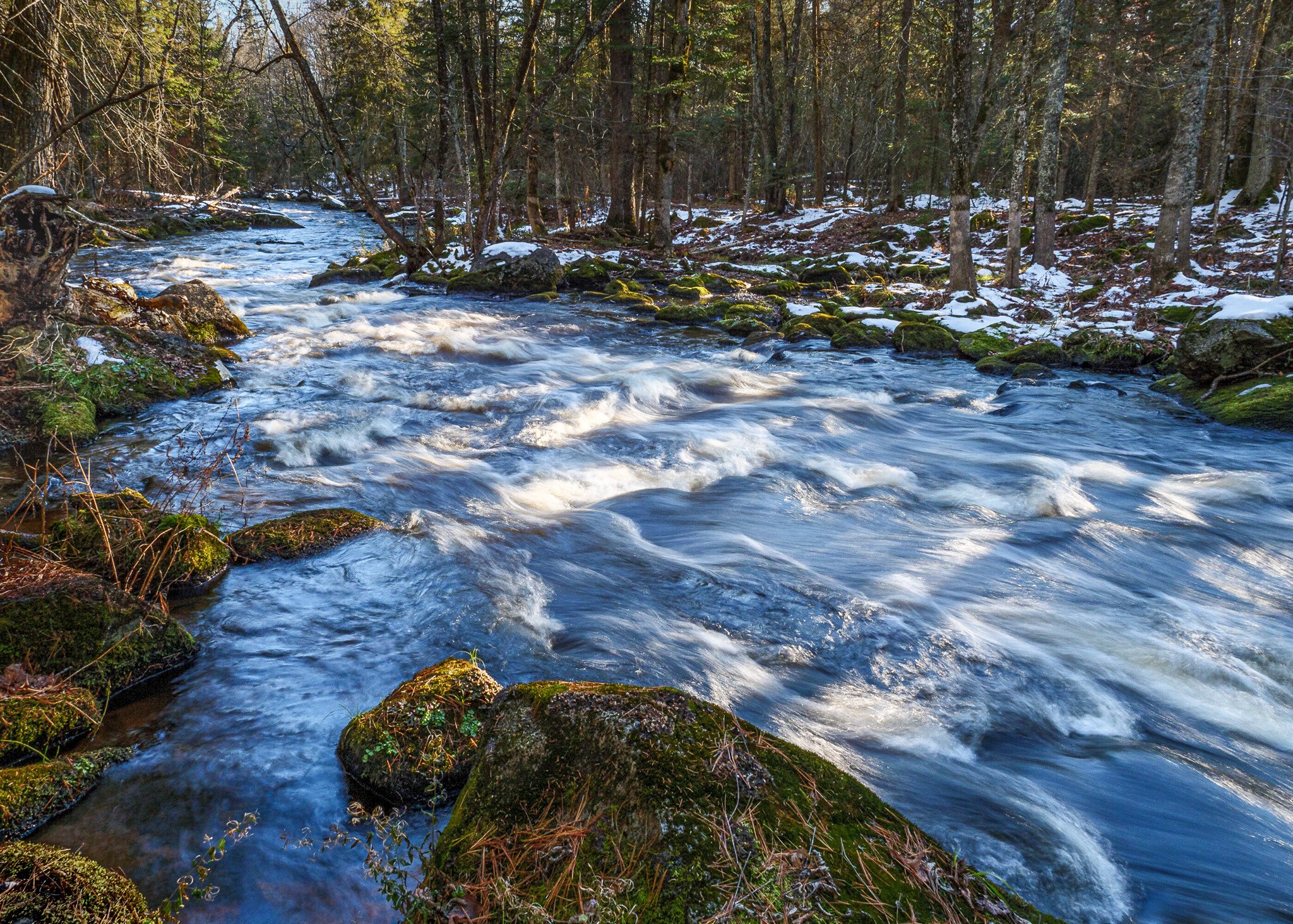
Re-edited using ideas from all you lovely people as follows -
New crop (3:2 ratio) to eliminate distractions on the left and bottom and top
Selective adjustment brush work on the left to even out exposure & contrast and keep eyes from being drawn there instead of the water
Bumped clarity and texture in the water itself
Bumped overall shadows
Bumped saturation a teeny bit
Reduced highlights (overall and some with adjustment brush)
All in Lr - does it work? Is it better?
I’ve been intrigued by this river for years and had meant to find more ways into it and one day I found this location and it was joyous. Photographing rivers and brooks has been a passion for a decade, but a lot of images can end up looking alike. So I started ‘breaking the rules’ and doing medium-long exposures (around a second or slightly less) and shooting with direct sun present. Not all over the scene and not overhead, I’m not that crazy. This shot represents that well and it’s my new happy place.
Specific Feedback Requested
But sometimes rules are there for a reason. Does the direct sun work? The blue is an honest reflection of the sky - no sliders. Does it look weird? And feel free to chime in with any compositional insights or processing ideas.
Technical Details
Is this a composite: No
Panasonic G9
Lumix Vario G 12-35 f2.8
ƒ/18.0 | 12.0 mm | 1/4 sec | ISO 200
Polarizer to bring up that sky reflection
Edited in LR to balance the exposure some, add clarity in the water and texture in the snow. Lens correction, a bit of sharpening and burning to bring up the rock in the fg.
Tripod obvs
Photographer on rock (her favorite place)0
Nice river scene and the dappled light works for me. My only thought was to lighten the dark area on the tree truck as it feels like an eye magnet to me. Otherwise, looks real good.
Thanks Harley…yeah, I am not happy about that tree, but other than bring a chainsaw what can you do? I think I gave it some attention in post, but I can’t remember. Will give it a go and repost later.
I think your intentions have been well met here. The SS has rendered the water nicely and the sun on the water is a big success . It’s what appeals to me the most about this image because the sunlight is not spread out evenly over the water. I think the composition is good because the movement of the water is emphasized by being shown diagonally with it flowing towards the viewer. I don’t think your foreground is very strong but it’s ok. The bright rock on the llc corner is an issue thought. If you scroll crop just above it you then see how much it affects your image. And yes that tree is a bit strange. I thought it was a fisherman at first. It’s a very nice picture and I can see how you got attached to this place.
Thanks for the post Kristen. It is a lovely composition. To my eye the bright light is too contrasty. I agree with the comments about the rock in the LLC. Also, I think the sky in the upper left is an eye magnet that detracts from the scene.Here is my rework: I cropped out the sky and the rock, cropped a bit on the right to prevent the image from looking like a panorama, and lightened the shadows and darkened the highlights to reduce contrast.
What a fine edit, Tony! This is the kind of feedback I’ve been looking for. Plus you did all the work. Kidding - I’ll futz with it myself and repost. Sometimes I get ‘married’ to my aspect ratio (4:3) and the scene itself - you know, when you’re there it’s hard to remove elements.
It’s a lovely scene, and I especially like the water texture that you got with your choice of shutter speed. The water is made even more interesting with the angled tree shadows that cross it. To me, that is the star of the frame.
With that in mind, I considered what might be distracting from the star. The first thing that caught my eye was that bright, yellowish rock in the LLC. It’s really the highest contrast thing in the frame, with the way it interacts with the very dark water there. There is another bright spot a bit above that, and then you have that dark stump. So, with those considerations, I tried the following targeted adjustments in ACR, just to those areas, not the entire frame, so that the brightest and highest contrast area would be in the water:
Lowered the exposure, highlights, and saturation of the LLC rock and the bright spot above it.
Raised the shadows and blacks on the stump, then increased the clarity to maintain a realistic contrast on it.
Placed a gradient filter from the ULC and down just a bit and lowered the highlights.
Added a radial filter along the line of the river, inverted it, and lowered the exposure of just the midtones around the edges of the frame.
For the entire frame, I brought up the shadows so it wasn’t so contrasty overall and cropped to a 5:7 ratio, getting rid of the open area to the left of the stump.
Wow, another take. I’m flattered you spent the time, Bonnie. You put some good ideas to use. I’ll have a crack at it, too, and we’ll see if we can make it sing.
Kristen, you have gotten some amazingly good advice in this post already. Both @Tony_Siciliano and @Bonnie_Lampley have given you some great suggestions. I just want to add that I love the way the dappled light looks on the water, it is the heart and soul of this image. The light makes the image work, and the tweaks discussed help present it in the best way possible.
Thanks Ed. I’ve just posted a re-edited image using many of the suggestions given. The star is the water and I took my eyes off that with processing. It’s a long story, but my editing pendulum swung from extreme over-processing to extreme under-processing in the last few years. Extreme in my view that is. So sometimes I just need to remember that extensive editing doesn’t have to look extreme or fake. I just need to concentrate on the heart and soul of the image as you put it. Old dogs can learn new tricks, we sometimes just need reminders.