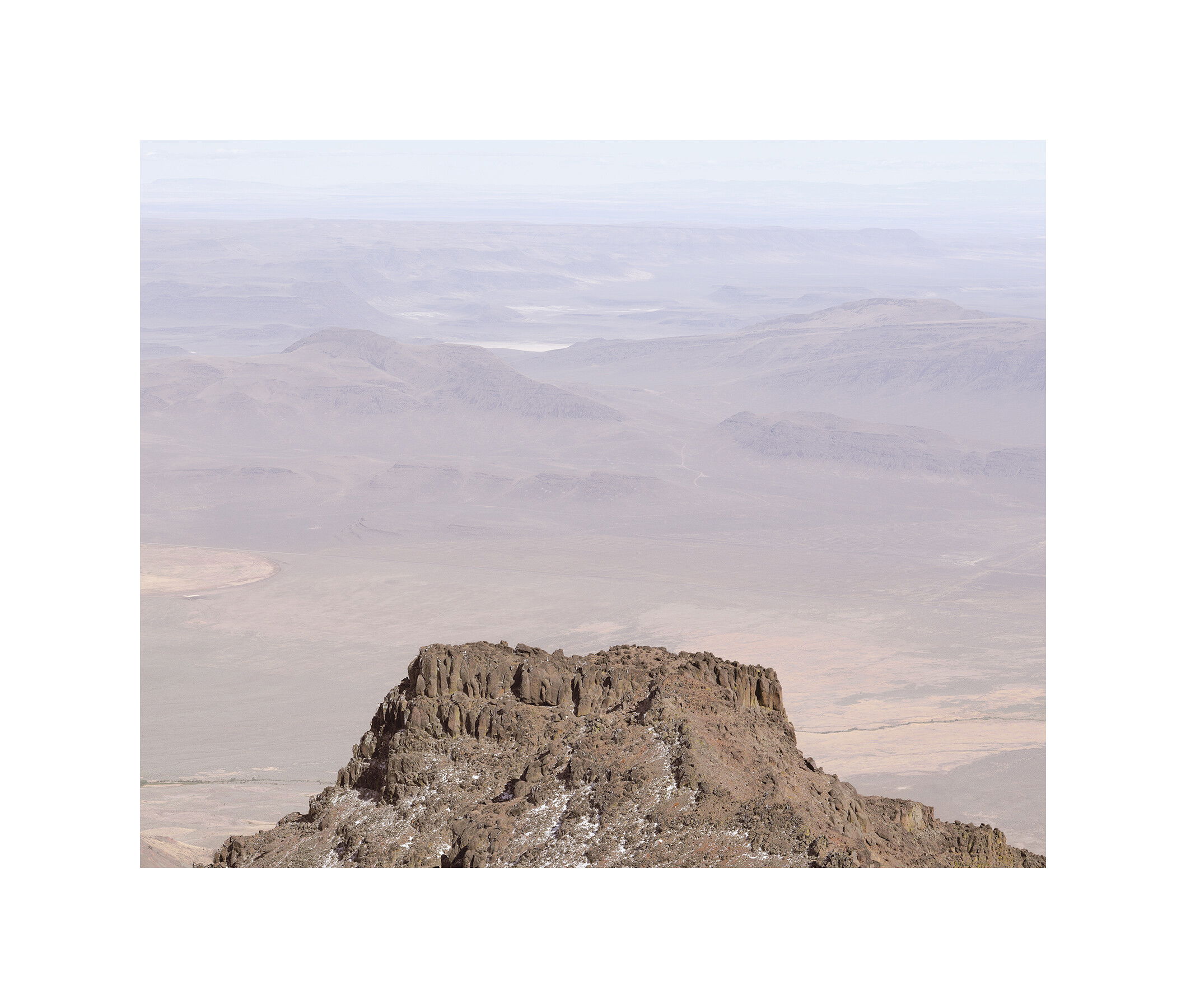
The view from the Steens Mountain peak was just stunning. But how to convey that feeling? I made this shot 2 months ago but was really disappointed because it just didn’t look like I felt. I had decided that the adrenaline rush combined with a sense of peace just could not be conveyed because it was not in the subject but in me and the camera just showed the subject. But after looking at Bruce Perceys work I decided that I had gone about it all wrong. I lightened the image and cropped it to give more negative space. But the biggest discovery is that a really wide frame really affected the mood. The composition is really not very interesting but I do now have the feeling of jumping off and gliding into infinity and that comes somewhat close to how it was. I also really desaturated the colors so that they became secondary. All done this morning so there has not been a great deal of reevaluation before posting.
Let me know what you think of this ‘creation’. Do the colors seem right to you? I could make that butte a bit redder?
I love your creativity and experimentation, Igor. That you came back to this, inspired by Bruce Percy’s minimalism style, is really great. The butte is really standing there alone, with a hazy vast and sort of mysterious expanse beyond to put the butte in context.
I’d have never thought to go with a super wide frame. Kudos for taking risks and trying new things.
I love this wide expansive image.
I rather like the composition. It does convey a soaring feeling. I think I would prefer the butte brought down in value to provide a bit more contrast to the ethereal light and mood of the background (which looks spot on to me). Of course, that is very much a personal taste rather than a critique of the presentation.
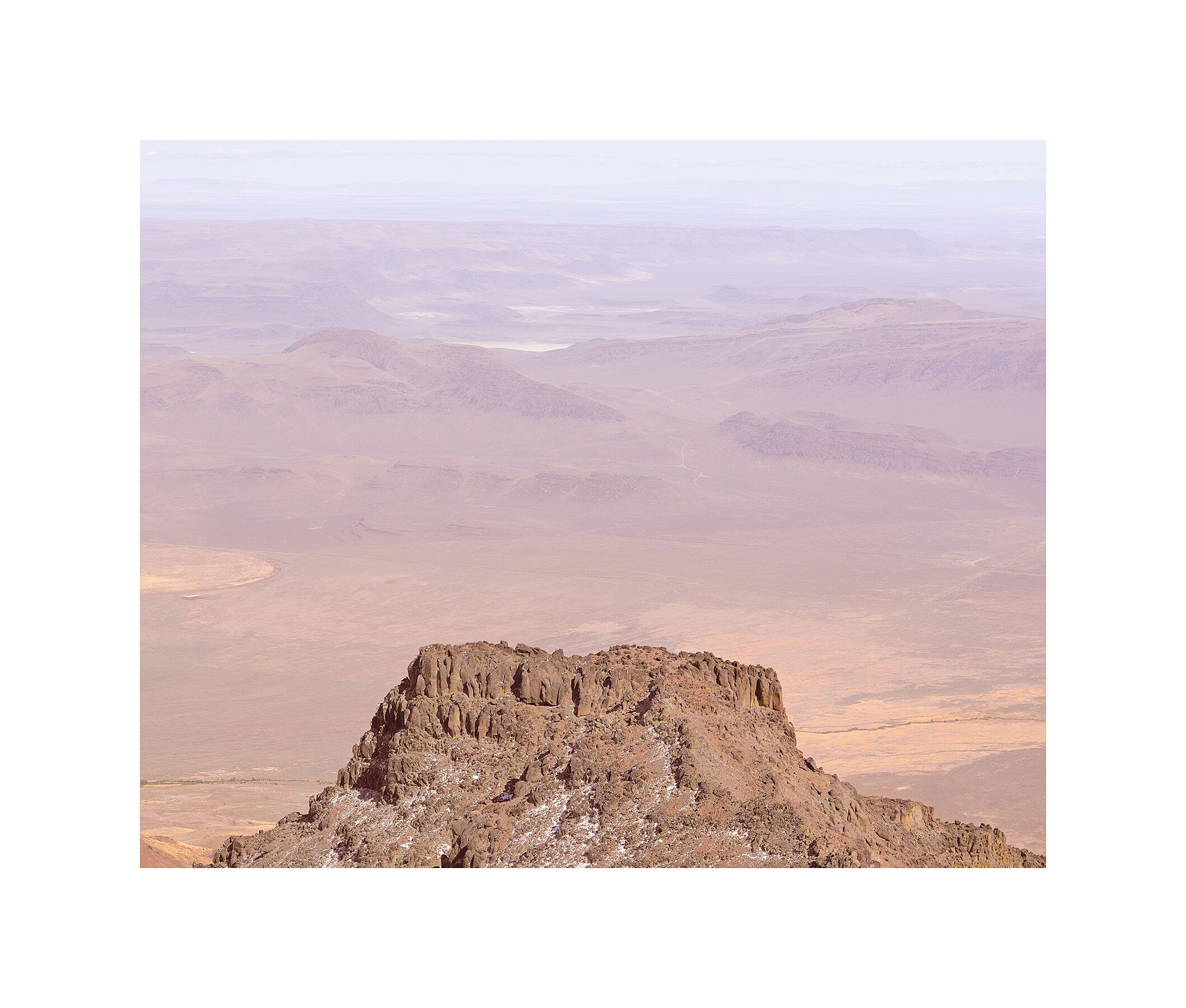
I have one like that as well. See what you think. I raise the values of the butte to reduce the contrast thinking the two should be more alike. To shift the attention from the butte to the plain below.
I prefer the second version because the less red foreground butte is less prominent relative to the background desert. That, to me, helps convey your idea of falling into the background space. The wide frame does help with that (I looked at it with a smaller frame and it does feel different). The colors look fine to me; it’s interesting that the subtle difference in color of the foreground butte has such an impact.
My theory is that the wide frame works with images with a lot of negative space because it makes it even more minimalist. Forest scenes look better with smaller frames.
Interesting observation. I waffle on whether or not to put a frame on online posts. It does give you a bit more control over how the photo is presented, since you never know what color background a viewer is using.
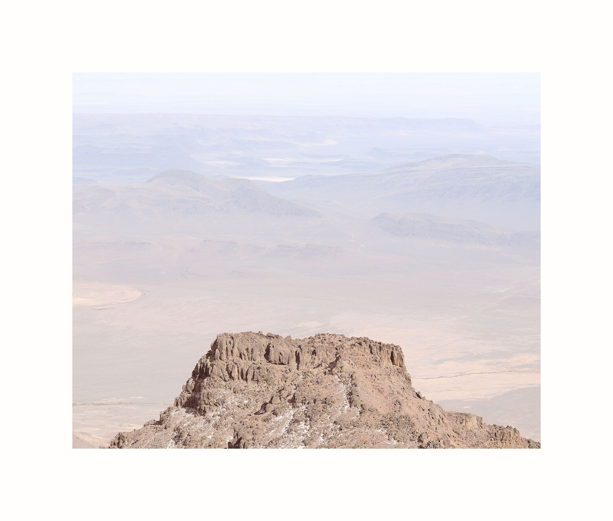
A wonderful view from up there! I wonder about a subtle gradient, which could possibly be masked off the butte, to give a bit more color and contrast to the nearer BG and fade away to the farthest.
That’s a really neat angle. I personally like the 2nd one better because I think it brings out the details in the distant view and the cliff that you’re standing on more. Really beautiful colors!
I think Diane is onto something very helpful here. Having something of a gradient darkening to the background would enhance the feeling of gliding off into infinity. As originally presented, the background is so uniform in luminosity that makes the image look more 2D than 3D. A gradient darkening on the background only would help provide more of transition that I think helps the viewer to glide off into infinity.
I still like the original the best for now. Perhaps the gradient with the original? The original is more optimistic. The others have more of a brooding quality and that’s not what this image is about.
Diane. I gradiented the image by creating a Curve layer and darkened the image then applied the gradient tool to that mask. Then finally erased the butte from the gradient mask. Is that how you would have done it? I found this method on a youtube video.
I like the darkening and might go even further. The more distant areas are more interesting to me, but somehow darkening the nearer area just feels right. I’d probably keep the contrast low, though.
I would do a slightly more straightforward route, but it’s whatever works. I would go to quick mask mode and choose the gradient tool and draw it from the bottom up, probably all the way, maybe 2/3. Then go out of QM and I have the selection. Make a Curves and the selection automatically makes a mask. Darken as desired by pulling down the center of the curve, trying to ignore the butte. Then go to the image layer below the curve and try select > subject of whatever will find the butte. Hit the slash key and zoom in on the edges and paint in any corrections needed with the brush tool, black to add the colored area, white to subtract it. Then maybe feather the selection slightly if it’s too hard. With that selection active, go back to the curves layer and use a black brush to paint over the butte.
It may take several tries to get it right, but just tweaking the curve may be all the tuneup that is needed.
Soaring. I feel the expanse - a real bird’s eye view. When I lived in the southwest, I would watch the ravens cruise along the edge of the mesas and I always wanted to be them. This image gives me that feel. The gradient version works best for me because the mesa feels less superimposed and therefore draws me in rather than blocking my way.
Hi Igor,
IMO, the original one is far most the best. You could even take it further. I made the warm colors warmer and the cool colors cooler, this to keep this transition in colors when I added high key.
I like this a lot more than I thought I would from the thumbnail. It feels like it breaks some rules, though I’m not sure which ones and how many. I think I like the darker butte better.
It’s certainly not one of my proudest images on NPN. In fact it’s likely one of the weakest images I’ve posted on NPN this year. And I’m not being humble.