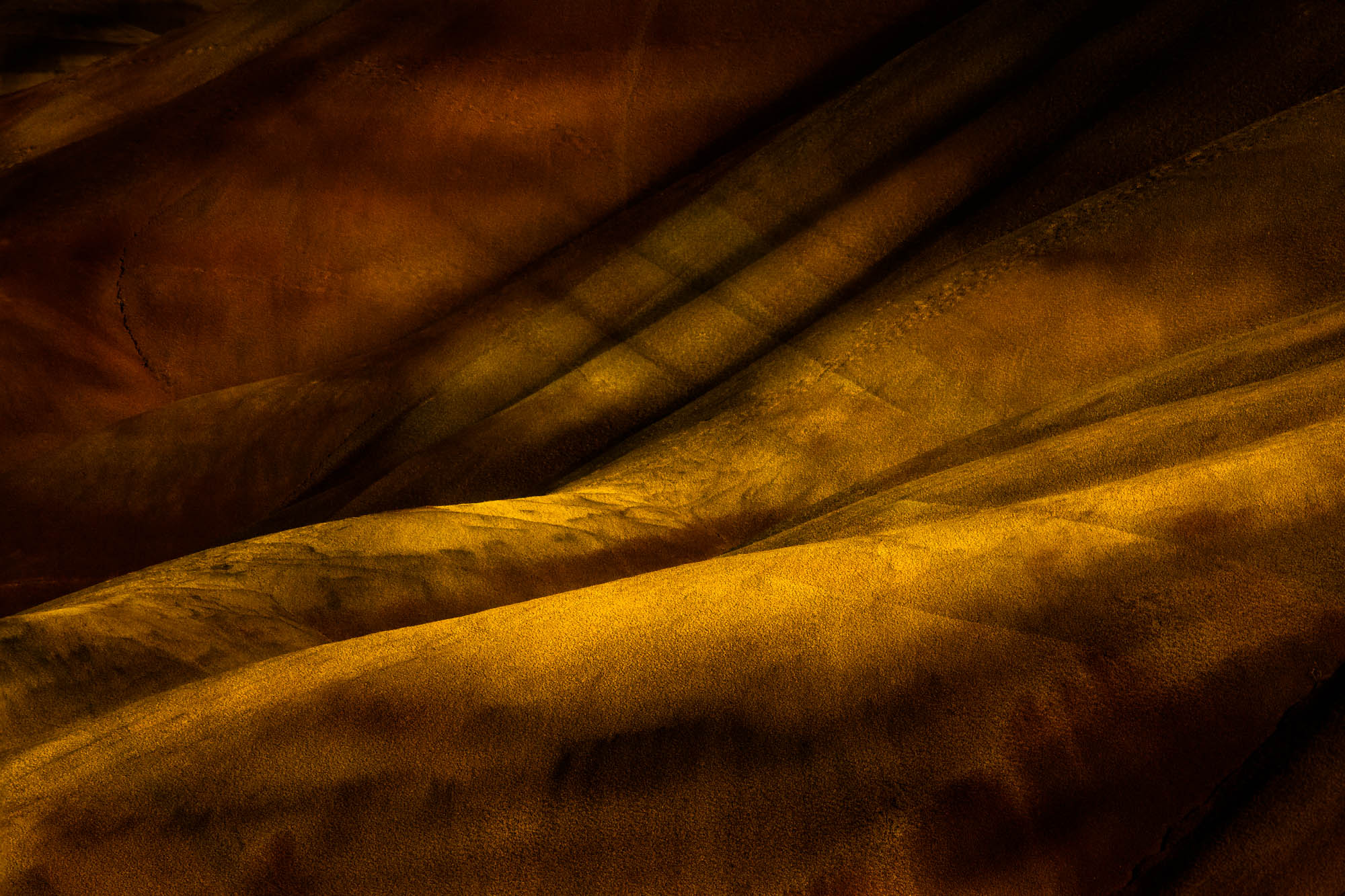
Another semi-abstract from Painted Hills. This one lent itself to developing its soft light in areas.
A little different from my typical attraction to strong graphics and edges, but I guess it is a softer version of all that,
What technical feedback would you like if any?
A lot of the deeper colors are not rendered well on my sRGB , compared to Adobe RGB, so I deepened the contrast.
All comments most welcome
What artistic feedback would you like if any?
I have choices about global contrast in this image … so attached are one with less, one with more.
This one is best on AdobeRGB monitor
It’s either the 1st or the 3rd for me, depending on what you’re trying to say.
I think this is a better image than the previous one. I prefer how the reds are handled here more than previously. The composition feels more natural. Although I liked the previous composition for it’s awkwardness.
There is a faint white line top center that bothers me. I don’t know why, because there are other faint lines on the left as well.
Oh, the first one for me, definitely. I feel the depth of the scene more. I could see cropping off the right side, so that dark angled line in the LRC is taken out.
Yep that lrc line is an "artistic challenge”. If I crop it out, then I lose some of the Urc that seems important to me. I burned it and softened its focus, but there it is. Maybe a different camera position if I get there again.
Nice image - great “bones”, as they say, anyway you work it. But, Dick, there is a point where, as an artist we have to stop taking consensus. And this image is a perfect example - everyone has a different opinion when the only one that really matters, in the final analysis, is yours. Personally, I love chiaroscuro - the way shadow defines light and the depth and mystery that arises when it is carefully and consciously employed. But that approach is certainly not “better” than any other and there can be no reason to employ that approach other than that it is consistent with your vision. So, to throw it back to you, what is your vision for this image? Where would you like it to be taking me?
Great images, Dick. Yes, a softer version of a strong graphic but an impressive image, nevertheless.
This is the one I prefer because to me it is the most balanced while presenting mystery and mood. Those with greater contrast are heavy and not subtle - I prefer the subtlety.
What I really like about this composition are 1 - how it looks like an imaginary landscape, like you made it up and everything is very deliberately included. That is composition by subtraction just like a painter; and 2 - that the scale of the scene is a complete and utter mystery. It is a work of art!
As a geologist I find this wonderful to observe. Nice work!
Thanks, Kerry. The reward I got from posting all these is the insight into the views of the reviewers. Every version won someone over, so it became clear that I had to find my own preferences. Your question “where would you like it to be taking me?” is the perfect koan at this point. I will ponder … maybe different answers, different prints, for different occasions.
This is amazing! I prefer the second one, where the lighting feels more natural. That emphasizes the subject for me, rather than the processing. I don’t object to the art of processing, but the subject here is so spectacular and so well seen that I don’t feel it needs much help. The colors are marvelous, the scale a mystery, the composition so pleasing. I wouldn’t object to some cloning work on the dark line in the LRC – maybe partial opacity.