The photographer is looking for thoughtful feedback on the image as a whole, especially around the areas noted below.
Feedback Focus: Artistic / Expressive
About This Image
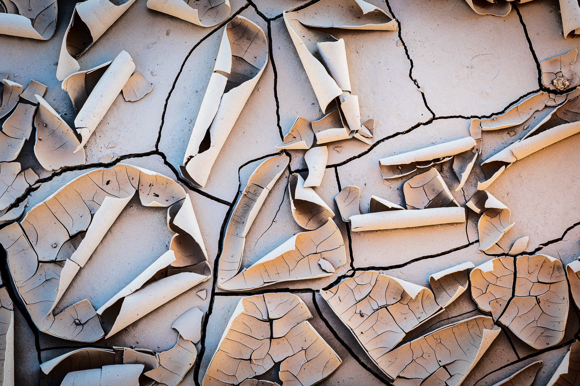
I was searching for some interesting mud patterns when I came across this small patch of parched earth. It had rained here recently, but the hot sun was out for a while, baking the land in the late spring heat. What really got my attention was the way the top most layer of dried mud was peeling away and curling up, looking like pieces of paper.
Feedback Requested
I’m wondering whether the mood or feeling I was aiming for comes through. Any helpful feedback regarding the composition and post processing of this image would be most welcome.
Technical Details
Camera: Canon EOS R6m2
Lens: RF24-105mm F4 L IS USM
Focal length: 105mm
Shutter speed: 1/60s
Aperture: f/13
ISO: 640
Processing software: Lightroom
Global adjustments to the exposure, contrast and color. Slight increase in texture, clarity and sharpening. Also added a slight vignette around the outermost edge of the frame.
This is a fantastic image, Ted. I’m a real sucker for mud and dried mud especially. The abstract nature of this and the colors all works so well together. Really nice work!
Parchment is a good title for this one, Ted. There are scrolls, shavings, all sorts of scribe-references. For some reason, the crop feels a little iffy for me. I don’t know whether it’s the bits in the URC (they are not present enough to work and too present to be ignored) or whether it’s the large plate near that corern that is more swept clean than the others.
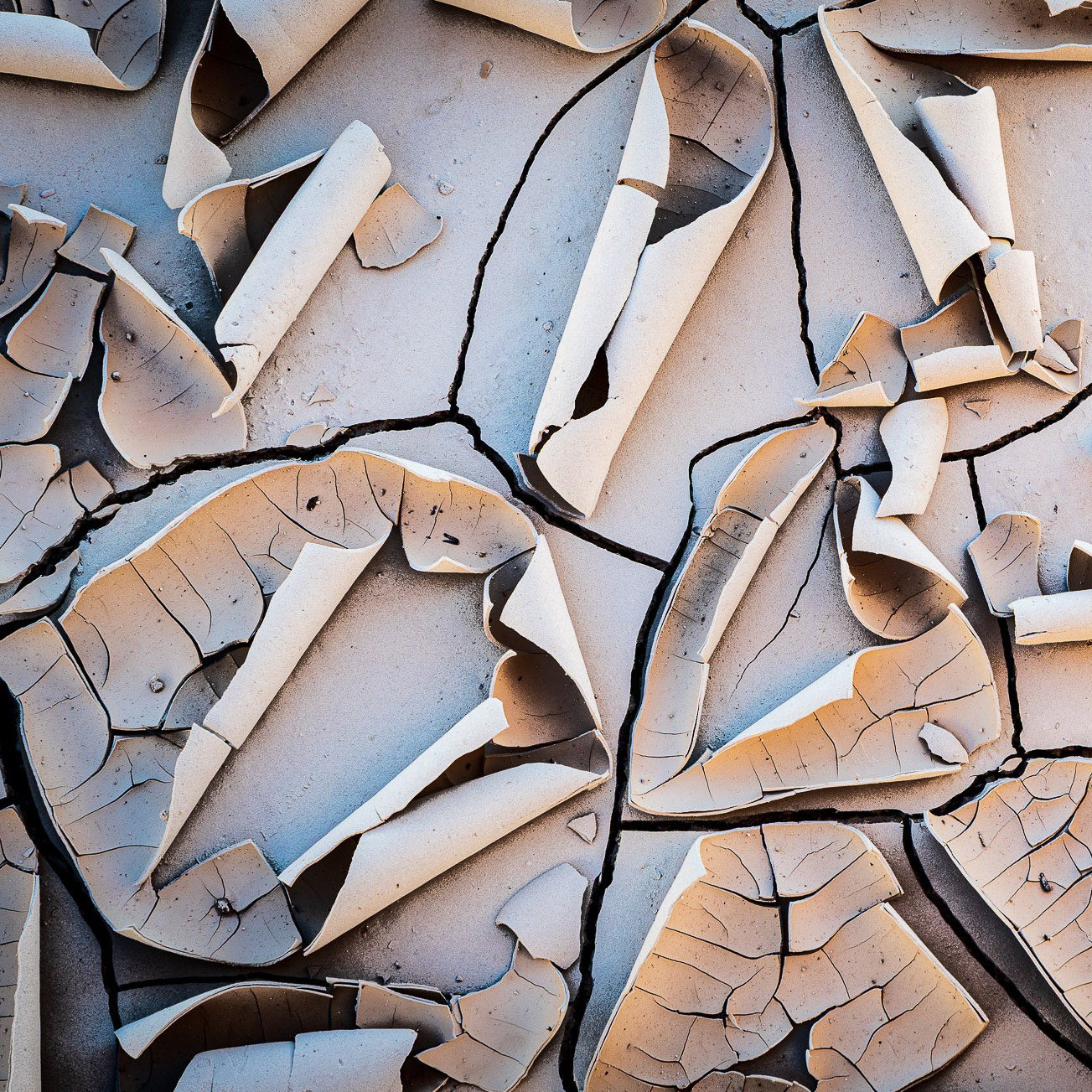
Of course, this is a wonderful abstract any way you look at it, and I’m not sure what parts really attracted you to the scene and feel indispensable to you. I played with a 3x8 and 4x5 crop, and ultimately settled (for myself, of all things) on a square crop as being the most engaging. There is so much to look at in the full view, I struggled to feel like it was truly composed. I do like the horizontal scrolls though, and my suggested crop loses those.
Anyway, my perspective might be a bit off, so please take it with a grain of salt, or at least a crumb of mud.
Hate to be repetitive, but this is indeed striking! A fantastic drying, curling mud image.
I would hesitate on a crop and here’s why. It’s faint and subtle, but the color on the left is leaning cool. It seems there is a gradual gradation from warm to cool. I think also the luminosity starts to drop off too, so that’s probably influencing. I’m not sure of your intent or what thoughts you were thinking when processing, but you might want exploit/enhance that transition of color (of course without overdoing it…) With that, I wouldn’t consider cropping unless or until maybe you tweak that. Just a thought - not a correction or nit - just an alternate thought.
This definitely has that “parched earth” look, feel and mood to it. So definitely fits the WC.
A fantastic find with excellent soft light! But for me, the interest is in the bottom half of the image (or maybe 9/16ths), with the finer cracks. But I do understand that whatever is not in the frame here may have been a distraction.
Hi Ted, I think this is a really cool image just the way it is. I also think Lon’s idea of enhancing the cool and/or warm parts of the image would be interesting. In terms of coping, it’s fine as is, you could also probably get several more interesting images out of this. Love the name!!
Alice
I am loving the slightly warm earth tones as well as those couple of areas with cooler blue ones in this intimate landscape. I think the tile is perfect as it does look like parchment. The processing looks just fine to me and the larger version shows off some wonderful textures and intimate details in the dried mud. I could see a few other interesting compositions in the original as well. Beautifully done!
Ted, this is outstanding. I really like the color shift from warm (lower right ) to cool (upper left). The curl stand out with their sharpness. My one, very minor idea is to dodge along the left edge where it looks like there was a bit of shadow. I think this view looks fine as presented. In fact, I like the lack of curls in the upper right, but do think that having some curling in that corner is important.
Ted, this really is a fine image. Great find here.
The framing is just fine. In fact, you’ve done something here that’s hard to do compositionally. It’s called “Art of the Fourth Corner”. It is relatively easy to frame a shot with interesting elements in three corners. However, it is difficult to have all four corners with interesting elements that tie the whole comp together. This image has that. In short: don’t crop it.
I think the image works well color-wise as it is, but it would be interesting to see if making the cooler areas a little warmer as @Lon_Overacker suggests.
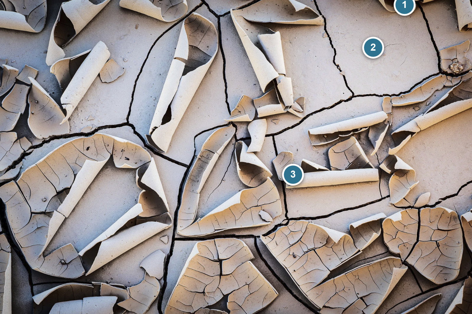
There is one little eye grabber near the URC: There’s a little spike of mud right on the edge that for some reason catches my eye. It’s minor but thought I’d point it out.
I think this would make a lovely print. There is so much detail and texture here. Nicely done, sir!
This is impressive because of the crisp details present in the scene. Overall, pleasing color scheme, maybe warm up the shadows a tad. You could even go black and white which would be equally impressive to the color version as well. Very nice and have no major nits to quibble about and hope that you will print this one out. Awesome…Jim
Ted: Frame filling fantastic IMO. I’m not sure there is a more pleasing crop and one of the things I like about scenes like this is its randomness. Really well seen and superbly captured. >=))>