Pastel Rivers

Image Description

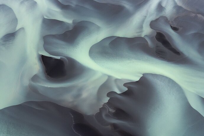
This shot was taken on a Cessna flight over Iceland. Looking at the picture, it’s hard to believe that all you see here is a riverbed with some sandbars. There is nothing in the picture to give a sense of scale.

Type of Critique Requested

  • Aesthetic: Feedback on the overall visual appeal of the image, including its color, lighting, cropping, and composition.

  • Conceptual: Feedback on the message and story conveyed by the image.

  • Emotional: Feedback on the emotional impact and artistic value of the image.

  • Technical: Feedback on the technical aspects of the image, such as exposure, color, focus and reproduction of colors and details, post-processing, and print quality.

Specific Feedback and Self-Critique

When I edit abstract shots like this, my struggle begins with cropping. What parts to get rid of? Should I rotate the image?

Technical Details
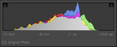
image
I tried to not increase the contrast too much and I have pushed the green colors slightly in the pastel direction because, in my opinion, it fits well with the soft shapes.

As always, any feedback is welcome!
2 Likes

Jens, this is such an intriguing image!! It has an aura of mystery and other-worldliness that really drew me in. Without a sense of scale, I have little idea what I’m looking at, but I’m curious enough to keep looking and let the image say something to me. The soft green tones give it an eerie glow. Very cool abstract!

Since you asked for feedback about cropping and orientation, I took the liberty of playing around with it. I hope that’s okay - I see others do it in these invited critiques, but I’m relatively new to the Network and am not completely sure of the etiquette. So please forgive me if I overstep; I was interested in exploring your question first-hand. Since it’s so abstract, it lends itself to so many possibilities, esp. for an “outsider” who doesn’t have any literal idea of the scene.

I opted to try three different renditions.

ONE: no cropping and vertical orientation; I find something draws me in more in this orientation… there’s a different sense of depth, perhaps?

TWO: cropping and reorienting, has a similar effect on me as ONE.

THREE: no crop, same orientation as original, vertical flip. This version to me has more movement, as it’s like the section coming up from the LL corner seems to be reaching out to the darker teardrop-shaped shadow. It’s like they’re in conversation.

In addition, as I worked with it, I noticed a few small white dots on some of the edges of different sections, so I did a very quick spot removal. With an image this smooth and surreal, little bright spots catch my eye, and if they’re not part of the story and easily removed, I err on the side of removal. As with everything I’ve shared here, it’s entirely subjective and reflective of my own practices. (And doing this tonight led me to realize what I enjoy about spot removal - it’s like the digital equivalent of popping the plastic bubbles on those sheets that are used to cushion shipped or packed items, LOL!)

Shew, that was long! Sorry about that :slight_smile: All for your consideration, take/leave as you wish. This is a compelling capture no matter how you trim and turn it - congrats!!

1 Like

Hi Beth,
thank you very much for your feedback.

Of course, I don’t mind that you played around with my image. Thank you for taking the time to do so. I think it’s the best way to showcase what you have in mind. Even if the adjustments sometimes seem tiny, they can have a big impact on the image.

Yes, this is a relaxing way to spend time :rofl:

Thank you very much for your three versions. I like number two very much because it simplifies the scene a bit.

1 Like

Jens, you’re most welcome! Glad to have offered something useful while not offending :slight_smile: I look forward to learning from others’ feedback on your image.

This is a wonderful abstract Jens! I would never have guessed the subject. At full size, the little ripples in the sand are really cool.

What gives the color? Is it inherent in the sand or water, or was it the way the scene was lit?

My favorite might be @Beth_Buelow’s version One with a slight crop. Lots of options, and regardless of what you land on this is a great image.

1 Like

Hi @John_Williams ,
thank you for your feedback. I quite like that crop.

The rivers in Iceland are incredible. They have very different colors. I only know that they probably have their origin in different glaciers. But unfortunately, I don’t know how exactly these colors are created. Just to give a sense of what I’m talking about, here is a video of the pilot we flew with:
https://youtu.be/CJlpzq5hwLA

Wow!! Thanks for sharing!

Wow, Jens. This is an incredible image. A wonderfully natural abstract landscape. And so many opportunities for creating different image from it as @Beth_Buelow and @John_Williams have. For me, I just love getting lost in the larger version.

Is this competition worthy? Absolutely. In my book it’s a winner on all fronts.

Thanks for posting this. I’d love to see more of your images from this trip.

Cheers,
David

2 Likes

Thank you very much, David. I really appreciate that.

I just read through all the comments, Jens, and I have nothing much to add. Competition worthy indeed. In my opinion Beth’s first version is best. Further crops lose depth and there’s nothing disturbing in your original composition anyway that I think is worth cropping out. The standing version, though, makes me think of the head of a praying mantis somehow, and maybe other viewers will see other shapes… let people’s imagination run free and give them the entire photo :slight_smile:

1 Like

Jens,

This is just phenomenal nature imagery. Nature abstract at its finest - and even an epic nature story.

This could be carved up a hundred ways, but given the little tiny clue and inclusion of the beached seals… this works most perfectly as presented.

Can’t offer anything! Any changes could certainly alter and make a new image… but I think one would be hard pressed to improve on what you’ve presented.

Wow!

I meant to stop by for a closer look at this one and got busy – glad the EP reminded me to come back to it. (And congratulations – well deserved!!)

I think this is a captivating and unusual image, and very well done! There are different crops here, as covered above, and I like all of them! I do think the verticals are very fitting for the sweeping lines. No suggestions at all, except keep doing this sort of thing!! The video is wonderful! It has me wondering about mounting a GoPro (or whatever is good these days) on the wing strut of one of my husband’s small planes. I’ve thought about it for years but always assumed the vibrations would be a problem, and the percentage of good shooting time would be very small.

@Ingrid_Vekemans @Lon_Overacker @Diane_Miller
Thank you for your kind comments.

Yes, It’s really well made. Whenever I watch the video, I would love to fly again.

Amazing Photo. The lines, shapes and tone. You really capture something unique and beautiful …

I think this is really nice in every way, lovely smooth processing and very well balanced, flowing composition. I do enjoy the subtler, natural looking colors, but if anything you could probably increase the saturation a little more to give it more pop and still maintain the natural look.

1 Like

@Jens_Ober “When I edit abstract shots like this, my struggle begins with cropping. What parts to get rid of? Should I rotate the image?” First, this is clearly an image that can have dozens of very successful lives. I urge you to trust yourself, maybe after printing several combinations and living with them for a few weeks. But the bottom line is this is a STUNNING image, stunning!

Hi Jens

This is simply amazing.

Hi Jens,

Sorry for the really late response on this. The photograph is beautifully taken and I think the thing that really stands out for me are the sharp demarcations between the curving shapes. Particularly for the bottom area where we almost have the outline of grotesque japanese faces on show (I have a vivid imagination).

The crop works really well for me and I don’t think it needs changing but I do like Beths vertical version.

I think as far as a competition entry goes, this has great positives but it will also have to surmount the big negative in that most judges will have seen a LOT of river estuary work like this from Iceland and will have become a bit jaded by them. However, those sharp demarcations I talked about do make it look different so I think it may well stand a good chance of going further than most of the Iceland river estuary abstracts (I would vote for it to get past the first rounds!)

I did have a bit of a play with the balance of tones across the picture, knocking back a few of the brighter areas, especially on the edge of the frame, and lifting a couple of the darker areas.

Superb photograph!

This abstarct is certainly outstanding with many crop options - processing though, I like it the way it is
Was this a photo specific trip on that Cessna ?

1 Like

Hi Karl,
thank you for your feedback.

Yes, this was a flight specifically for photography. The pilot was a photographer himself and he knew exactly how to fly to satisfy a photographer’s needs.
If you are interested here is a link to a YouTube video of that pilot: https://youtu.be/CJlpzq5hwLA