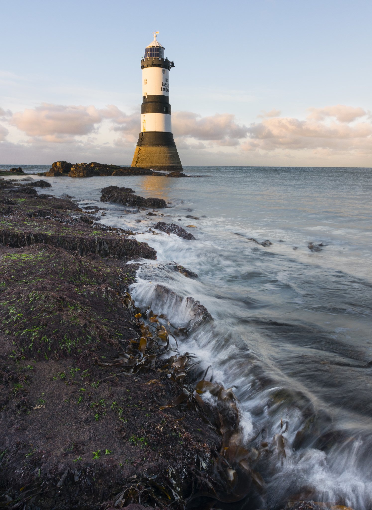
Hi all. New to the forum and been learning photography for just under a year now. Looking to improve so would love some critique on this image of Penmon Point, Anglesey, North Wales. Any feedback gratefully received especially regarding composition and post processing improvements. In my opinion the lighthouse is too close to the centre of the frame rather than following the golden ratio. I was trying to use the sprig of seaweed and breaking water as a lead in line. Does this work?
Exif data: taken with a Nikon D5300 and tamron 10-24mm @ 16mm. 1/4 second shutter, f16 and iso 100.
Welcome to NPN Chris! Nice first post and I would say the composition works quite well. Great job using the surf line and seaweed to lead the eye in to the frame. I don’t think the lighthouse is too close to center. In fact it’s off center just enough to tell me you carefully placed it in the frame.
The sea does look especially calm - and so it’s nice that you got as much action/motion in the wave line as you did.
Processing, color/sat, etc. look good and natural to me. Given the time of day (early/late?) I suppose you could warm up the light hitting the lighthouse, but that’s just a thought and certainly not an issue.
This is very minor as well. But there is an ever so slight CW tilt to the horizon. Some barrel distortion may be involved as well. Not that’s being picky…
Hi Chris- “CW” means ClockWise direction. The horizon is tilted to the right just a bit.
I like your image. The composition is just fine, and I don’t think the lighthouse is too close to center at all. Like Lon, I also like the leading edge of the shore line pointing to the lighthouse.
Processing-wise, I think the only thing you might try is making the upper third of the image a big darker, so the colors are a little more saturated. Can you remember just how dark it actually was? It would be nice to bring out just a bit more of that sweet color in the clouds.
Other abbreviation used frequently on here are: CCW = counter clock wise, BG = background, FG = foreground, DOF = depth of field…I am sure there are others!!!
Welcome.
Sorry, we should have an acronym FAQ… CW = clock wise, CCW would then be counter clock wise. You may see others like: URC - upper right corner, LRC, lower right corner, etc.
And no apologies… sometimes we make assumptions - and kudos for asking the question and not letting me get away with assuming…
Chris, you have already gotten some good feedback here. When I have a dominant subject like this lighthouse, my preference is to have a symmetrical composition where the subject is more centered in the frame (currently you have it more to the left). Attached is a crop using my suggestion. I think it feels more balanced to me without losing the impact of the diagonal waterline.

 CW = clock wise, CCW would then be counter clock wise. You may see others like: URC - upper right corner, LRC, lower right corner, etc.