The photographer is looking for generalized feedback about the aesthetic and technical qualities of their image.
Description
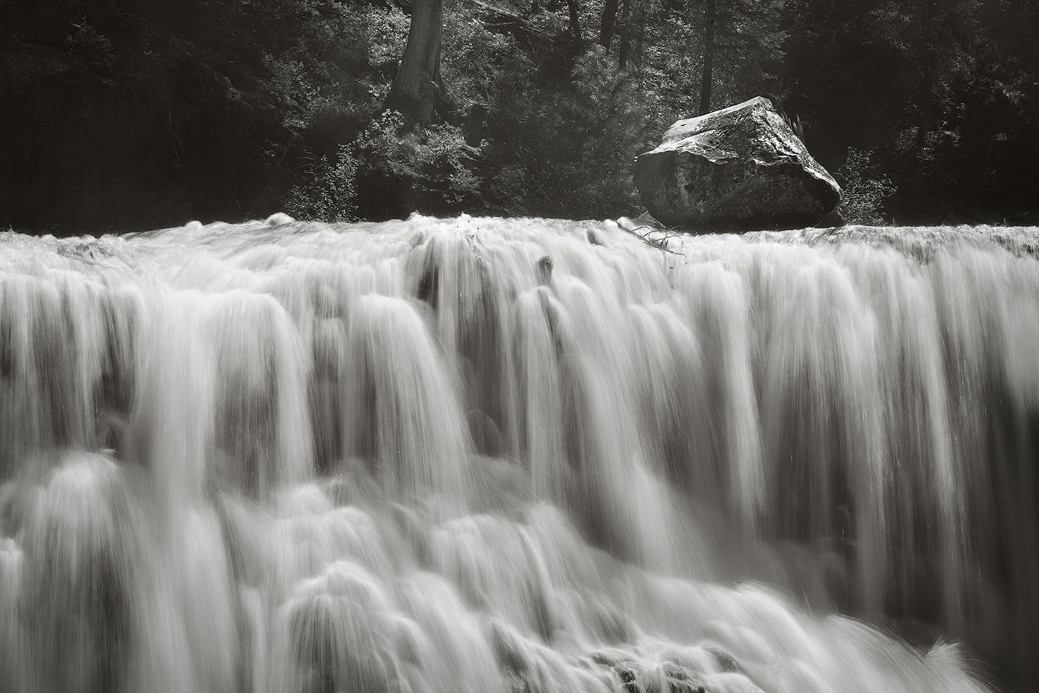
This large boulder atop the Middle Falls of the McCloud River always fascinates me. I felt this was about the geometry and textures of the scene, so I converted it to b&w. Went with a longer SS to smooth out the water and make it more graphic.
Specific Feedback
Any comments welcome. I wanted to keep some detail in the shadows, but not sure how well I succeeded. Intellectually, I know that one doesn’t always need all that shadow detail, but it’s hard to let it go full black.
Nice! I love the graphic nature of this and the dichotomy created by the water and the boulder.
The high-key treatment works well but the highlights in the water are a tad too bright and lacking in some detail.
You might also consider cloning that branch on the right edge, the tree branch in the water just left and below the boulder and the bush on the right side of it.
I do like the misty softness of the background forest.
This could be processed in many different ways, but your choice here is the ticket.
-P
I like this image very much Bonnie! It is quite unique as Igor has mentioned. The rush of water over the falls is quite beautiful and I like the shapes and diagonal fall of the water over rocks at the bottom third.
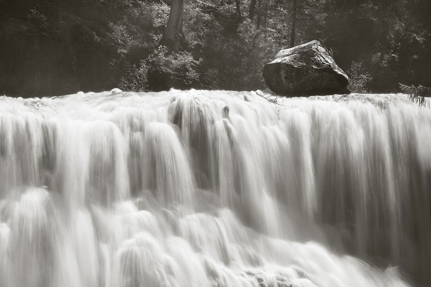
I also like to keep some details in the shadows, but I think you could go a touch darker without going full black.
I would certainly consider another version going a little more dark and contrasty.
Preston - you were right about the highlights. They weren’t blown in the main file, but getting close. I darkened the lightest end of the highlights (lights 3 in the TK panel) and it definitely improved this. I also cloned out the tree branch on the right (I’d already gotten rid of another branch over there). I left the little branch almost going over the fall and the shrub next to the boulder, as they don’t bother me and I like a bit of imperfection in my images.
Glenys - I darkened the image overall and increased contrast in the water (by burning the darks).
I missed this earlier but glad I found it as it is very different and interesting. I do like the darker version, but it seems to have lost some detail? Just guessing, from how it looks on my monitor, but maybe the histogram (at least in important parts) didn’t go all the way dark? I completely appreciate the TK masks and adjustments but I wonder how just a curves or levels squeak of the histogram would compare.
I like the compromise on the branches. A very cool image in any case.
PS – I keep thinking how Cole Thompson would have centered the boulder. But probably without wading in the stream.
Thanks @Diane_Miller. I went back and tried a gentle curve, but it didn’t work for me. I generally tend towards the lower contrast end of the spectrum.
Would he? I don’t follow him. I’ve seen his work, but it doesn’t resonate with me very much.
Hi Bonnie,
The taming of the highlights in the water in the rework looks great and is the ticket for me. Your chosen SS is perfect for my tastes as I like the textures in all those lovely cascades and the atmospherics with the rising mist in the BG is the icing on the cake. I can take or leave the rock, but that is just my personal opinion and certainly not a deal breaker. Beautifully done.
I prefer the top, more contrasty image. The SS is perfect to me, showing enough detail. This is almost whimsical as the boulder looks as if it should be cascading down the falls. Excellent.
Bonnie, this scrolled off my screen to oblivion and I neglected to answer. I can’t say I follow Cole Thompson but occasionally his work pops into view. A lot of it doesn’t appeal to me but every so often there is one that I really like, and it’s usually a simple centered composition. But of course I wasn’t suggesting that with any seriousness – it just hit me for some reason. Probably too much coffee.