The photographer is looking for thoughtful feedback on the image as a whole, especially around the areas noted below.
Feedback Focus: Artistic + Technical
About This Image
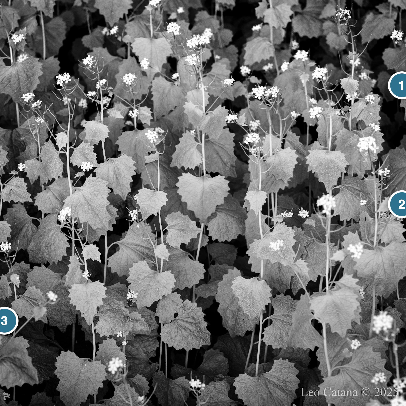
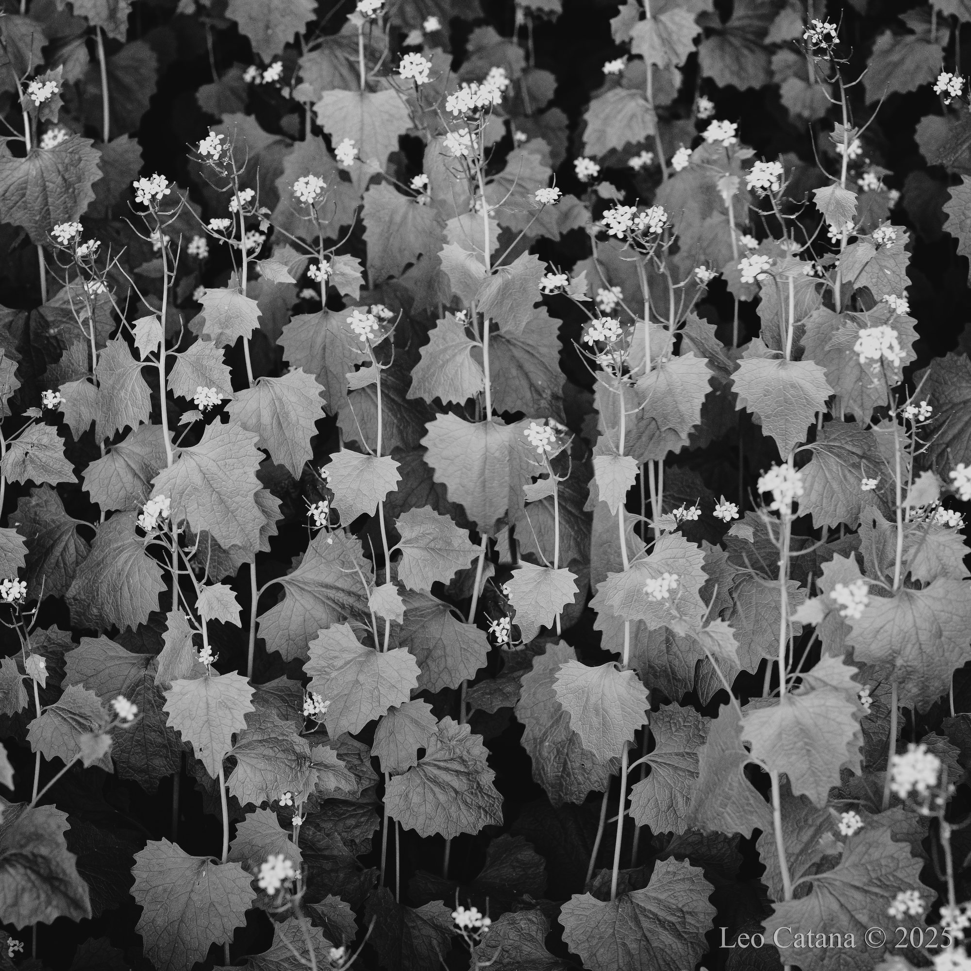
Captured at the edge of a forest, with the receding woodland stretching into the background. The direction of the light seems to have encouraged the plants to turn their leaves toward an optimal position for capturing the scarce light available to them. Combined with the close grouping of the stems, this creates an impression of community and shared desire among the plants. At least, that is how I see it.
Feedback Requested
Does the processing support the sense of community and shared desire among the plants?
I think it does - they are tightly grouped and of a similar age and size and that goes a long way to showing harmony of some kind. The even gray of the leaves works well to show the darker spaces below and the remaining blossoms above. You could do some border patrol to remove a few intrusions, but it’s a continuous subject so has to be cut off somewhere. Nicely seen and I like the processing. I wonder if applying some clarity/texture to just the leaves through a mask would bring up even more interest there.
I like this very much and think it does work as a community. I think the light tones in the flowers are balanced around the perimeter, but there’s a gap in the centre that my eye is drawn to. I cloned in a flower to the centre and it improves the balance, perhaps.
Also, i played with bringing down the overall exposure a bit, and the white flowers by a fair bit. They seemed a little hot to me.
But a lovely balanced image that has me moving around and exploring its depths. Very nice.
Even though it seems to be crowded with information there is a nice a pleasing rhythm to all of it. That’s what holds it all together for me. I also think that perhaps the b&w treatment helps as color may have added confusion but am not sure without prior seeing it.
This is quite striking. The processing works for me - I love the lightness of it. It has a nice rhythm, also, with the progression of leaf sizes becoming smaller to the top. That, along with the light tonality, gives it a very uplifting mood. There is a cohesive feeling to it, as if all the plants are pulling together and rising up.
This is probably the most artistic presentation of garlic mustard, which is an invasive plant species in North America, I have seen so far. And it is a native wildflower in Europe. Black and white with slight vignette brings the eyes up into the center of the comp. The other suggested edits are worth trying for strengthening the comp. Well done…Jim