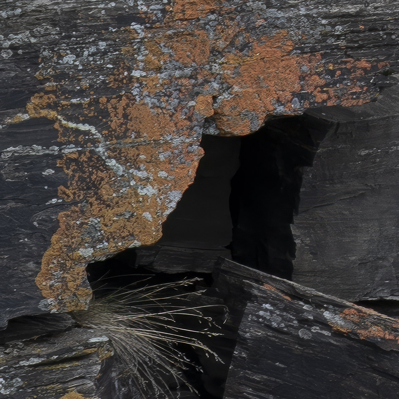
I find this to be a fascinating image. You’ve got really pleasing textures and colors throughout the image. It’s nice of the orange lichen at the top of the frame is mirrored by the
Right lower corner.
I do see the pixelation pattern especially in the orange areas of the scene. Is this the actual texture present? An interesting comp and I’ll add further comments when you are able to respond to the critiques presented so far…Jim
I cropped this from a much larger image and then I expanded the image in PS, which must have pixelated the image and i’m sorry I missed that. I will go back an see if I can fix it.
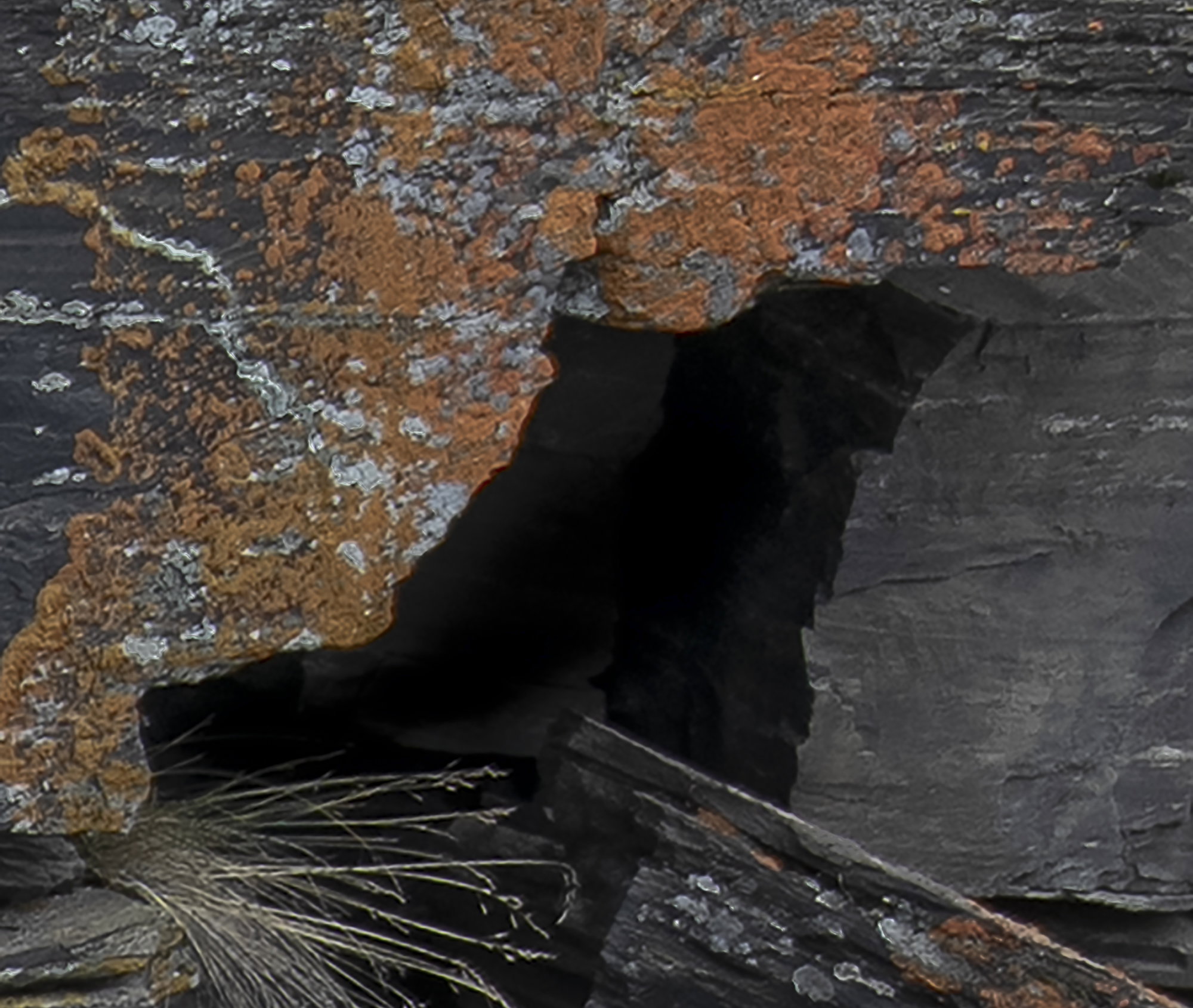
Not a processing expert, but I don’t see how it would. Repost looks better but to my eyes, areas still look slightly out of focus. Could be my bad eyes, but I do have my reading glasses on.
Alice: I really like the more expansive view in the revision and the colors look OK to me on my I pad. I like the disparate elements. I’m wondering if you could tease out just a tiny bit of shadow detail in the “cave”? Still, well seen and captured. >=))>
Your image caught my eye right away for the textures of the lichen and rock forms. The tuff of grass is a really nice element. I also like the square format and overall subdued lighting. It may just be an extreme crop that has resulted in the less than sharp image. I tried to download and do some sharpening but I could not tease out some crispness without degradation. Well seen scene!!!
Hi Bill, actually there is quite a bit of detail in the shadows but I was trying to stay with the negative space theme and “portal” for the weekly challenge. Should i open them up a bit??
Alice, the extra bits in the revised version add well to the view. The orange and white lichen plus the grass tuft do a fine job of framing the opening The overall darkness make for a mysterious, yet inviting view. Desaturation will not change the resolution (sharpness). My guess is that the reduced pixilation in the repost is at least partly because it can’t be viewed as large as the original.
I really like the composition in this image, Alice, and I think the darkness of the “hole” is an integral part of the composition that keeps me looking at it. The revised version isn’t showing a lot of pixelization. If this is a really large crop, you might go back to your original raw file and run it through one of the modern enlargement packages,if you have one, then crop it to where you want it. They’re obviously not perfect, but they can do a pretty good job of interpolating and adding appropriate pixels.
Hi Dennis, when I did the revised edit I ran the photo through Topaz’s enlarge program. I think it’s an improvement. I will look at a less aggressive crop and see if it still has the “Portal” look about it.
The color and shapes are very nice. Just some technical issues. As you take these closer intimate images the depth of field becomes an issue and f/8 is pretty shallow. You also noted that the lens was 200mm zoom but you don’t state what setting the zoom as at when you made the shot. At 200mm your DOF is very small. These factors may have lead to the lack of sharpness the image has. With textured surfaces like this sharpness is important.