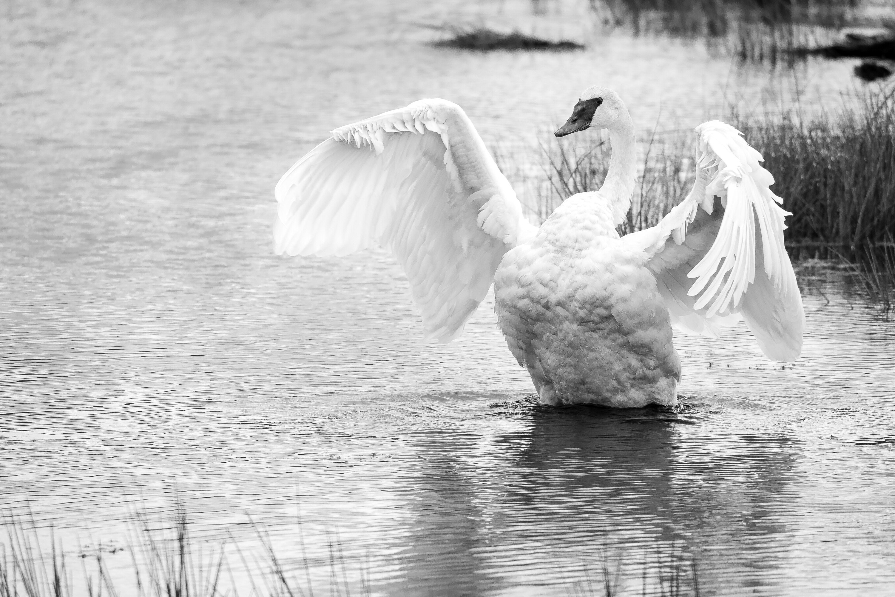
This is an older image that I really like. A pair of trumpeter swans flew into a pond behind me at a wildlife preserve - so close I thought they might brush my head! So after going away and out of sight to let them settle, I crept closer bit by bit. They were curious about me, too, and swam closer to my position on the path. All the while they vocalized to each other very quietly. It was just luck that this one decided to flap a little and I was able to keep the face and body pretty sharp.
Specific Feedback Requested
It was a bright, overcast day without any color in the sky and not much in the foliage so I decided to go with B&W. My struggle is to get the bird to be more defined against the water. The gray value of the wing edges and the water are very similar. Because there’s practically no color in the water, manipulating color value sliders didn’t do the trick. So…thoughts? Suggestions? Ideas? Next time take a picture of a black swan? lol
Technical Details
Is this a composite: No
Panasonic DMC-GH3
LUMIX G VARIO 100-300/F4.0-5.6
Focal Length 218.0 mm (436.0 mm in 35mm)
f/5.1 | 1/1250 | ISO 250
Tripod
Processed in Lr to improve clarity and contrast in the feathers - dodging and burning to bring out tonality and to get the primaries in the bird’s left wing to show up against the shadow of the curve the wing made behind. Brought into Ps to make a weed disappear since it looked as if it was growing out of its head. Cropped slightly and increased exposure and whites. Phew.
Nice action caught with good detail on the bird! It feels to me like it could be cropped a bit from the left – nothing happening over there to balance the bird.
You might try this for the B/W, if there is any hint of color in the water: Increase saturation for blue and cyan, and maybe adjust the Temp to look for any color in the water. Then the B/W sliders for the various colors may allow a little more darkening for the blues/cyans.
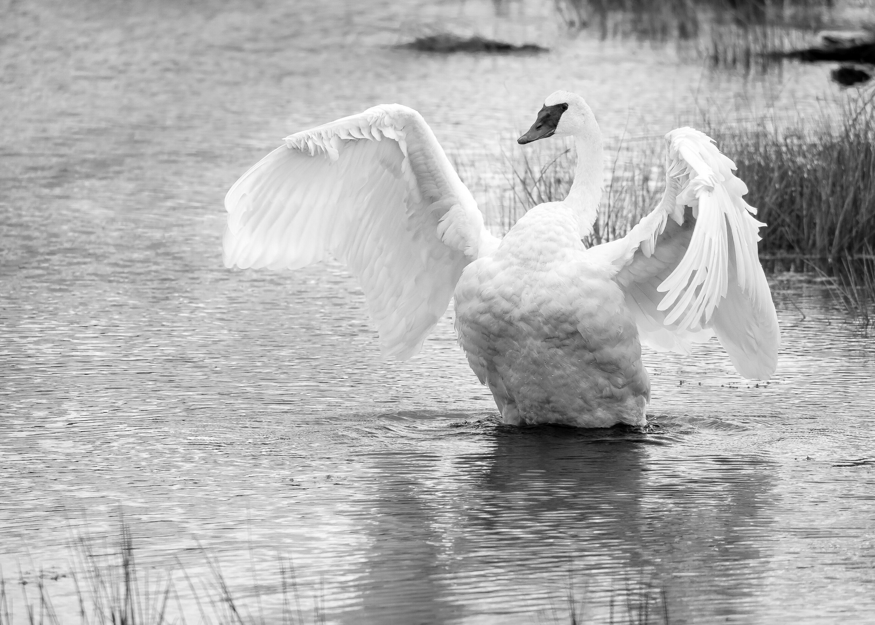
Thanks @Diane_Miller for reminding me about white balance. That worked better since there is hardly any blue/aqua in the shot. Just one of those things. The re-edited image is above (I cropped a bit as well and I think it works).
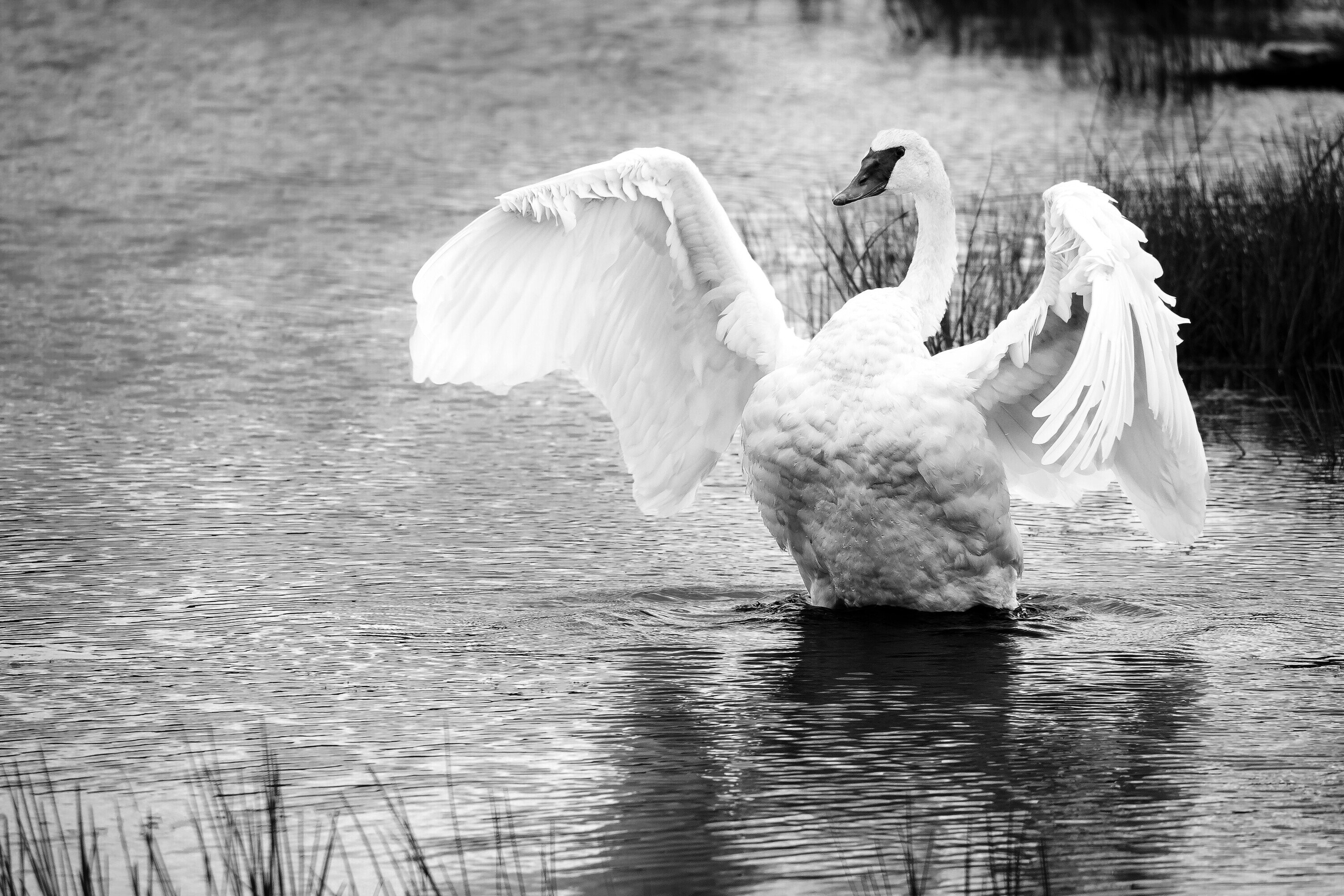
I like this a lot also. Personally, I much prefer the looser comp. If this were mine, I darken the BG and clone out some of the elements to make for a much cleaner frame overall. Something like the below:
First Kristin, a very cool pose and superb detail in the Swan. I do prefer the composition in the original. If anything, I’d take a little off the bottom, but that makes the growths there too short to work well, so on balance I’d leave it alone. I think Lyle did a good job of adding contrast, but for my taste it went too far. I find solid blacks and whites too harsh for my taste.