The photographer is looking for thoughtful feedback on the image as a whole, especially around the areas noted below.
Feedback Focus: Artistic / Expressive
About This Image
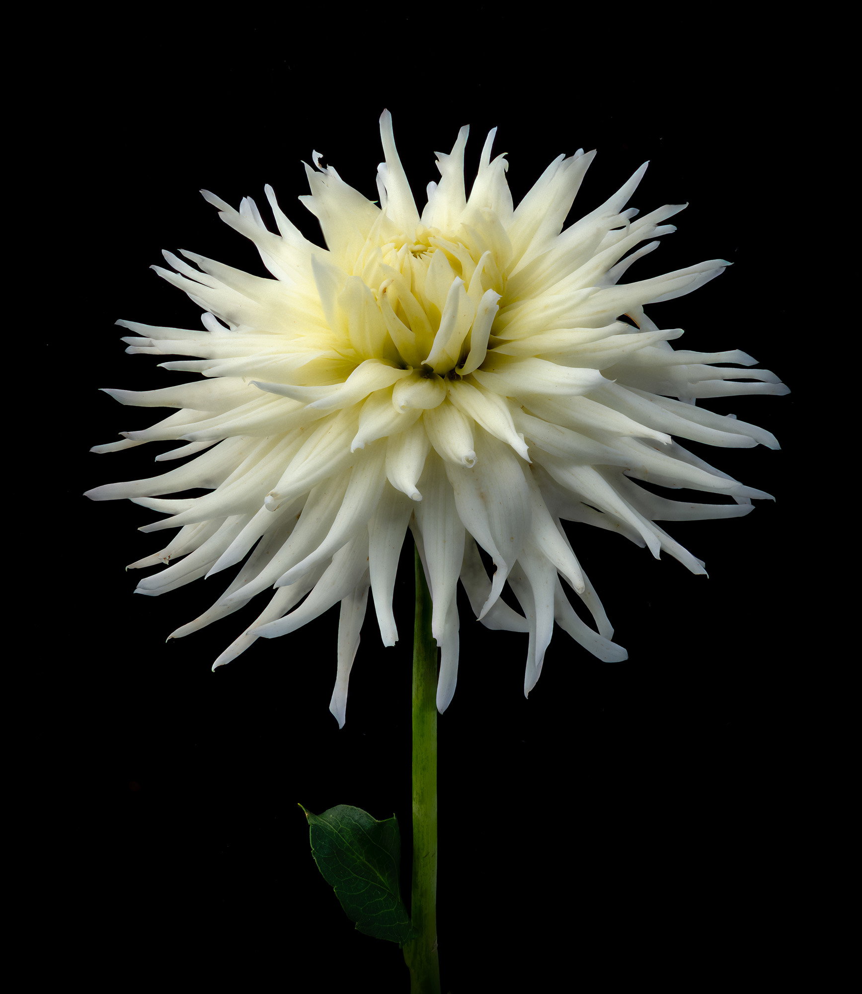
This dahlia is named Hy Debut and is a very large, Spectacular cactus dahlia.One problem that I always experience with image stacking is that I never get enough images for a completely sharp subject. First run through, 95% coverage so I reshot the series. Technically, this is a studio shot where the BG is a piece of black velvet that is attached to a foldable small light tent. I arrange everything so that I get directional, diffused natural light. White flowers show insect damage and dirt specks, so I cleaned up the most obvious ones.
Feedback Requested
This is a pretty formal flower photograph and how do you like the lighting. For wildflowers like the Silphium in my prairie, a dark, green natural BG might produce a better image. What do you think?
Processing software: Lightroom Classic, Photoshop 2025, Zerene Stacker
Major adjustments: Levels, add to canvas and rotated image for vertical stem, crop for comp. Post cropping vignette used to darken stem at base
Blending/stacking: PMax 150 images
Other notes: I used the banded tool to touch up most of the blemishes in the petals
Jim: With 150 images in the stack the increment between each shot must be incredibly small even for a relatively large flower. At this size I can’t detect any imperfections and the uniform lighting brings out the best in the bloom. One small detail that I like a lot is that the leaf on the lower stem isn’t rendered as bright as the flower or the stem.
As for preferring the studio vs the natural BG, each has its allure. I love shooting in the wild with all the inconsistencies and variables one has to contend with. I suspect the challenge in studio work is the setup and light adjustments but at least you are in a controlled environment with complete control over most variables. As a formal portrait this is a superbly crafted image. >=))>
Jim, this portrait of the dahlia is striking, and I think the processing is super. It’s art. If you wanted it sharper, could you run it through Topaz, but I think it’s fine.
Hi Jim,
This is striking as a flower portrait. You must have done a very assiduous job or eliminating the imperfections, as this specimen appears to lack little bites and dust particles. It still feels very real though, so that’s wonderful.
As for sharpness, one reason I stopped doing flower photography about 8-10 years ago is that I felt like I was chasing a sharpness standard I could never reach. I would have been thrilled with this level of sharpness. I don’t see any fall off between stacked frames, and I think the curves of the flower petals feel very natural.
I think you are ready for your cup plant and prairie dock. I’ll go now and look up what those are. Looking forward to seeing those too.
ML
This is gorgeous! The contrast between the dark background and beautiful light dahlia is striking. For the background, doesn’t it depend on the purpose of the photograph? If formal is needed, this is perfection. Having a blurred, textured green would be a different feel. Both awesome as the flower is the star here! I’m with ML…cup plant and prairie dock??
Thank you @Bill_Fach , @holly1 , @Marylynne_Diggs , and @joyce for your comments and critiques. @holly1 and @Marylynne_Diggs cup plants and prairie dock are classified in the genus Silphium and are related to sunflowers, asters, daisy’s…etc. They are well designed for life on the prairie with tap roots that can extend down into the soil by 2 to 3 meters. All are fairly large plants with yellow daisy-like flowers…Jim