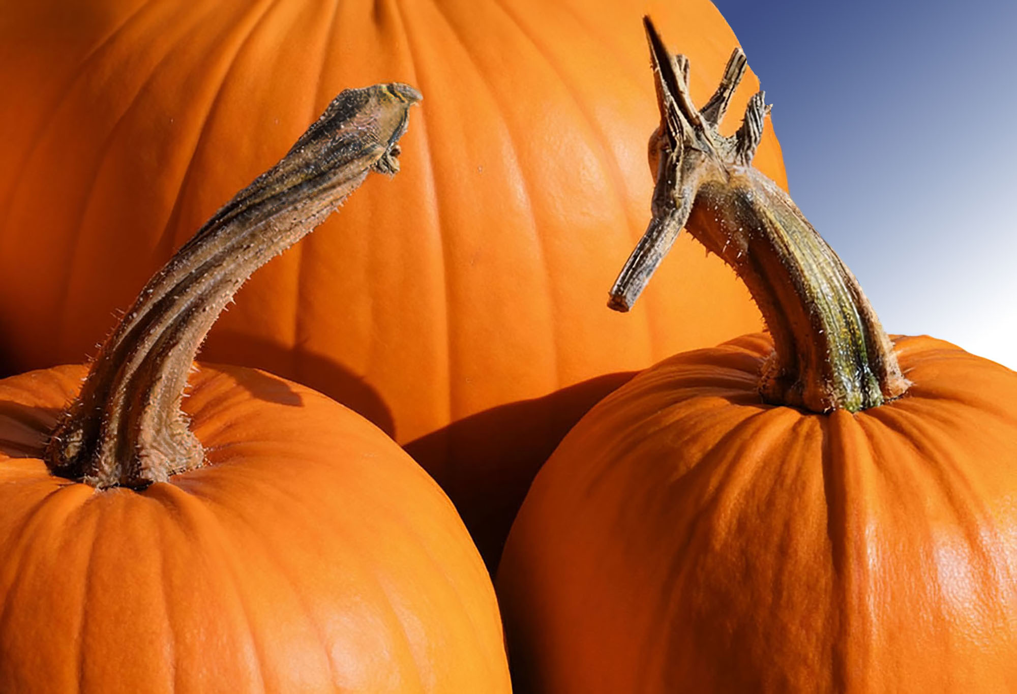
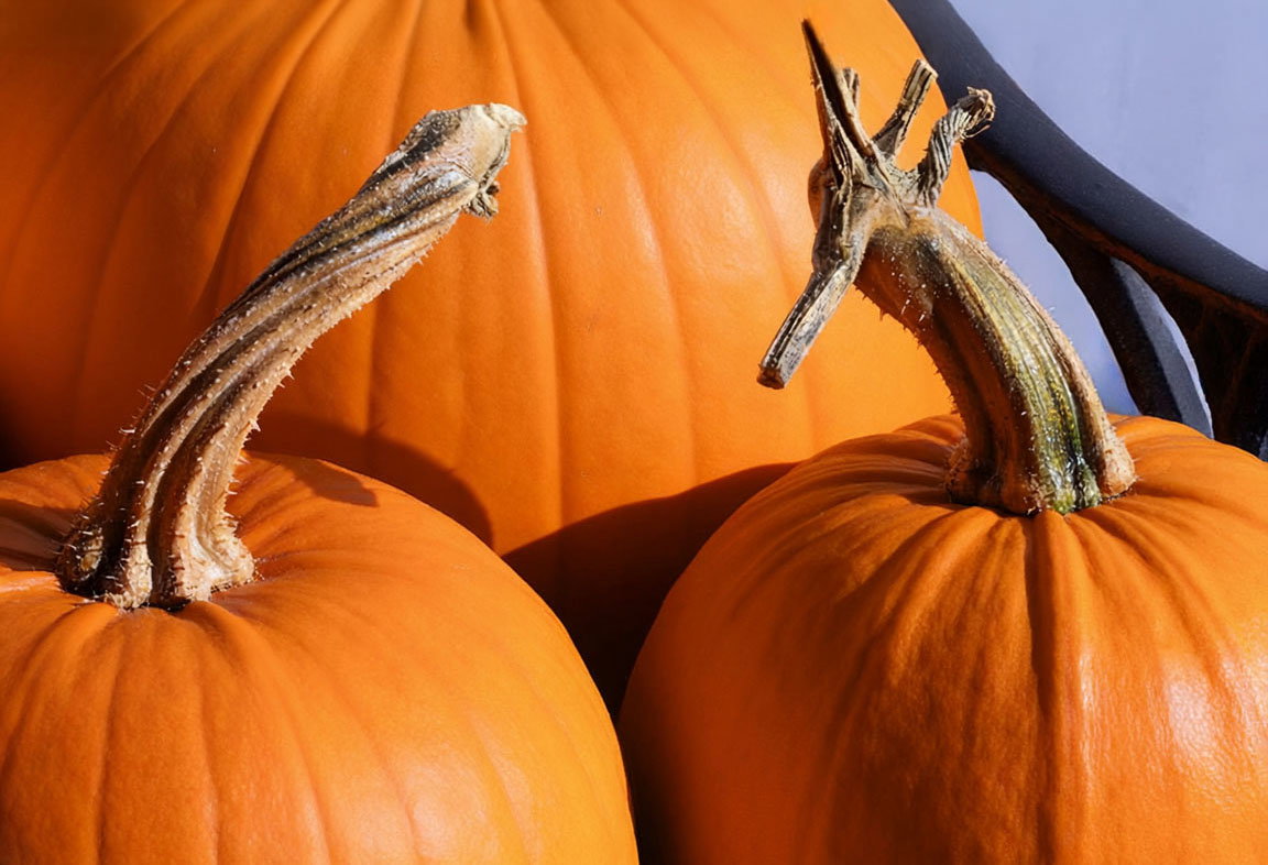
What changed: I did some work on the areas that were sort of a little overexposed . I threw in a blue layer towards the upper right-hand corner that I thought was perhaps less distracting.
Added after receiving feedback from the community.
A very cool still life, David. Nice stack with no anomalies that I’m seeing. The lower left pumpkin stem looks like it has some spots that are close to being blown out-you might look at bringing them down. I like the way the reflected light off the pumpkins made the stem slightly orange. A fun concept and very well executed.
Fantastic form and colour in this expertly executed stack.
The colour processing is wonderful too.
The only thing I can think of to improve the image would perhaps have been to have the whole frame filled with pumpkin. The sky blue and dark blue URC is fine as a contrasting colour yet I think the image would be more impactful still with just pumpkin.
I understand it may have been unavoidable or possibly intentional,
Great repost David. That little extra blue in the corner really makes the whole image pop. (I might have considered leaving the little tail of the pumpkin stalk protrude into the blue, though)