The photographer is looking for thoughtful feedback on the image as a whole, especially around the areas noted below.
Feedback Focus: Artistic + Technical
About This Image
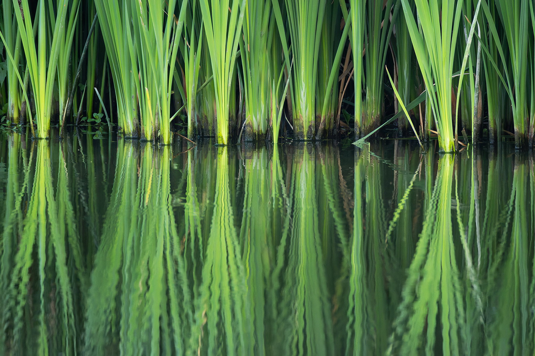
I was looking for birds at a boardwalk at the local state park. No birds. I noticed these reeds and thought they may make an interesting reflection and abstract.
Feedback Requested
I upped the contrast and saturation to give it a bit of pop? Too much? Not enough?
I also chose to show more of the reflection and have the reeds more in the upper part of the frame. I have other compositions but chose this one.
Any comments appreciated.
Technical Details
Camera: Canon EOS R7
Lens: RF200-800mm F6.3-9 IS USM
Focal length: 800mm
Shutter speed: 1/500s
Aperture: f/9
ISO: 6400
Allen: Frame filling fantastic. I like the comp with the horizon line uncentered. Apparently this is a bit of a receding shoreline as there is the illusion of it being tilted CW but when I checked the correspondence of the reeds with the reflection it’s actually slightly rotated .2° CCW which is trivial. The saturation looks good to me and while I’m no devotee of B&W I suspect that could work for you as well. Nicely seen and good use of your long lens to extract a very pleasing scene. >=))>
Interesting study in green, Allen. I do like the reflections and might go with a composition with even a bit less on top, but it’s hard to say without seeing it. The slight ripples in the water really add nicely to the feel of this image. Very well seen. The processing looks good to my eye.
Hi Allen, I love this reflection. The light green, almost yellow adds interest and texture, and the saturation works well for an abstract.
The receding left side doesn’t bother me but you might be able to correct it in LR Transform if you wanted. Dennis’s suggestion of less top is an interesting idea and might be fun to check out.
Well done!!
Alice
This is wonderful, Allen. I love the linearity and the interruption presented by the ripples in the water. To me, those ripples take this up a notch.
Nicely done!
ML
Love this! I’m with Bill on his description of filling the frame. What was amazing to me is that I did not notice the ripples at the bottom at first glance. The symmetry of the reflection, strong lines, light and luminosity really jump out.
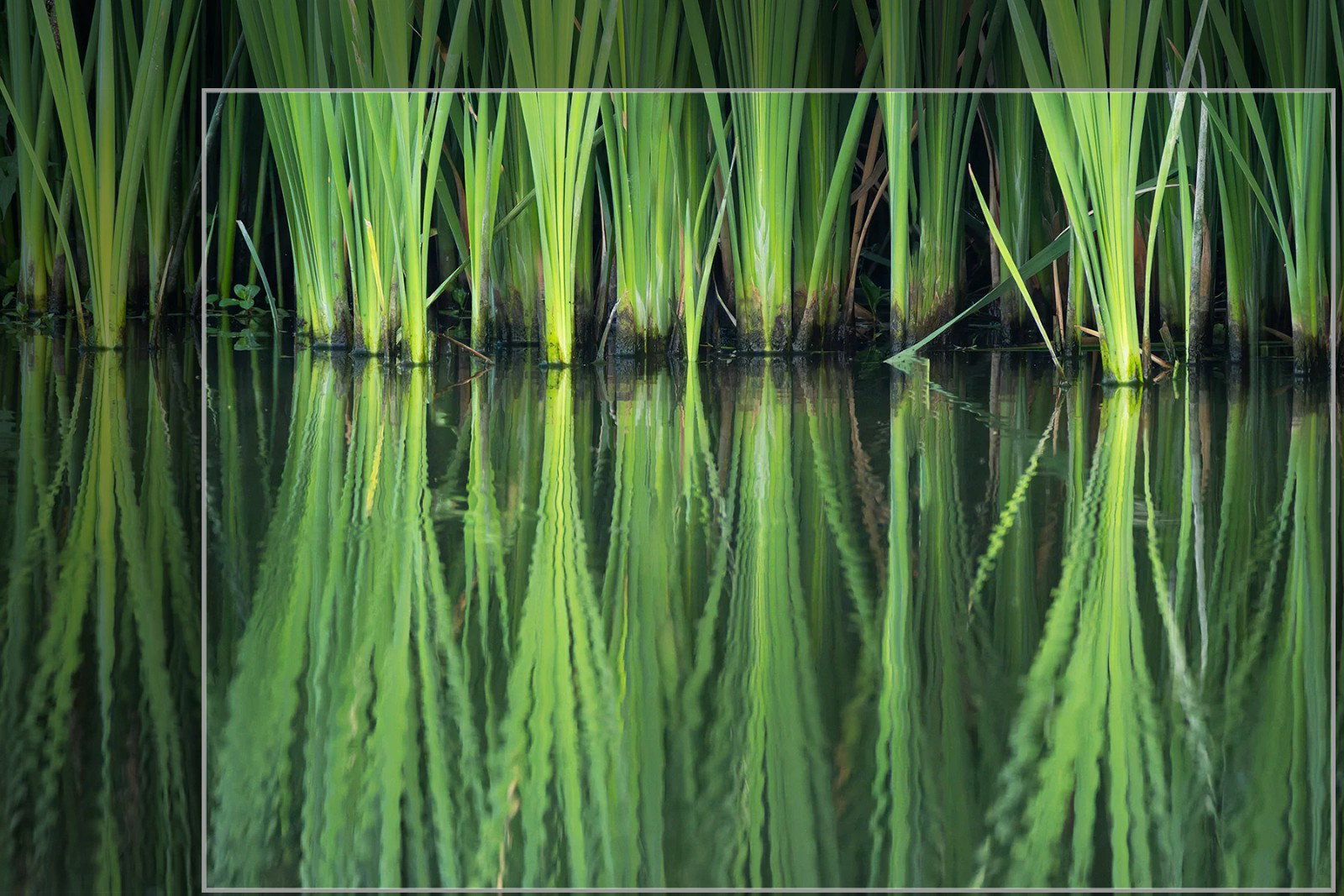
So speaking of the ripples, I might be inclined to emphaszie them even more by cropping from the top a bit more. I’m unsure about removing any from the left or right, but a tighter crop up top could be an option, if you’re inclined. Of course this is quite wonderful as captured and presented.
Color, sat and processing are all excellent, spot on.
Oooh this is striking. Sometimes in the kayak I’ve done similar things, but you have the advantage of a steady platform. The interruption of the angled pieces makes for a nice contrast and adds some interest and tension. I think Lon’s crop is a nice choice.
This is wonderful!! The ripples are just right and the colors gorgeous. I love the crop, with more weight given to the ripples, and for my taste you have a lot of flexibility. @Lon_Overacker 's crop works well, too. Excellent lemonade!