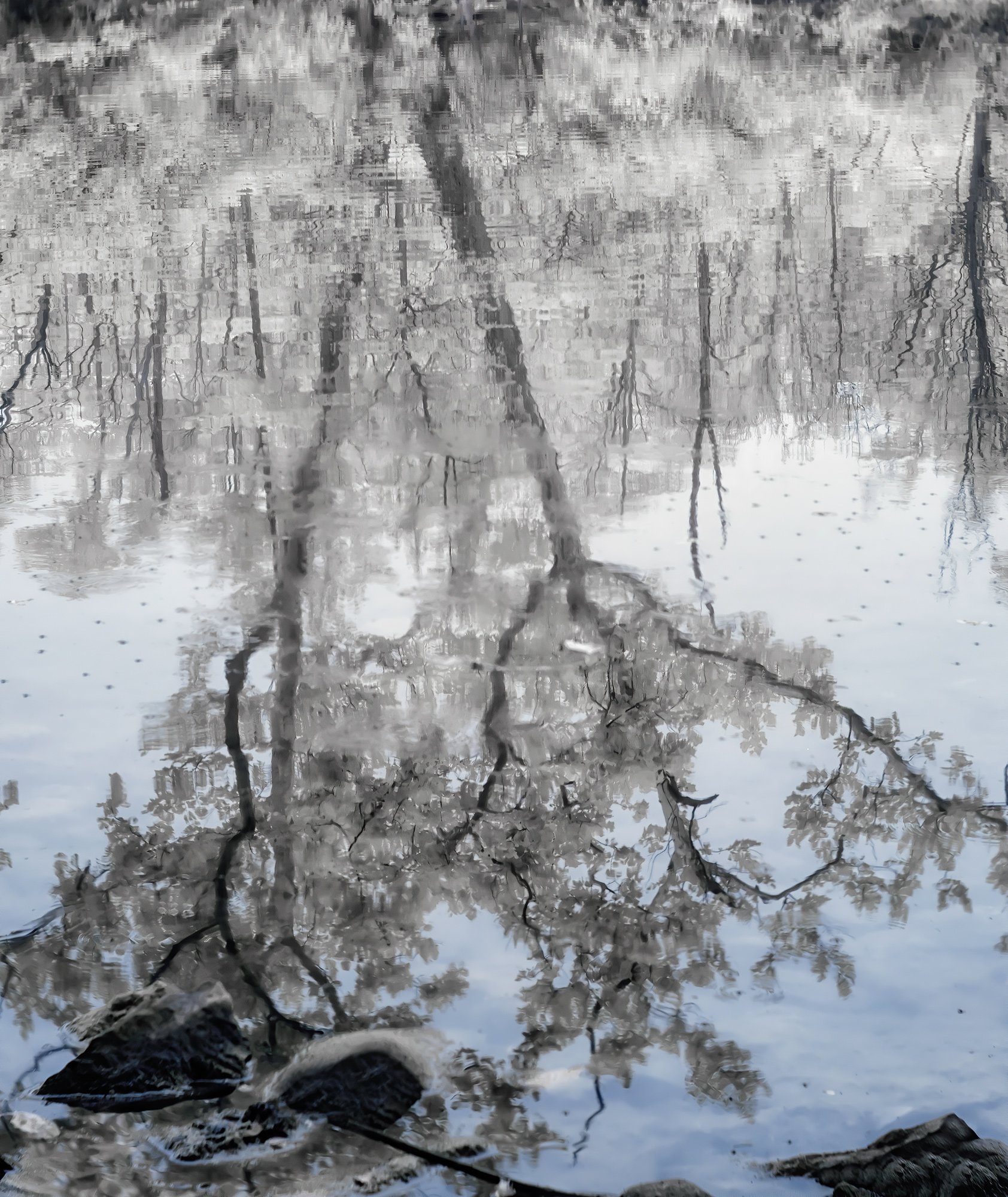
I took this image this morning. It was foggy and visibility was low for taking photos, but I took a few infrared photos, this being one. I wasnt sure if you accept infrared photos, as I haven’t seen many. I have uploaded one version of the reflection only in the river. Just wondering what your thoughts are .
Fuji XT1 converted to infrared. Fuji 18-135. Post in Raw File Converter and photoshop.
What technical feedback would you like if any?
What artistic feedback would you like if any? Any thoughts
Pertinent technical details or techniques:
(If this is a composite, etc. please be honest with your techniques to help others learn)
This is lovely and the IR gives it a surreal air. Works for me! I especially like the way the “sky” grades from pale blue to white through the frame. The rocks at the bottom, though, take us back to reality. If you want that bit of reality intruding, then the rocks are fine - if not, perhaps cropping to remove them. If you do prefer the rocks stay in, you might consider cloning out that one angled branch that comes in mid-way along the bottom, the stick that it crosses, and that rounded bit of rock to its right. Maybe even those bits coming in near the LLC. Basically, cleaning up the bottom of the stray bits that contrast with the three main rocks and the reflection.
@Bonnie_Lampley - thank you Bonnie! I agree that the rocks are just too dark and seem to interrupt the flow. . I like your suggestions to clone out the branches etc. I cropped it above the rocks, but I don’t like the cropped version, as I lose the blue. I will work on cloning the branches out.
I agree that the rocks bring reality. If you remove them you just have a tree thats been reoriented. A bank at the top would then help. I feel that there is not enough space below the rocks. They’re dark and crowded. There’s not much that can be done about the crowding but perhaps raising the darks could help. Actually, some separation of the trees from the rocks would be nice as well. The trees themselves are gorgeous and the infrared interpretation worked well.
I do enjoy seeing infrared images, so keep them coming . And you are right, we do not see many of them here at NPN, but that doesn’t mean that they aren’t appreciated.
I tried to form my thoughts on this image without reading the other’s comments, so as not to be overly influenced by them. My initial reaction was that this image was having a hard time deciding whether it wanted to be an abstract, or an image more grounded in reality (which of course is what @Bonnie_Lampley and @Igor_Doncov discussed in their comments about the rocks and such).
While this may not be your personal vision for the image, what I find most appealing about this image is the abstract reflection of the trees in the center of the image. Had I been shooting at this location, I might have considered trying a composition more like this rework…
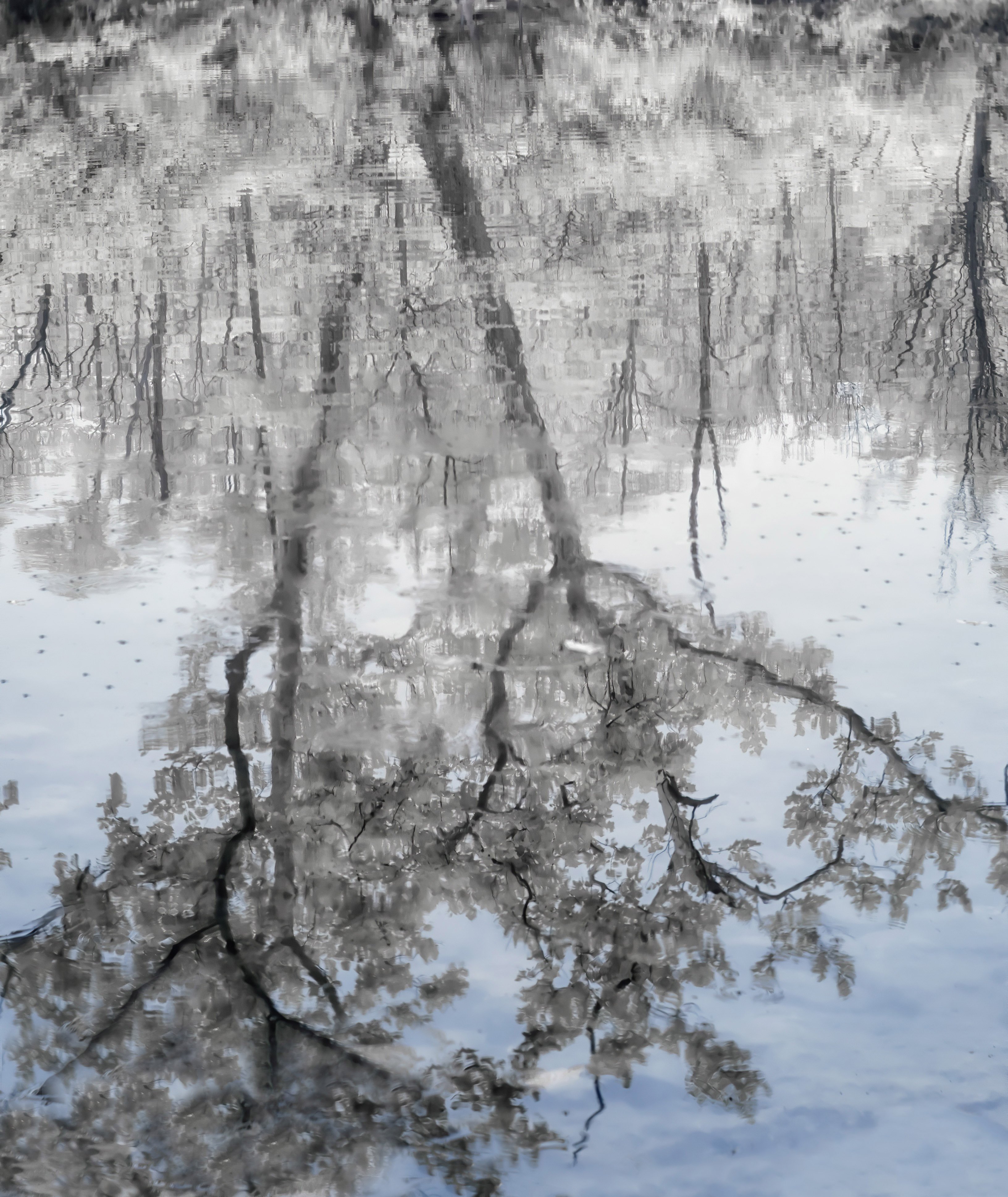
@Ed_McGuirk Thank you so much for your thoughts and rework! I don’t know how you find the time to do all that you do here, but it is appreciated. I’m not sure how to get the water blue where you changed it, but I did re-work the image in two ways. I tried the crop that you did, and I wasnt crazy about it because the blue water was missing. So I played with it again today and cloned out the rocks. Here is my rework. I’d love to know if you like your crop or my rework better. No hurt feelings either way. I’m trying to decide which one to post on my website, social media and on Fine Art America - although I could do both. Thanks again!
@Igor_Doncov thank you for your comments. I have re-worked the photo and have taken out the rocks. I could go back and re-take the photo from another angle, but I like this one for now. I do have the bank above the reflection, which I cropped out because it was cluttered and didn’t add to the image. Re-work below.
I think this is a very intriguing image. I love the slight hint of a bank in the original version, and only wish there was more room at the bottom below the rocks. The might be lightened a bit, and maybe a subtle gradient burn at the top to balance them a little. The diagonal stick could be removed. I’m curious how you got the blue – do you have a filter that lets in some visible light and used the Channel Mixer technique to give a false color image? At any rate, it is gorgeous!
@Diane_Miller@Igor_Doncov@Ed_McGuirk Thank you for your feedback on my photo. I took out the rocks at the bottom as well as the sticks. @Diane_Miller The blue was a result of the processing in photoshop using Lifepixels actions for infrared. Thank you so much for your kind comments! Glad you like it.
I thought so – those actions are the Channel Swap method, which allows some filters, most strongly the SuperColor filter, and now the newer Hypercolor filter, to be processed to give false colors. I like the subtlety of the color work here, with everything B/W except the reflected sky.