Please share your first response before reading the hidden notes below. The photographer is looking for an unbiased initial impression.
Feedback Focus: Artistic + Technical
Questions for Viewers
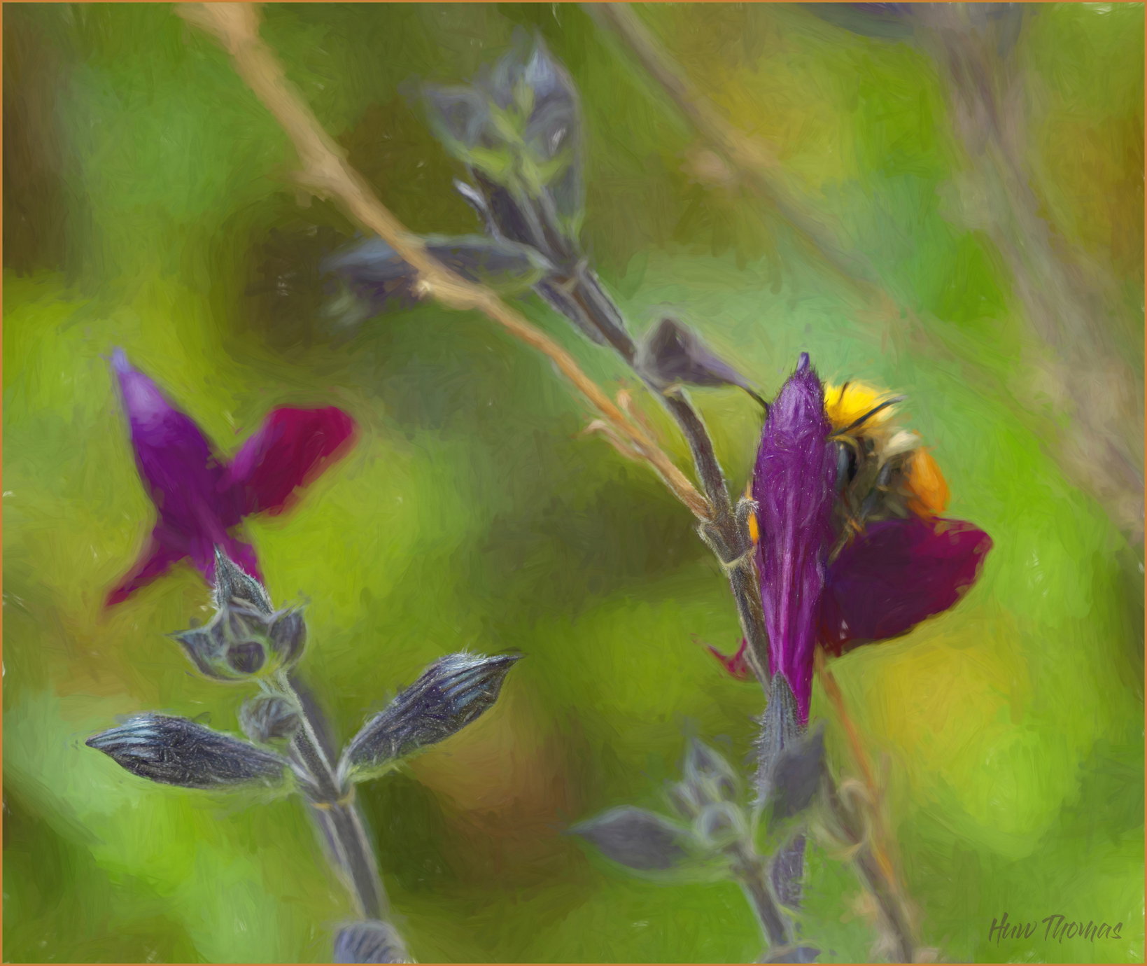
Bee on Salvia
Jumping way out on a limb with this one - all about Late Summer colours
Just a bit of fun
About This Image
Loved the colours
Split Complementary scheme Purple vs yellow+Green
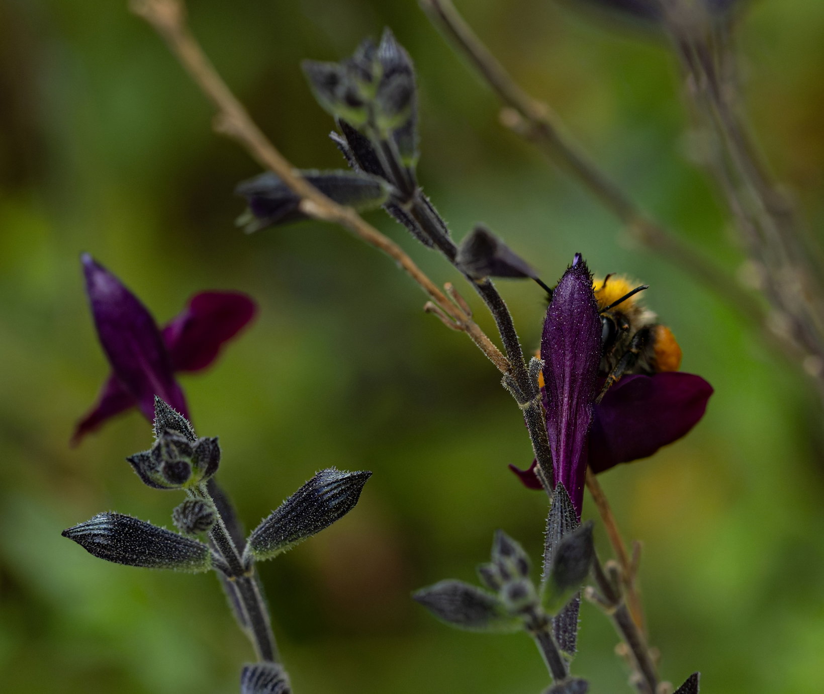
So - started with a basic image - bumblebee on purple salvia
Followed it round garden til it landed where I liked the composition - yellow and purple.
Image was very noisy - almost pointillist - Inspired by the the noise - took the image in a painting impressionist journey
Blur in places, 3 images blended - one original , one a bit Orton like, one with impressionist brushstroke in Topaz studio 2 (Cezanne I think)
just Do you like it?
Is it interesting?
Left the dead stem in - as painters love it for structure and how it echos the one on the right.
Ignored the rule of 3’s (only two flowers)
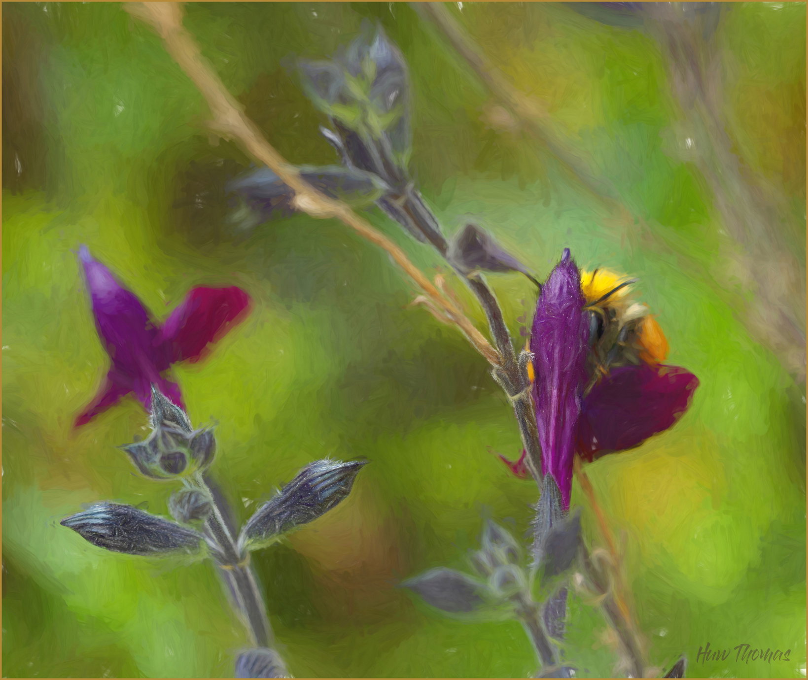
Huw, this is nicely colorful and artistic, since the bee plays such a small role, I’d title it something else. Having various parts angle across the frame adds a good touch of movement. I do think that cloning out the random white spots would be a good improvement.
The random flecks of white are where the paint is supposedly thin in the "Cezanne emulation " put in by Topaz 2 - they can certainly go.
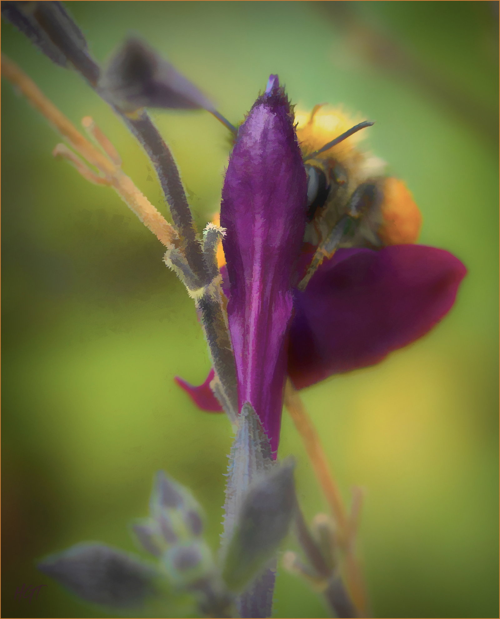
The bee is massively important in the colour scheme - but I’ll play with names - I quite like limiting the crop to just that flower and bee - may have a go to see how it looks
Hi Huw,
At first I didn’t see the bee but when I zoomed in I got it. I get what you were going for with the painterly look and I think you achieved that . I wonder what it would look if you got rid of the background stems and focused/blured the two salvia? The other option which is less creative is to do a close crop on the single salvia with bee.
Alice
Wonderful!! I love the close crop and think you have a lot of possibilities going back to the original capture with just a slightly less close crop and trying other artistic effects, maybe more subtle. It’s a lovely composition of the bee and the flower and the colors are so nice!
I like the original post a bit more than the tighter crop, Huw. It has a very impressionist look and the saturated colors fit that feel. Very nicely conceived and executed.
I think I prefer the original too. It’s creative, artisitic and as Mark eludes, has an Impressionistic look to it. For, I’s say the scene was photographed through frosted bathroom glass; it’s got that look. AND, the colors abound and are wonderful in the original.
For me, the intimate crop, you’ve lost that artistic look, although the softness of the bg works beautifully in this version. Colors are still important and the bee, well, my first impression was that a good title might be “Peek-a-boo”!
With the original, I think it might be worth doing a little cleanup by cloning out the little leaf triangle along the bottom right edge and yeah, the white Topaz specs. Not a huge factor, but personal preference.
Great work, wonderful colors and very artsy. I think a case here of closer, more intimate, not necessarily a better image.
But that’s just me.