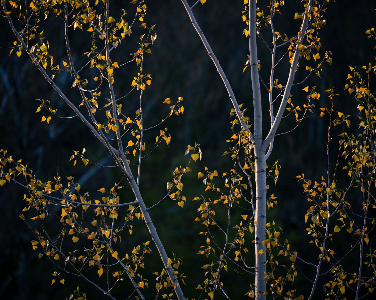
Hey! I just got a new 100-400mm lens after renting it for my trip to Florida. I really enjoyed it and am now trying to look at things a bit differently around home. I went out this weekend to a local park with the intention of shooting the light as the sun rose over a ridge. Sadly, I forgot the necessary attachment to be able to lock my lens onto my tripod so this was all shot hand held. Luckily I can easily go back, and hope to as the trees get just a few more leaves over the next week or two, I think there are just too many branches and not enough leaves in most of these shots.
Specific Feedback Requested
What I am looking for is essentially am I on the right track. I tried to isolated specific things that were catching my eye…mostly the light but then trying to utilize other structures around that. Interested in your thoughts on if this seems to be headed in the right direction.
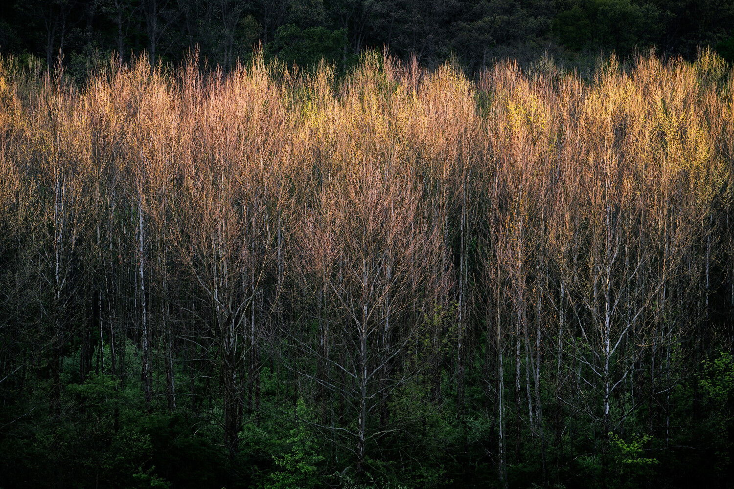
I think you did and backlit trees or leaves are a favorite of mine as well. The little leaves in the first shot are so delicate…that’s about the stage they’re at here. I’d see about removing some of the bright trunks in the background and maybe warming up the white balance a tiny bit.
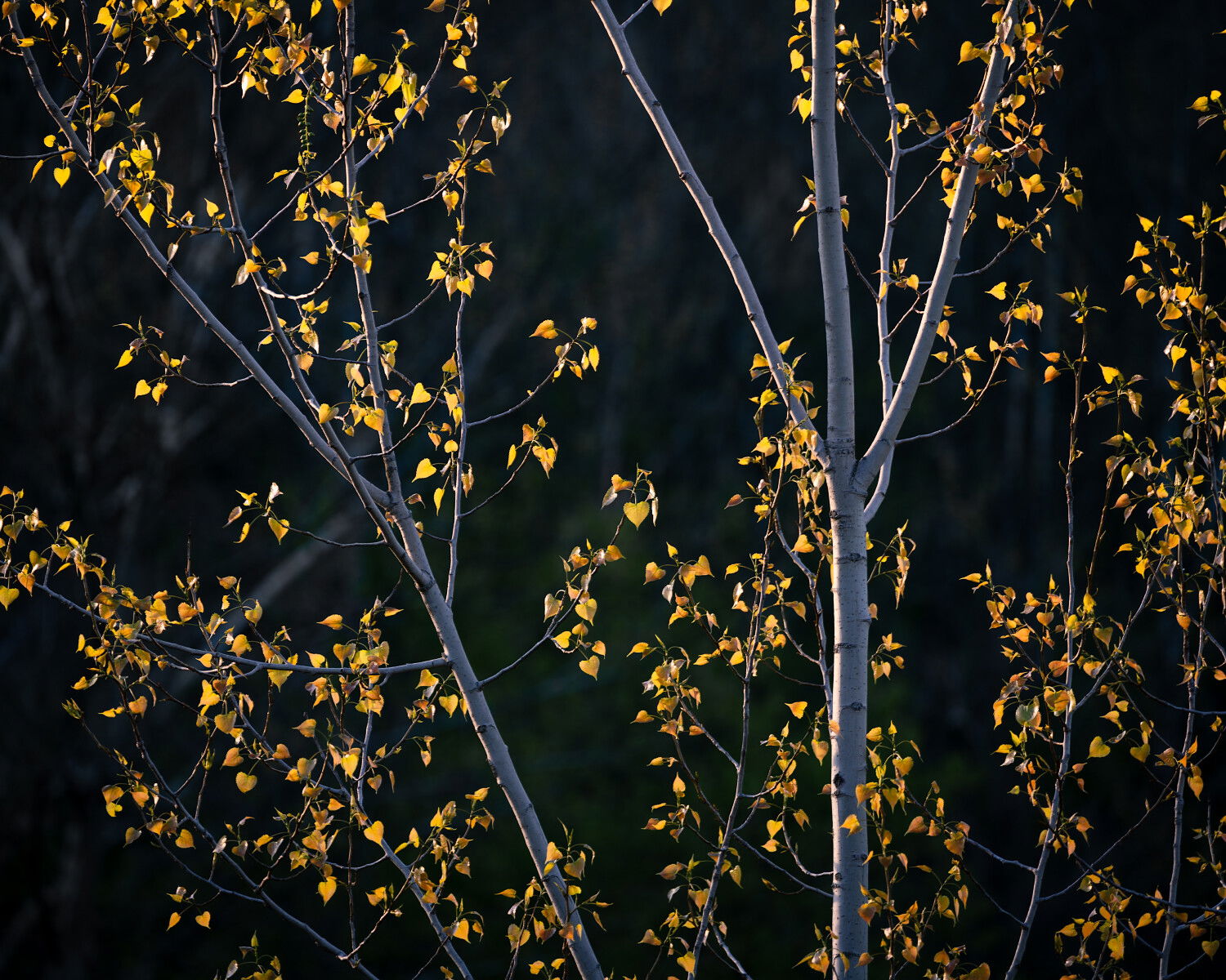
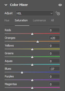
The light brushing the tree tops in the 2nd & 3rd images is also eye-catching. I’d either remove or burn in the most prominent bush at the bottom of the 1st one. The uneven light in the bg above the trees isn’t so bad. It looks a bit cool to me as well, but YMMV. The horizontal one…I might play with the color channels to see if you can get greater separation w/the red, yellow and orange shades. There’s a lot there and they’re sort of smudged.
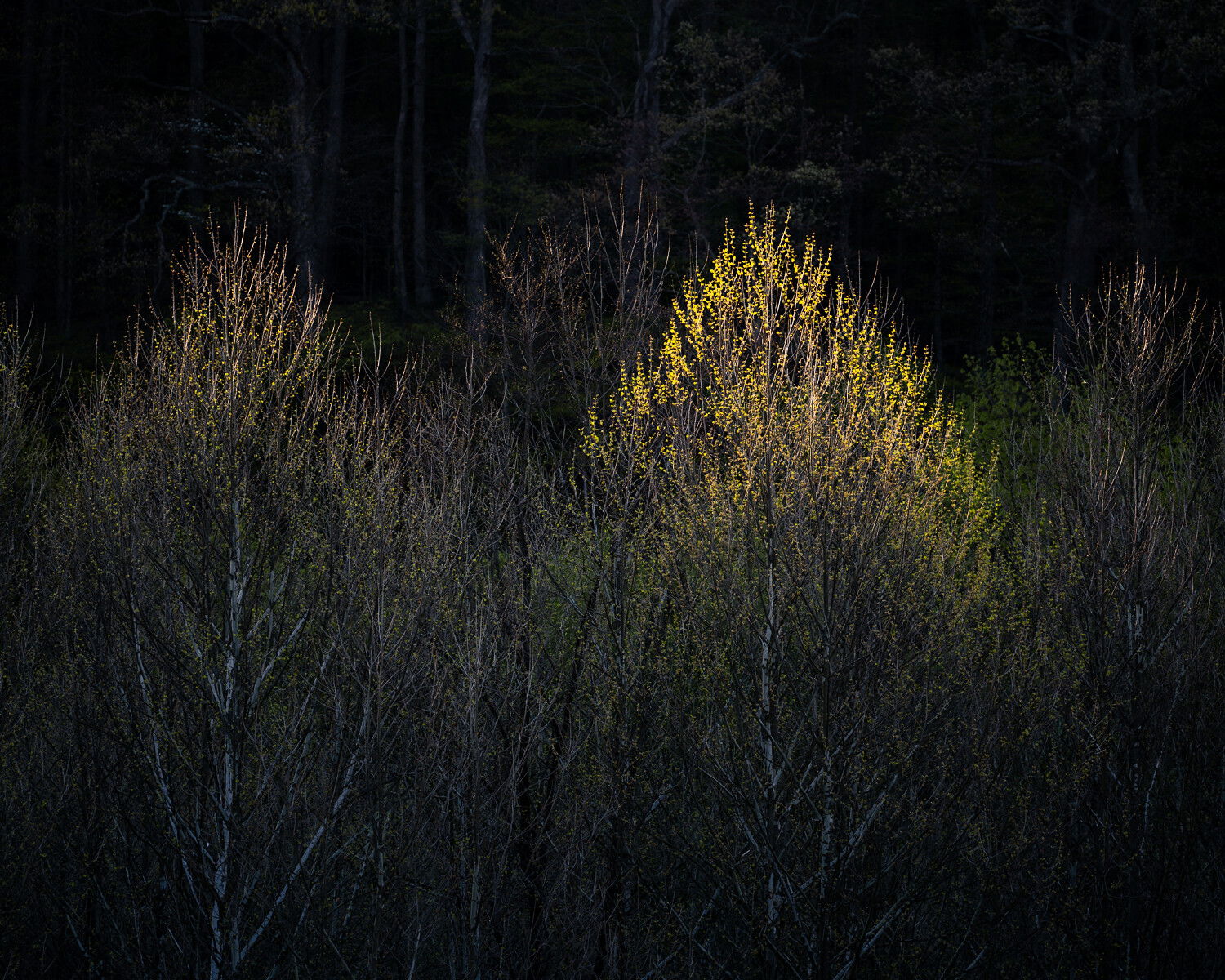
The last one is just lovely. Speaks to the fragility of spring so well.
Terrific series. Seems like I gotta lug my 100-400 outside to play!
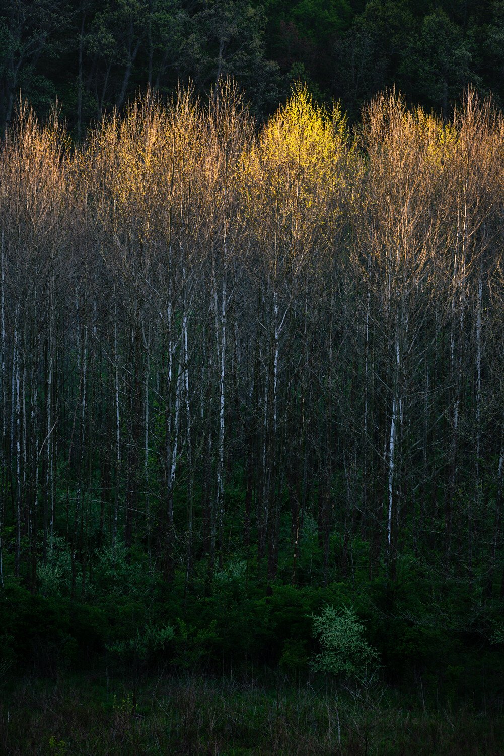
The 3 “group” pictures are, for me, the best of the lot, and surely a way to go.
Favorite is the third one (of four)- I would dark the top trees a little.
Cool - you will have a lot of fun with that lens! This is a lovely series. I think you succeeded in emphasizing the light in the 1st, 3rd, and 4th photos. The 2nd one might work better (for me, anyway) if the shadows were raised a bit, especially in the bottom half.
I wouldn’t say there are too many branches. Yes, they are abundant, but at the scale you are showing, they make more of texture or pattern, rather than as discrete linear features. As a pattern, I think the branches are very effective in giving these some energy, with their upward pointing shapes.
I really pushed the warm/cool in these, maybe went a bit too far. I will play with it some more. I’m going to work to darken down the small bush in the second image for sure. I didn’t even catch that, glad I shared it here!
This has me really interested, it isn’t something I’ve ever done before with the intention of color separation…could you expand on this a bit, what exactly would I be trying to do, I assume with curves? Open to trying it, but I have no idea where to even start on this one…learning opportunity!
For sure, I’m going to work on that little bugger! I got the Sony 100-400. These are all shot hand held some there may be a bit of motion blur, but I’m kinda shocked at how well it did at ISO 100 and from 1/50 to 1/100 hand held.
Thanks @Ola_Jovall I was a bit hesitant at first, but it seems like they came together well. I go back and forth on the “sticks.” In my eye before I got there, I envisioned a bit more “glow” from the leaves, that may be why the sticks didn’t quite line up with my vision, but they have some positive qualities as well.
Thanks @joaoquintela, I kind of like them presented as a group…Each has something a little different that I like, but I can see why #3 is your favorite!
I can see that for sure, @Bonnie_Lampley, I may try to get it to match more closely with the 3rd image as they were shot at nearly the same time.
At first I was drawn to the “light” but when I got back to look at them on the computer, the “peaks and valleys” were almost equally interesting to me!
Thanks for looking everyone, some more work to do!
Thanks @Michael_Lowe, one of the things I’m enjoying about posting here is the different perspectives. It gives it a first signs of spring vibe for sure.
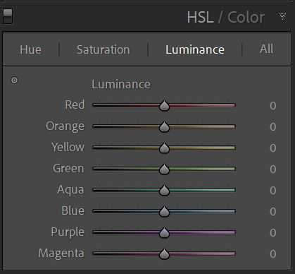
The HSL Panel in Lightroom is a cool thing to mess with for subtle shifts in color -
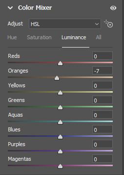
For your picture, I used Camera Raw where it’s called Color Mixer. Here are the settings and then the picture. It’s not a big change, but I think the colors are more distinct.
I think it’s pretty self-explanatory what the variables are (hue, saturation & luminance). You can slide the individual labeled controls or use Targeted adjustment button (small circle on the left in Lr and on the right in CR) to sample an exact area of your photo and the app will change the color selection accordingly.
That’s it. I use it fairly frequently in color shots, but also in B&W to dial up or down the intensity of a particular color value in the shot. I did it in that b&w I recently posted in Landscape Critique.
@Kris_Smith Thank you for sharing that, very helpful. I usually have used that with a thought of accentuating or downplaying a color. Not creating separation between colors. Thanks for that!
And who said forests in Ohio were very difficult for woodland photography?
Add a new telephoto lens and some backlight and you are good to go…
This is a really fine set of woodland images. The telephoto has allowed you to simplify the scene, and isolate the gorgeous backlight on the trees. While they are all good, the last two images are killer in my opinion. However I do like the processing tweaks done by @Kris_Smith to the third image. With spring (or autumn) foliage, I frequently find the Hue shifts of yellow to more green, and orange to more red (like Kris did), creates color separation that produces a pleasing result with warm colored foliage. It’s a move that I make a lot.
I think the first image could benefit from more luminosity in the yellow leaves, to enhance the backlit look. But the light in the last two images is exquisite, you made perfect use of shadows to showcase the warm light on the trees. I think the horizontal in image #3 is stronger than the vertical in image #2 because the horizontal shows that warm light in all its glory. Really beautiful images, keep up the good work David.
Image #1, increase yellow luminosity using TK Yellow color mask to select leaves
I appreciate that! I am going to work on #3 a bit more carefully as I feel it deserves the attention to try to get it “right” I may post another version when I get it. I like the idea with #4 and will probably do something similar. A bit more “glow” would better align with what I witnessed also.