The photographer is looking for thoughtful feedback on the image as a whole, especially around the areas noted below.
Feedback Focus: Artistic + Technical
About This Image
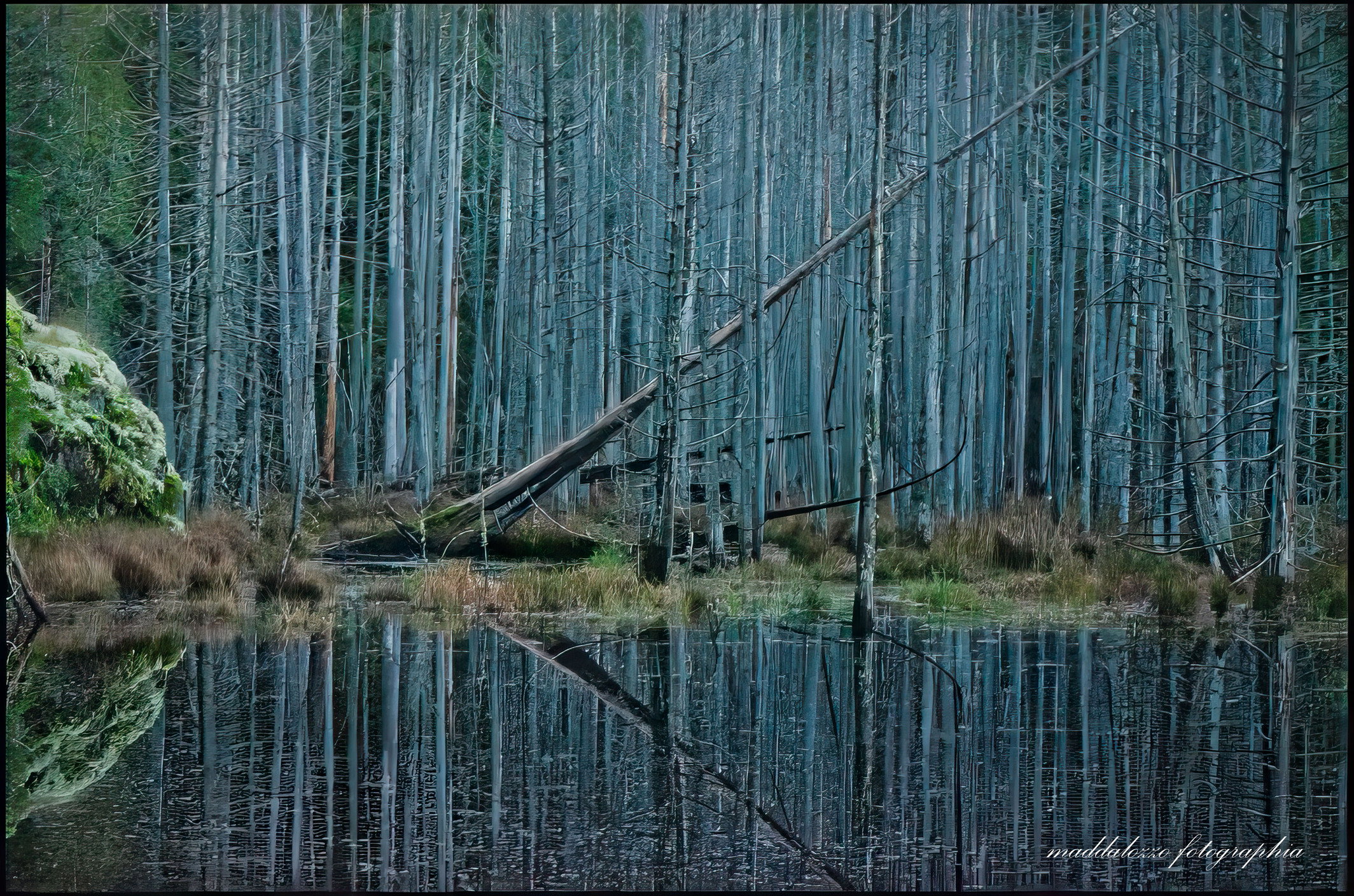
Smuggler’s Cove is a provincial marine park in my backyard. I typically hike/kayak to this destination weekly. It was previously a smuggling site for Canadian rum to the American markets. At the start of the trail, you cross a series of boardwalks that overlook the bog created by the resident beavers. (saw two last night!) I’ve always been intrigued by this scene; at the tenacity and endurance of this dead tree angled at 45 degrees. It has persisted since I’ve moved here in 2015.
Feedback Requested
This photo is from my archives in 2021. I took the image just before blue hour. Any advise is welcome.
Be on the lookout for those smugglers. They may have a windfall with all today’s tariffs. Really nice image about lines and geometry. The triangle created by the angled tree and the reflection on repetition of lines are wonderful . The blue is intriguing and most effective. I suggest you may want to reduce the opacity of your signature, so it’s not so prominent. Also, my eye suggests that the bright yellowish white at left could be toned down some. I’d love to have your back yard as a photography playground.
Laura, I absolutely love 85% of this image. The blue color is to die for and mixed with all the vertical trunks makes for a delightful image. Some might say the blue in the trees is unnatural, but who cares, it’s lovely. I think I would crop a little off the left to get rid of the “out of place” imho green trees.
This is a wonderful image Laura, as it fits this week’s challenge topic very well. I do feel that the large bush and tree on the left edge are distracting, so my thought was to crop that out, leaving just the pattern of trees broken up by the lone dead tilted tree. I think this would end up being a more impactful image.
Laura, the collection of dead trees with their blue tones is very striking. I agree with the crop suggested by @Michael_Lowe as that removes the greens on the left, leaving the angled tree as the major difference.
Good on spotting this Laura. Its a beautiful image that 100’s of photographers have just walked right past! LOL. I do agree with the crop. That bush is just incongruous with the rest of the shot. If you decide to do that, I would suggest trying to lightly darken that side a bit to frame in the center piece of the shot. And perhaps do the same to the left side, which already has a natural frame in that straight tree. Just enough to keep the attention of the viewer on the center.
Something else that you might want to try if you have not already done so is using the high pass filter. Your shot is sharp enough, but I find that high pass filter tends to make things seem a bit 3D. I might be wrong, but you could try. Its a stellar shot without it, but thought it might work here.
Hi Steve,
I don’t know what a high pass filter is or what it does. Can you please elaborate as I would like to learn how this could be applied. Cheers,
I’m pretty sure anyone would be jealous to have this scene near their backyard! I know I am!
That stand of bare trunks is a gold mine of opportunities and the fallen diagonal really makes this an engaging scene. The backstory to this location is fascinating as well!
I’m with the others on the crop. At least for me, the issue on the left isn’t necessarily the presence, but how much. In other words, this follows my personal axiom, “If you’re going to include something, make it on purpose.” In other words, if the greenery was important to your composition and story, then I would expect to see more. As presented, there’s just not enough to tell the view it was important to you. PLUS, most are focused on the dynamics of the bare trees and reflection. The crop just showcasing the trees is the story; however the story becomes about the trees (and the patterns, etc.) and NOT about the context of the location; ie. this could be anywhere. Anyway, just food for thought.
Lots of options after a crop; B&W speaks loud, but so does the blue hour tones. The graphics are strong and that diagonal really holds the whole thing together. How about ICM? Great potential there with some vertical movement - if you’re in to that type of photography.
I can see why you return to this scene over and over - and if I were you, I’d continue! I bet the mood, light, etc. changes over the seasons too. Can’t wait to see what you might come away with next time.
I can’t add anything to all the feedback you got from the landscape gurus already, Laura, but the blue tones of the trees and the scene are wonderful. I do agree about the crop as well.
Ok Laura, I think you will like this effect, when needed or wanted (can I get arrested for copying AI? LOL). This is for Photoshop.
Step 1: Prepare Your Layer
Select your target image layer in the Layers Panel.
Right-click the layer and choose Convert to Smart Object.
Why? This allows you to go back and adjust your sharpening slider or change the blend mode at any time without damaging the original image.
Step 2: Apply the High Pass Filter
Go to the top menu and select Filter > Other > High Pass…
Your image will turn completely gray, showing only faint outlines.
Adjust the Radius slider at the bottom:
For portraits/skin: Keep it low (1.0 to 2.5 pixels) to capture fine hairs, eyelashes, and pores.
For landscapes/architecture: Set it slightly higher (2.5 to 4.5 pixels) to emphasize structural lines and rocks.
Tip: Stop sliding when you just begin to see the details peaking through the gray. If you see actual colors, the radius is too high and will cause ugly glowing halos.
Click OK.
Step 3: Blend It into the Image
Look at the Layers Panel. Double-click the Filter Blending Options icon (the two tiny sliders icon next to the word “High Pass” under your Smart Object).
Change the Mode dropdown from Normal to one of these contrast blend modes:
Soft Light: For a subtle, natural-looking sharpness.
Overlay: For a standard, crisp result (most common).
Linear Light: For intense, high-impact sharpening (best for highly detailed textures like brick or fabric).
Click OK.
Step 4: Fine-Tune (Optional)
To lower the intensity: Lower the opacity of the High Pass smart filter effect.
To change the sharpness: Double-click the words “High Pass” to reopen the slider and readjust the radius.
To target specific areas: Click on the white Smart Filter mask thumbnail on your layer, grab a black brush, and paint over areas you don’t want sharp (like smooth skin backgrounds or out-of-focus bokeh).
Laura: Perhaps I’m just in a contrary mood but I like the original crop much better. There is enough there to add interest, almost like the toppled snag is growing out of it, and the reflection of the green in the pond works for me as well. My eye does start there but because it’s on the left edge my gaze naturally moves right through the frame. For me the stuff on the left is a foundation and not a distraction. All that said, I think this is a marvelous scene and would want °to return at different parts of the year. My only really serious nit is that the tree is angled at 37°, not 45° . Terrific shot! >=))>
That’s a wonderful photographic subject, and I love that angled tree mixed in with the straight ones. I can see why you have been intrigued. Here’s another vote for @Michael_Lowe’s version!
This is amazing! If this was in my backyard I would be there every couple of days photographing this location in all kinds of different light. I love the cool blue tones along with the vertical lines of the tree trunks in the horizontal format. I also quite like the visual tension with the diagonal of the leaning tree. The green on the left side of the frame does catch my eye somewhat so I too think the crop by my brother @Michael_Lowe makes an already fine image even better IMO. Beautifully done. BTW, congrats on the Editor’s Pick as it is well deserved.
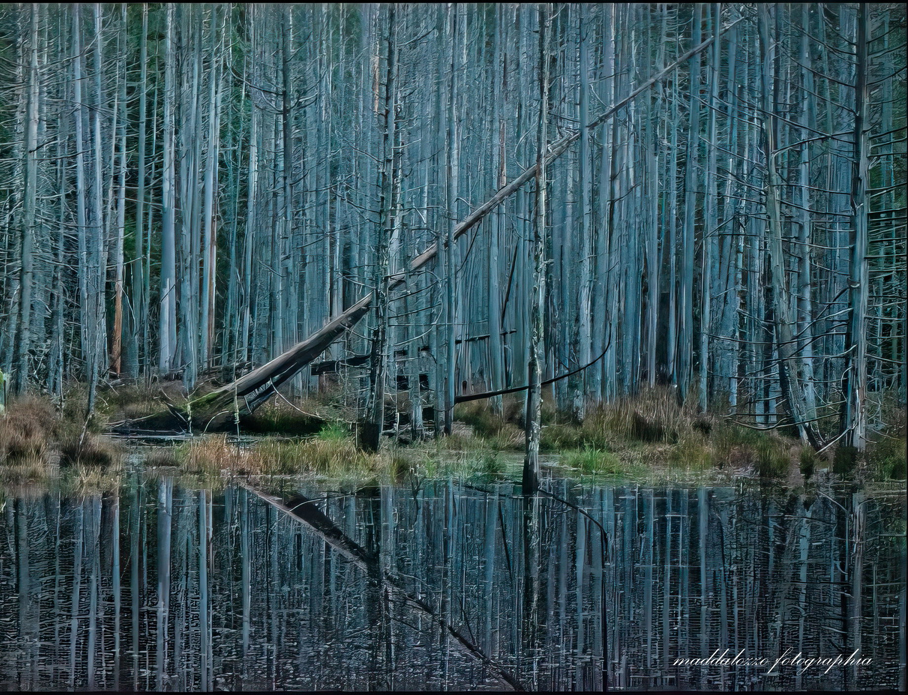
 I like the crop you’ve proposed.
 . Terrific shot! >=))>