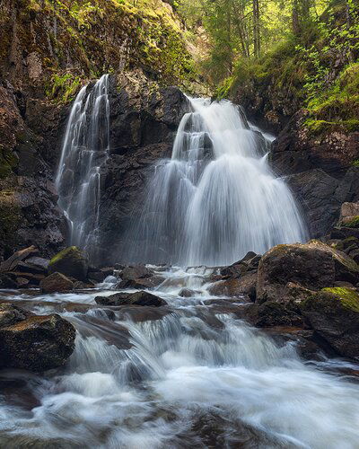
Hi! Here is an image of a local waterfall with some spring greens surrounding it that I visited last week. After removing a large fallen and stuck branch that was crossing the whole foreground I took several images with different exposure times and settings. I ended up using the f/6.3 and ISO 400 ones as the foreground and midground needed the extra light on the sensor. I lacked a bit of sharpness in the immediate foreground but did not find that disturbing here. I have other exposures that seem a touch sharper there and I could blend one in there, but I didn’t feel the need and wonder what others think.
Any comments are appreciated. Does it have that ‘spring freshness feel’, even though there are not too many greens in the frame (ugly bright sky would be in the frame further upwards)? Do the colors look good and natural?
What technical feedback would you like if any?
Any
What artistic feedback would you like if any?
Any
Pertinent technical details or techniques:
D810 with 14-24 f/2.8 with CPL.
Settings: f/6.3, 1/6 s, ISO 400, 22 mm. 2x focus for dof. Both raw double processed for details in shadows.
Edit:
Suggestions incorporated in a 4x5 crop below. Thanks!
Ron,
This is beautiful and yes, this certainly has that crispness and feel of a fresh, spring image. I like the clean whites of the falls and the color balance looks good to my throughout. Shutter speed excellent too.
The softness of the immediate foreground doesn’t bother me. For one thing, it’s moving water so not really expecting sharp detail there anyway. Having said, I was thinking of a slight crop off the bottom, which would result in cropping out the softest part along the bottom left edge. Compositionally, cropping a bit off the bottom elevates the view more towards the upper part of the image. But this is pretty minor.
Processing, colors, saturation all look great to me. The only minor suggestion I can think of would be to slightly burn down the ULC - more for a slight vignette than anything.
Enjoying this one.
Lon
Ron, this is a lovely look at this falls. The colors and processing look fine. The softness at the very bottom is disguised well by the motion. I agree with Lon about a modest crop off the bottom. To me, that crop enhances the sense of the motion.
I would suggest you keep all of the bottom of your image and here’s why:
It’s the best part of your image and, in fact, one could argue that it by itself is better than the bigger picture. It does, however, show one issue that’s easy to fix: the yellow moss on the distant rock in mid center. No matter what you decide I would remove that patch of moss. This is a wonderful image and certainly better than my first post many moons ago.
@Lon_Overacker @Mark_Seaver @Igor_Doncov Thanks for the feedback, interesting things to check! I played with a 5x7 and then 4x5 crop. Below is the 4x5. ULC burned a bit more; I played with the vignette before, but the upper part where the light was hitting turned out wrong. Now it’s only the lower part of the ULC, or something like that 
Igor, I liked how your crop showed that mossy spot, it didn’t catch my eye in the large version of the image. I removed it below, and I liked that!
I fixed/removed a few brighter spots on the left edge too.
1 Like


