The photographer is looking for generalized feedback about the aesthetic and technical qualities of their image.
Description
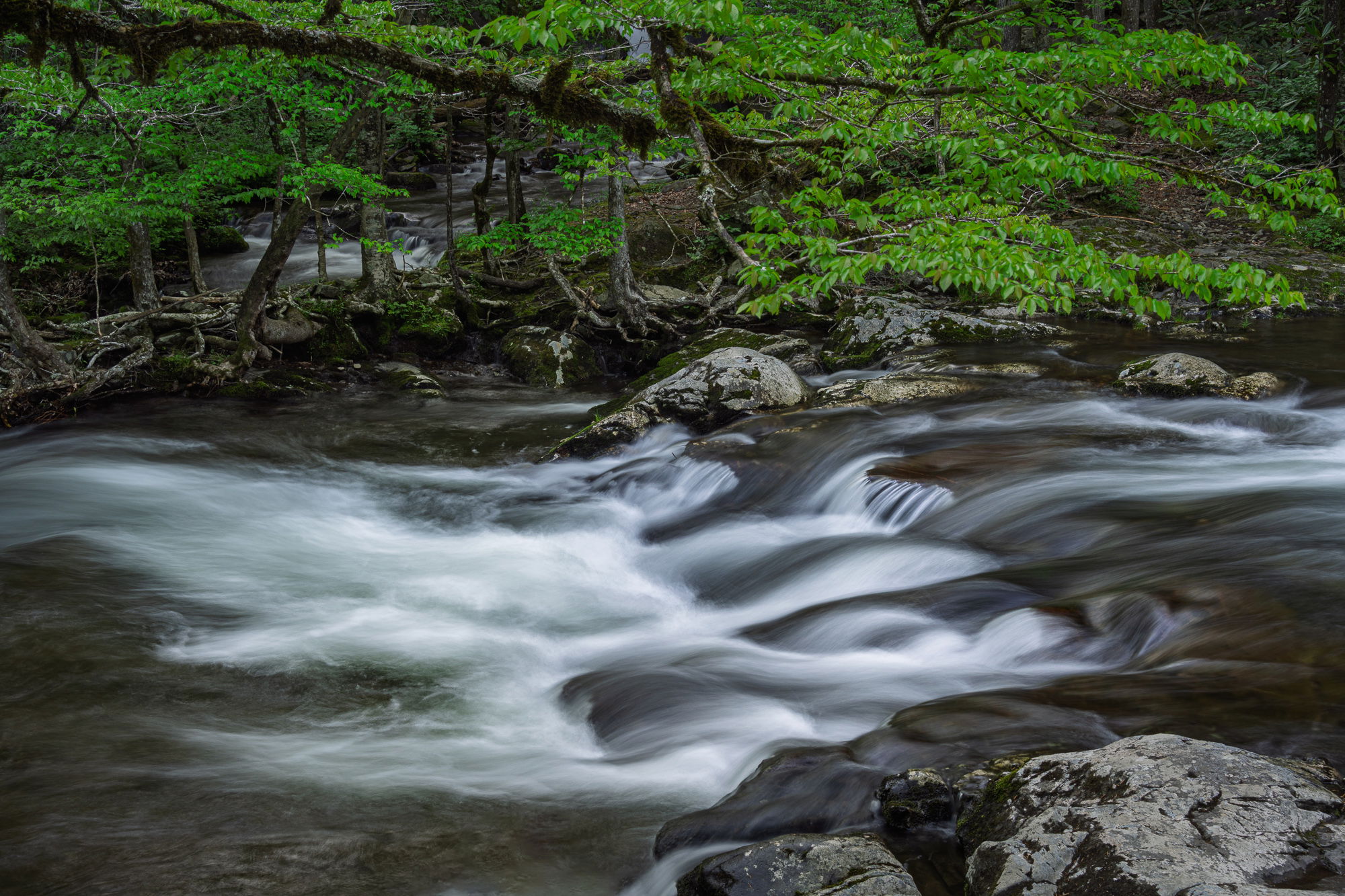
This is another picture from the Tremont area in Great Smoky Mountains National Park. In fact it is just a few feet up the stream from the image I posted a couple of weeks ago (Confluence), but the feeling is much different.
Specific Feedback
I was attracted to the smooth flow of the water and the deep early spring green of the trees. I tried a lot of different shutter speeds. I felt like this one captured the feeling of a smooth flow without completely washing out the texture.
Technical Details
Sony A7riv with a Tamron 50-400 lens at 55 mm. 1 second exposure at f/16. Both global and local adjustments in Lightroom. Mainly dodging and burning to control contrast
Critique Template
Use of the template is optional, but it can help spark ideas.
I really like this composition Will. i think you caught the flow of the water pretty right-on. The trees in the background flow nicely across the scene, paralleling the water. Good mood light with the lights and darks creating depth and contrast. The foreground rocks provide a good front anchor to the scene. One possible thing you could try to see if you like it better is to remove the upper left branch (better done in Photoshop). Might bring the background tree out more. Really nice job Will.
Very nice composition Will. I don’t have any specific critiques of the image. I really like this type of steam scenes. They are especially nice in the fall with the changing of colors of the foliage. Nice job.
Will, I like the contrast between the dark greens and the flowing water. You’ve got a good mix of movement and detail in the water. I think the rocks at the bottom do a good job of putting the scene into context.
A beautiful and serene landscape image. Great job on the processing as I’m really enjoying the greens and clean whites of the stream. Also, great job catching the shutter speed that allows both texture and flow without losing, washing out detail in the water.
I honestly didn’t notice the long branch along the top left. Fortunately it’s on the dark side and not immediately seen as a distraction. I do think however, if it were mine would be enough to keep me from printing (as presented.) The good news is that you have enough strong elements to come up with some sort of crop/clone to mitigate that log. Of course it depends on how willing you are to make such changes - not everyone is.
Hi Will,
This is another beautiful image from the Tremont area. As you already mentioned the greens are quite lovely and represent springtime in the Great Smoky Mountains perfectly. I am loving the textures and details in the flowing water as your chosen SS looks perfect for my tastes. I also think the converging stream in the BG works well as do the vertical lines of the trees along the stream. I could see using the remove tool to get rid of that dark limb coming in from the left, but that might not be your vision for this image. Very nicely done.
Thanks all. My intent with the branch at the top was to use it as a framing device. But its not quite as in focus as I thought when I took the shot, so I darkened it a bit. I could remove it, though it extends over a pretty large area.
I try not to change scenes too much for both aesthetic reasons and to stay true to what I saw. But as LR/Photoshop’s removal tools have gotten better, the aesthetic reasons have been less important.
Will, I have looked at this a few times and really like what you have here. I will echo the other comments wrt to comp, color, and chosen ss.
With regard to the tree branch: Removing it would laborious due to the fine leaf detail surrounding it. I did a ‘scroll crop’ down from the top to eliminate the branch. Doing so gives the image a more pano look and feel, though.
Regarding removing elements from a scene…
I used Content Aware Fill to remove to small elements from a scene since they were distracting. I honestly felt a little conflicted about doing so, On the one hand it improved the image, imo, but on the other, removing those bits were not true to the scene as I witnessed it.
While I don’t have any specific guideline for removing elements, I’ll just say, stay true to yourself.