What technical feedback would you like if any? What artistic feedback would you like if any?
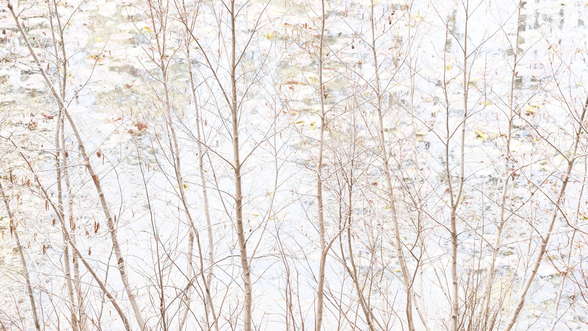
Any feedback is welcome. Do the reds/oranges look overdone? And what about that blob of a rock in the lower left - is it too distracting? The slightly darker areas in the background are tree reflections, which I desaturated and brightened considerably so they’d blend in better.
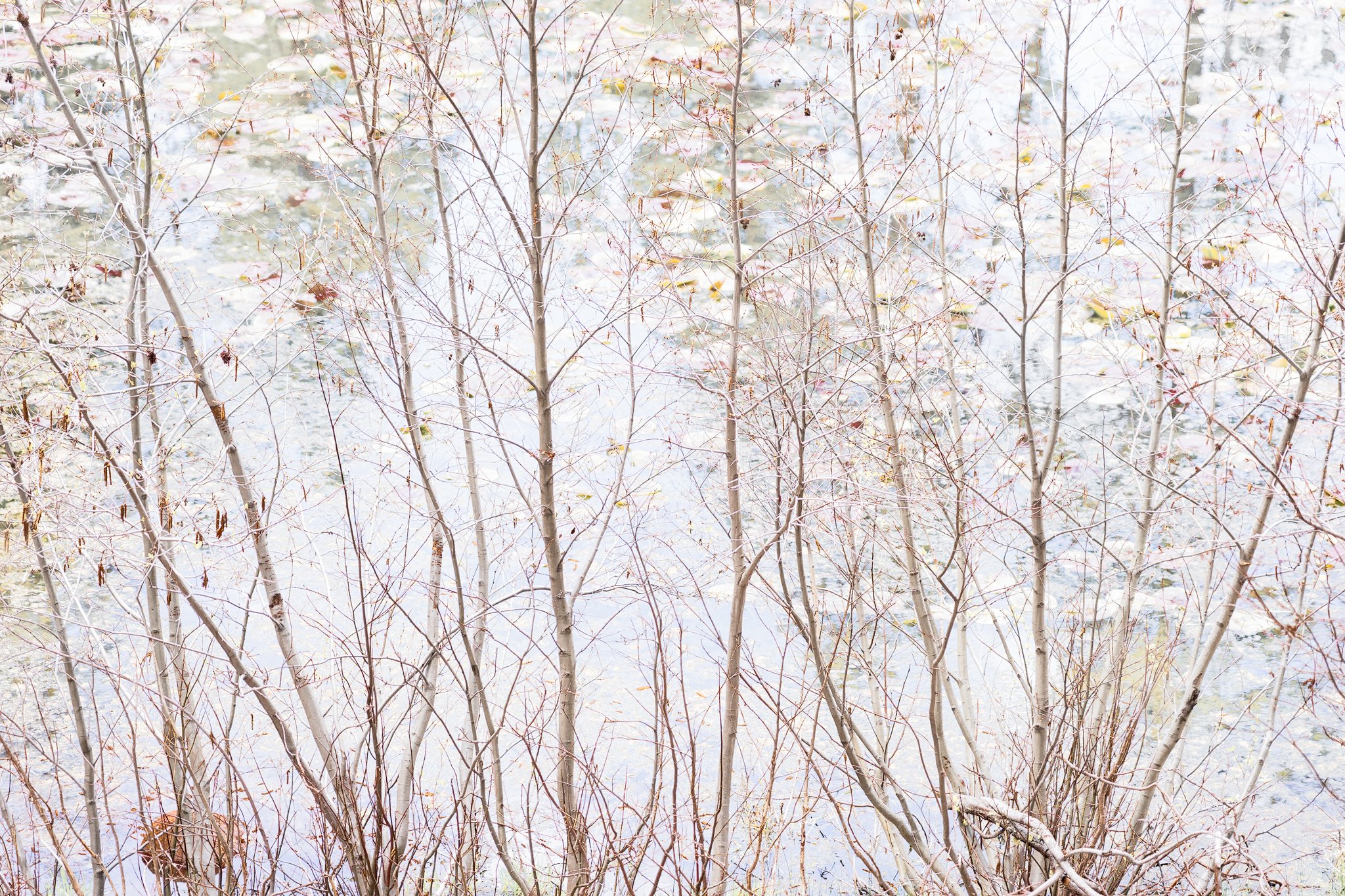
EDITED: Added second version to reflect Lon’s comments.
Pertinent technical details or techniques:
(If this is a composite, etc. please be honest with your techniques to help others learn)
Single frame, a7, 24-105mm @ 88mm, f/4, 1/160s, ISO 400, hand held.
You may only download this image to demonstrate post-processing techniques.
Hi Bonnie,
I enjoy these types of images that are more subtle in nature focusing on detail, pattern, and hints of color. The color looks nice and not overdone to my eye, but I do agree the ‘blob’ in the lower left does pull a bit of attention. I don’t recommend removing it though because it was a natural piece of the scene. Keeping an eye out for this in the field is my preferred means of avoiding distractions, but if you are better at photoshop than me you could pull it off! I really do like the image as is though. Nicely done and ready to be put on a wall!!
I LOVE this, but will make a suggestion that I think transforms this to another level. You ask about the rock and Kyle raises the challenges of cloning, which I agree with. There is also the disjointed branch on the lower right side. How above a simple crop off the bottom, eliminating those two elements? Even a screen scroll transforms this in to almost an abstract, impresionistic… you could even go high-key.
Try the scroll and crop and see what you think. I don’t want to post the suggestion, rather let you discover it.
Honestly, when first viewing, I spent a little time trying to figure out what the background was. A hillside, water, a granite cliff? And it’s the mystery the background brings that for me really elevates the delicate trees to something more abstract rather than literal.
Cropping those two elements, if that fits your vision, really transforms this to an outstanding image.
Thank you for the suggestions, @Lon_Overacker. I do believe cropping out the very bottom improves it by making it more abstract. In the original, I was leaning towards abstract, but I also liked the way the willows fanned out from the bottom. Can’t have everything, though, can we. I also made it a bit more high key using a very pale yellow overlay to warm it up, dialed back the reds and oranges, and dodged some obviously very dark spots. Thanks for the push to work on this some more.
I, too had trouble understanding what the background was as well. I disagree that the more common crop of the upper portion is the more beautiful. Look at what you get with the bottom portion:
I’m really on the fence. I looked at this earlier today before anyone had commented and my initial impression was to crop the bottom, but now that I see @Igor_Doncov crop I like that also. Either way, beautiful shot.
Bonnie, I also glanced at the original yesterday, and initially thought it would be helped by a crop from the bottom. The re-work you did was the exact crop I had in mind, and as Lon points out, it elevates this image to a higher level of abstraction that is quite wonderful. I really like your rework a lot, but I see your point on the 'fanning out" of the willows, which I too find appealing. You could use Photoshops perspective warp on your cropped rework to restore some of that fanning if you want to.
With that said, I also very much like what @Igor_Doncov has done in his re-work. It puts an entirely different spin on the image, but the panoramic format works very well for this subject. so in the end I like both your rework, and Igors alternate approach.
Okay, so is this background actually water or snow ???
@Igor_Doncov, thanks for the comment. I don’t know that one side or the other is more beautiful - the crop depends on what I want to emphasize. Which I haven’t figured out, clearly - ha.
@Ed_McGuirk, thanks. The background is water. I deliberately exposed as far to the right as I could, then used color masks to lighten the blue water and greenish tree reflections.
I’ll put up a third version with the tonal changes and dodging of the second version, but with the entire frame again. Thanks, everyone for your comments.
Bonnie,
I love the high key presentation as it makes the image very impressionistic. This has a wonderful soothing feel to it that I find very relaxing. I do like your rework with the bottom crop along with @Igor_Doncov’s crop. I do not think you could go wrong with either one, but I do prefer the bottom crop. I think this would make a lovely print.
This is a gorgeous image, Bonnie. Excellent concept and execution. As for which final image I prefer, my choice is overwhelmingly in favor of Igor’s crop. For my tastes, the “blob” is not a real issue, but the “disjointed” limb is actually a big positive. I love those little distractions that make me look closer, especially when a closer look is rewarded with the beautiful colors and shapes here.
What an enjoyable image and conversation! I love how people have different opinions and see beauty in both the cropped versions. The cropped versions are aesthetically pleasing, and this conversation reveals that all shots work depending on what the viewer brings to the experience. We prefer what resonates with our vision/heart/soul. At the end of the day, it comes down to you as to which version conveys the message you intend. What you’re hearing from this conversation is that they are all effective images.
Bonnie, the beauty and wonder of your image is that it’s so good, that you could slice and dice this up in numerous ways (crops and processing) and each one would be a success on it’s own - simply because what you’re starting with is so wonderful. All the crops and suggestions are wonderful because what they came from is that good…
Crop or no crop, the image is mystical. The high-key nature of it is fascinating. My one nit aside from the cropping, is that the one trunk on the left that extends up to the ULC seems a bit to bright, almost over exposed. I know everything is bright in the image, but all other trunks retain detail except that one and especially on the right side of the trunk.