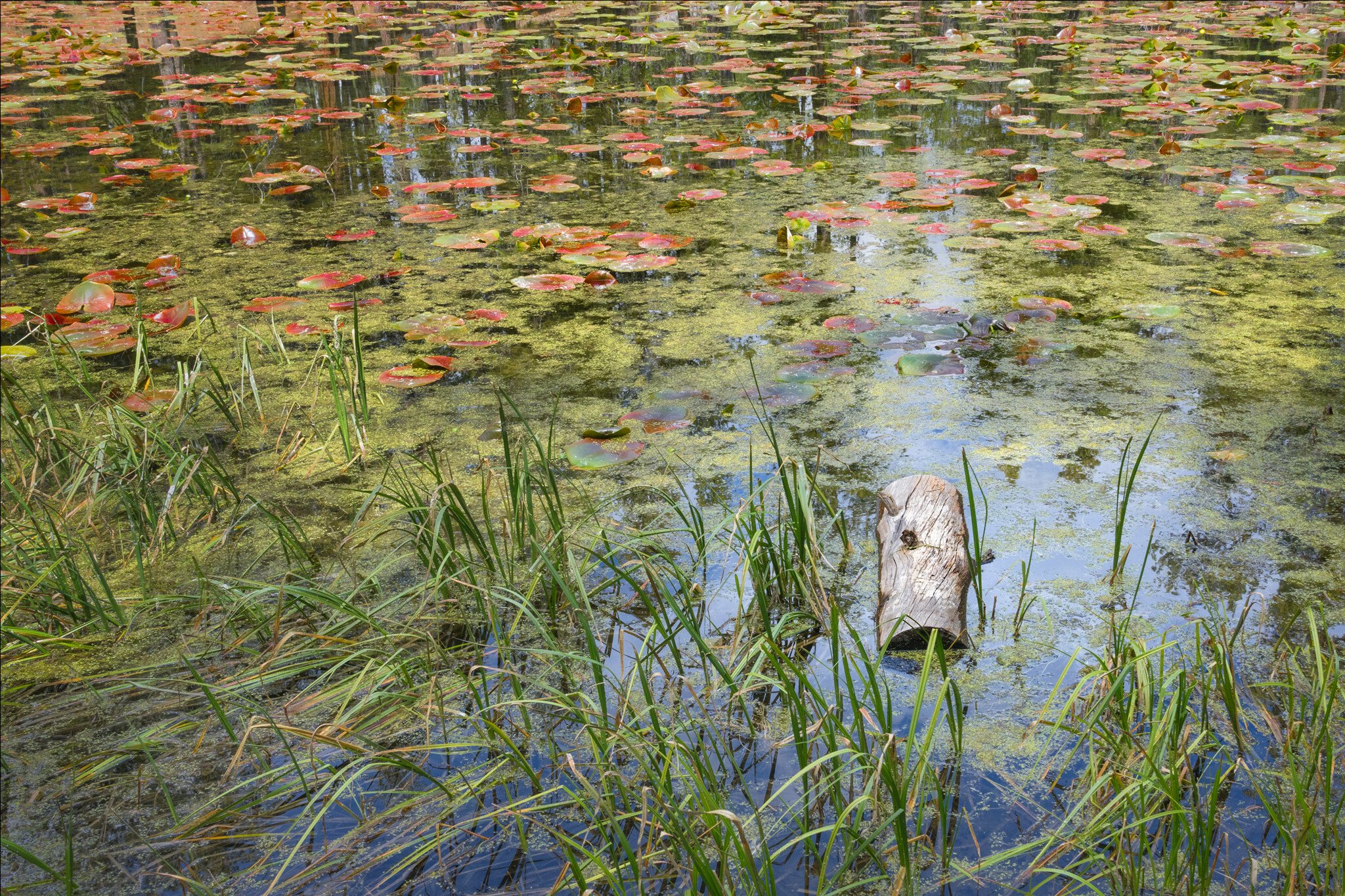
I like the upper section with the water and lily pads the most. What’s surprising is how little color you chose to use. It’s also pretty contrasty. I would add more overall color.
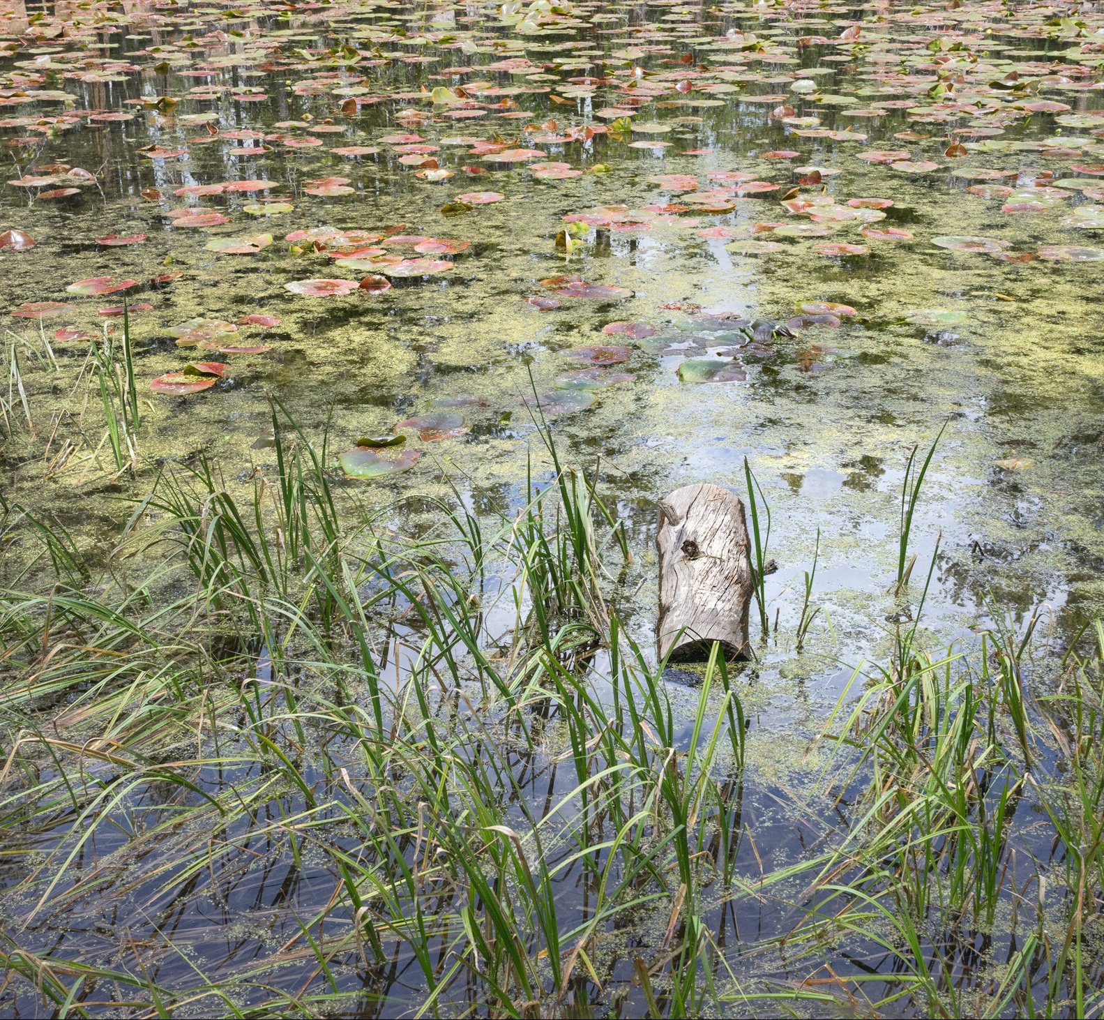
I’d be caught by this, too, but might not have shot it and I’m glad you did. It is an oddball in this scene and makes for an interesting counterpoint to the softer, wispier and irregular shapes in the surround. Ola’s crop works for me, isolating the juxtaposition and emphasizing it.
I think the light (lower saturation) color puts more of an abstract spin on this scene, which knowing your work I suspect was the look you were trying to achieve. I do like the crop that @Ola_Jovall made in his rework, because I think it creates more equal weight between the lily pads and the grass. To me it feels better balanced that way.
Thanks, @Igor_Doncov, @Ola_Jovall, @Kris_Smith, @David_Bostock, and @Ed_McGuirk for your thoughts. I didn’t intend this to be so desaturated. It didn’t seem that lacking in color on my screen, and I’d even saturated the reddish lily pads some. Nonetheless, I went back and increased the saturation overall to see how that compares. I also decreased the clarity and texture to reduce contrast.
I do like Ola’s crop suggestion. The original crop is a bit awkward. I recropped to 2:3, with a more rule-of-thirds look. The rework is above - looks pretty different and I’m not so sure about it.
Prefer the original, the rework seems artificially saturated. I like the painterly pastel look of the original. I feel the log adds nothing and would prefer more of the upper part of the image.
I have to reverse my opinion and agree with everything George wrote. The original without the log would be best. The revised colors do look artificial. Sorry.
@GEGJr and @Igor_Doncov, I agree that the 1st rework was a bit overdone on the saturation. I posted a 3rd try, with slightly less saturation, but with the other edits. I can’t get rid of the log, though, that is the story of the photo for me - the lonely log, the square peg in the round hole, the outsider cut off from his group.
I suspected you felt that way and therefore never brought up the log. The image would have been great without the log. The log seems out of place. But that’s your point. You want a log that’s out of place. It’s an imposition. I get that now. It’s a valid statement.
I have to say that the more I look at this the more I like it. Log or no log. A lot of your images are like that. Therefore I find it better to not comment on your images too soon and just let them grow.
I still like you original post the best. Both in color and composition. I find that to be true of my work as well. You put a lot of time into seeing, composing, and processing before showing something. We, on the other hand, may put at most a minute into looking at it. It’s unlikely that what we see will measure up to what you put into it. The beauty of this image is not immediately apparent. It’s an impressionist painting, a Monet, with a log in it. There, I’ve said what I think.
Hi Bonnie! I really love your Rework#1 the best, the one in the middle. You really made the colors stand out and I feel like your little log stands out a lot better too, being surrounded by the bluer water. Really pretty image!
You definitely found a great scene, Bonnie. I do prefer the revision’s crop, and I think somewhere between # 1 & # 2 rework for saturation would be perfect. It’s a delightful scene!
Hi Bonnie, I get your point but I find the log distracting but that is your point, isn’t it? Then you succeeded! Maybe another angle or perspective, if you will, would be more agreeable. Sometimes as the artist we want everyone to see what we see but sometimes it just doesn’t work. That doesn’t make it invalid as art but we may have to accept that it won’t have wide appeal or even be critically acclaimed. But of course, you are the artist and correct to interpret your work as you please. Congratulations on achieving the reaction you wanted. That is what we all strive to do isn’t it?
Late to the party here, but my first impression was of the Cool log. Just a thought, but cropping off the left and some vignette puts the log in center stage.