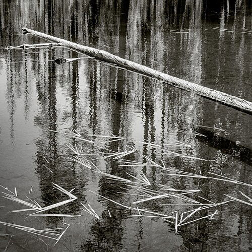
REWORK:
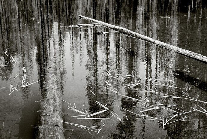
ORIGINAL:
This struck me as a study in lines. The colors were quite blah (blech, really), so b&w it was.
Specific Feedback Requested
I experimented with different crops, but decided to go with how I framed it in the field. If anyone has different ideas, feel free to chime in.
Technical Details
a7r3, 63mm, f/16, 1/100s, hand held, no polarizer.
1 Like
Hey Bonnie! I think B&W works well here and that the visual elements you’re working with are really interesting.
Where I run into a problem is with the straight foreground log on the left. It’s not just its straightness, which feels a bit rigid and “unnatural”, so to speak, because it makes it easy to imagine you standing there as the photographer lining it up. It’s the fact that it seems to meld with the other straight reflections where it enters the water - I can’t tell where one ends and the other begins, and this becomes distracting because my eye keeps trying to make that distinction. It also serves to separate the right 3/4 of the image from the area on the left, which makes it feel disjointed for me.
In light of those points, I think a 1:1 crop isolating the right-hand side of the image fixes most of the issues I have with it. After cropping, a vignette is needed on the left side in particular to “enclose” the composition. I would also be careful about the inky blacks in the upper right and on the right edge, and just try to keep those from clipping, as that becomes a bit distracting (but less so in B&W).
I hope this helps!
Another intriguing post from you. I like how the left log goes visually from being above surface to below surface and yet remains visible. I think that’s what you were after there. That transition that show the log sharp partly and a small blurb Ed’s the rest of the way (I don’t know what I wrote here or what I meant to write). That in conjunction with the remaining elements being sharp.
Thank you, @Alex_Noriega for your comments. Your crop is the same as one I tried before going back to the original frame. I realized all the things you mentioned, but probably was hoping my intuitions weren’t valid - ha.
Indeed, @Igor_Doncov that is what I was thinking. But, perhaps this little scene should be two scenes, not one, for the reasons Alex mentioned. I shall have to return to this lake (unless it’s already dried up  ).
).
Hi Bonnie,
Definitely about many lines, and I love the contrast as well - great choice on the b&w for sure. I think the near convergence of the two fallen logs was a great asset to the image. I didn’t think the one on the left being straight, or any other issue - that is untill I read the comments and paid a little closer attention. Two things on the left. The main left log seems to morph in to a different log (because it’s submerging…) but then it also ends abruptly, something I can resolve - it’s either a sawed off end, or something optically is happening. Not a huge deal, unless one starts pixel peeping. But secondly the area if the LLC doesn’t have the reflection and we can see through. There’s nothing wrong per se, but that corner is a little less congruent with the rest of the scene.
All that to make a vote for the crop. Your repost and Alex’s suggestion I think nail the scene. There is still a clear message about lines - the diagonal of the fallen tree anchoring the scene; then the high contrast reflections of lots of lines and then totally mixed around with the random lines and angles of the reeds.
Contrast and tonality are wonderful. The crop is the ticket. A wonderful b&w image.
Lon
1 Like


