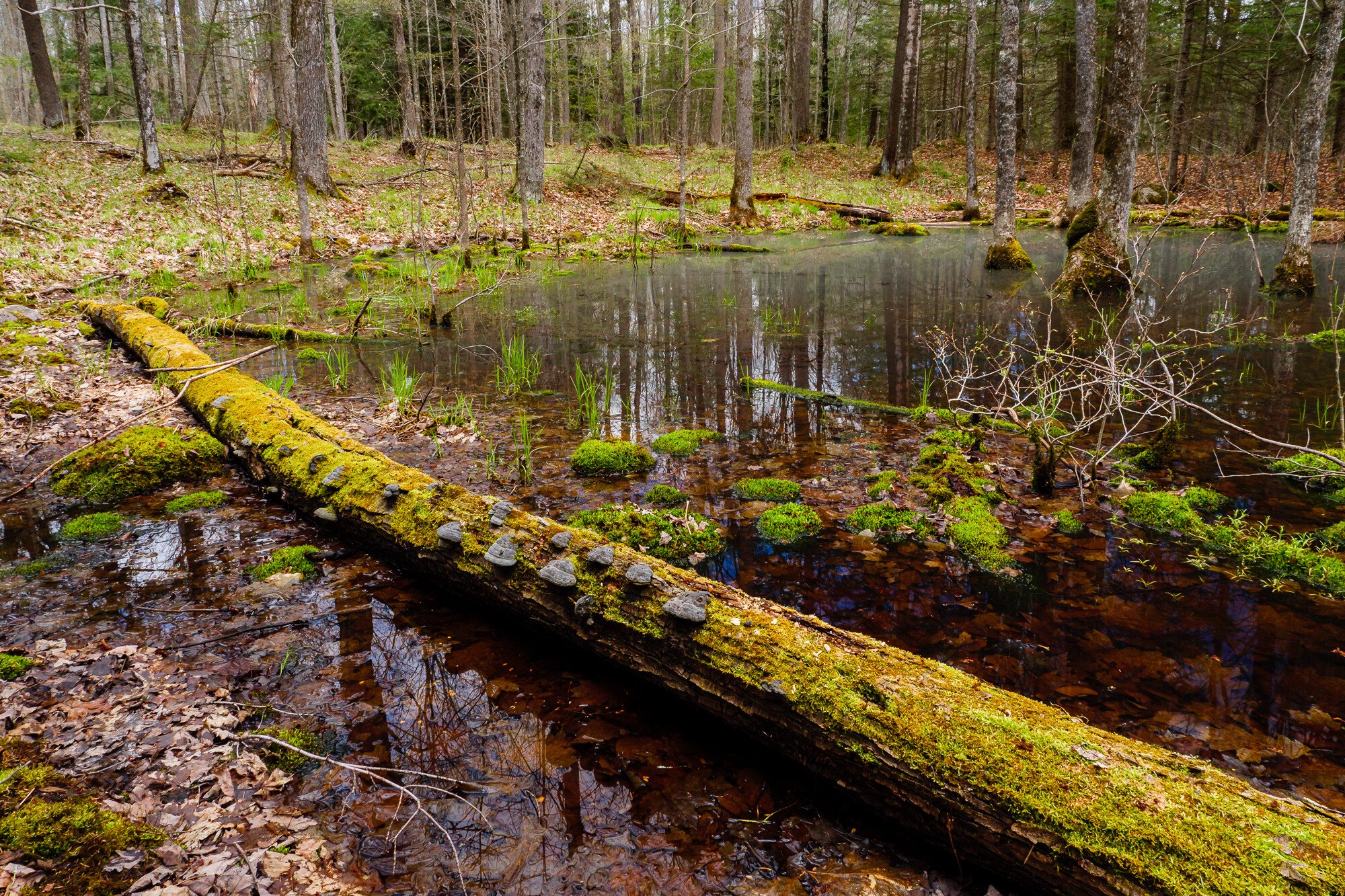
Loving vernal pools or ponds is tough love. They are so tough to photograph. Their messy and loosely defined shapes make it hard to find good vantage points because the edges are very squishy. Their messy nature means there are many distracting elements. And they’re buggy. But I keep trying because they are interesting and vital pieces of habitat for many woodland creatures.
I found this one recently on a day where the clouds came and went across the sky. In a moment of relative shade I crouched in between some saplings and did my best. The mosquitoes were doing there worst and I have some other shots where you can see a cloud of them just in front of the lens. Maddening. The haze on the water is probably mostly pollen.
Specific Feedback Requested
This was the cleanest view I could get with any kind of organizing element - that lovely fallen tree. While it isn’t a leading line per se, I think it provides a decent anchor and the rest of the image flows from there. I dialed up the reflections for this shot because I think it adds to the story, especially in the LLC.
Technical Details
Is this a composite: No
Lumix G9
Lumix G Vario 12-35mm f/2.8 @ 12mm (24mm equiv.)
f/9 | 1/30 sec | ISO 400
Handheld w/polarizer
Lr processed for a little crop, lens correction & general improvements. Played in the color sliders some to lighten greens & saturate oranges. Graduated filter in background to reduce exposure & pull down shadows. Ps to remove some tags on trees left by loggers & to do some light dodging in the deep shadows in the water.
I think this composition works pretty well. The log with the mushrooms is interesting in its own right, and also does a good job of anchoring the composition, as you said. The log makes the image work for me. I also think you included just the right amount of background trees. Mosquitos are maddening, but at least you didn’t have to deal with the New Hampshire state bird, black flies, I thought you would appreciate that…
Some suggested processing tweaks. I would burn the fallen leaves in the LLC. For the shoreline along the top of the image, I would burn the ULC, and dodge the URC, to better balance luminosity along the entire shoreline. The yellow/green of the moss on the log feels slightly too electric saturation for my taste (yellow saturation can be tricky), and I would dial that down a bit. But overall this is a nice scene, worth some further processing tweaks.
Thanks Ed. Yeah black flies I don’t miss, but we have what I call no-seeums that are just as bad.
I like the log, too, and was worried it was a little overwhelming, but didn’t want to cut any of it off. Here is a version with the suggestions you made -
Better?? I think that the colors were a bit too vivid, so that’s the biggest difference for me. The woods on the right in the bg were more heavily shaded by conifers than the left where it was logged later or heavier, so I don’t know how I feel about evening out the light there, but here it is.
Hi Kristen, I like the composition with the log leading the eye from LRC diagonally upwards to the edge of the water which then brings the eye back around to the right of the image. For me the colors are a little too vivid and over saturated … but that’s very much down to personal taste. Overall an interesting image of a difficult to photograph subject.
Regarding the luminosity at the top. In the original the ULC was too bright, but primarily only in comparison to the URC. This made me notice the ULC more than I would like. I thought by balancing the luminosity of the background, that the ULC would become less prominent, and retain more attention on the foreground log. In your rework I think the ULC is still slightly too bright.
Color hue and saturation are very subjective things. In your rework, my personal taste would be to reduce yellow saturation a bit further, and maybe shift green hue a bit more green (making it cooler) to get more green vs. yellow color separation in the various mosses. Here is my spin on that, take it for what it is worth , your vision may be different.
Thanks Jon and Ed for your continued insights. It may still be too saturated, but I am kind of happy where it is because it was bright. It was a thriving little ecosystem on the verge of spring. I think it needs vivid color to illustrate that. And of course our monitors and visual cortexes are all different.
But…Ed…I think you’ve sucked the life out of the picture by flattening the luminosity so much. For me, natural differences in light values throughout a scene add vitality and sparkle to a picture. Direct sun excluded, I’m ok with showing gradations in luminosity value if I think it works and in this case I think it does. Your evaluation has given me another perspective and lens (groan) through which to organize and present a photo, so don’t feel like you have to keep quiet about my shots in future, we just differ on this one.
I agree that the desaturation has been taken too far. To me certain colors look too saturated while others are fine. I would change the cyan greens, especially to the right of the log. There is also an area near the log where the water is India ink blue. I think that’s been over processed. Overall I think the log makes this image and without it there would be much less interest.
You are right. It was bugging me, too, as we had this discussion, but I wanted to see if it bugged anyone else. I’ve done some additional tweaking to the image, taking into account many suggestions and opinions and a few ideas of my own.