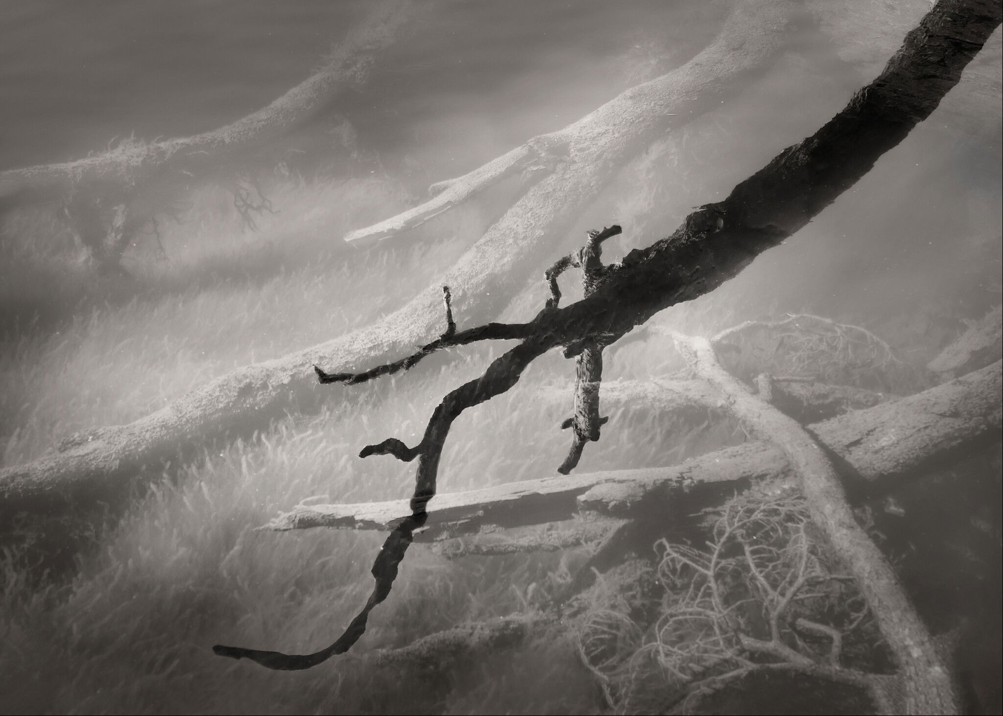
Continuing with this theme, I’ve been looking for scenes like this as we hike about. It’s a funny thing, though, once I start “looking” for something specific, the photos I make aren’t as appealing as the first one in the series that I made based on my initial “oh, wow, cool!” reaction. This one is growing on me, I think. The light isn’t as interesting as my first one, but the submerged logs are cool.
What technical feedback would you like if any? What artistic feedback would you like if any?
Any critique welcome.
Pertinent technical details or techniques:
Single frame, a73r, f/11, 1/80s, ISO 400, hand held.
Interesting play on the original photo Bonnie. I agree with you about subsequent photos, this seems to happen to me a lot. . . good to know I’m not the only one. For me, this one is more subdued. The submersed twigs seem clearer but something just doesn’t seem as strong as the original. Perhaps burning/dodging or contrasting adjustments??
The key in these images for me is the ability to make an association with the black fg shape. In the previous there was ‘the leap’. Here a comparison is more difficult. The black suggests something menacing as does the gnarly form. But it’s really not that threatening overall. So I like it but not as much as the previous one. I imagine these compositions are difficult to previsualize because the root isn’t black in reality.
When I downloaded this and put it into a frame I came to better realize just how good this really is. It’s actually marvelous image. I love the composition, the arrangement of tones in space. I thought I could make the root more threatening by cropping into this comp and making the root larger. In the end I don’t think I made it so. I think the mind just has a more difficult time imagining with this form than the other one. But in other respects this is a better image.
Thanks @linda_mellor and @Igor_Doncov for your thoughts. Igor, I’m not sure what you meant by making an association, but it got me thinking. I went back and made some adjustments to make more of an association between the shadow/reflection branch and the main underwater one (brightened the central portion, darkened and decreased clarity around the edges). Also did a bit of a crop and cloned out some edge distractions on the right.
Bonnie, I wasn’t referring to the association between the dark roots and the light roots. I was referring to the associations your imagination makes when it looks at the dark roots. That’s the strength of your images. I’m actually writing an article on this subject matter because it dove tails with my own approach currently.
Well, this is a pretty cool image. I viewed it first without reading your description, and thought the background trees were in a foggy forest, and not underwater. It’s an image that definitely gets one thinking. I the original image and the original crop. For me the processing of the original looks more “underwater” than the rework does, with it more even lighting. What I can’t figure out is if the dark branch is partially or fully submerged, which is another intriguing aspect of the image.
I do love the juxtaposition of the light and dark branches. But I see a second story here too. A shot of just the background submerged trees would be an interesting image in it own right too.
If I might make a suggestion. The comments refer to the recognizability of the components. I think you should play with the tones as you see fit to convey what’s in your imagination. This is not a literal image. I saw your new changes as an attempt to use the same approach as the previous image. But this image is pretty different than that one. Your rework is an improvement in my opinion.
@Igor_Doncov, you’re exactly right. I was trying to make this one a bit similar to the previous one. The light parts in the previous one, though, were natural - sunlight on very gently ripples. Trying to replicate that look in PS doesn’t work as well, for sure. I do like the rework better, as I think it looks less literal. Still, might be overdone.
Bonnie,
Wonderfully creative work again! I have to say I prefer the reworked version. The lightening adds interest and complexity to the mood of the image. For me this image is about inviting the viewer to explore the depths, and I think the light adds to creating mystery in the shadows.