Stepping Into Winter with Repost

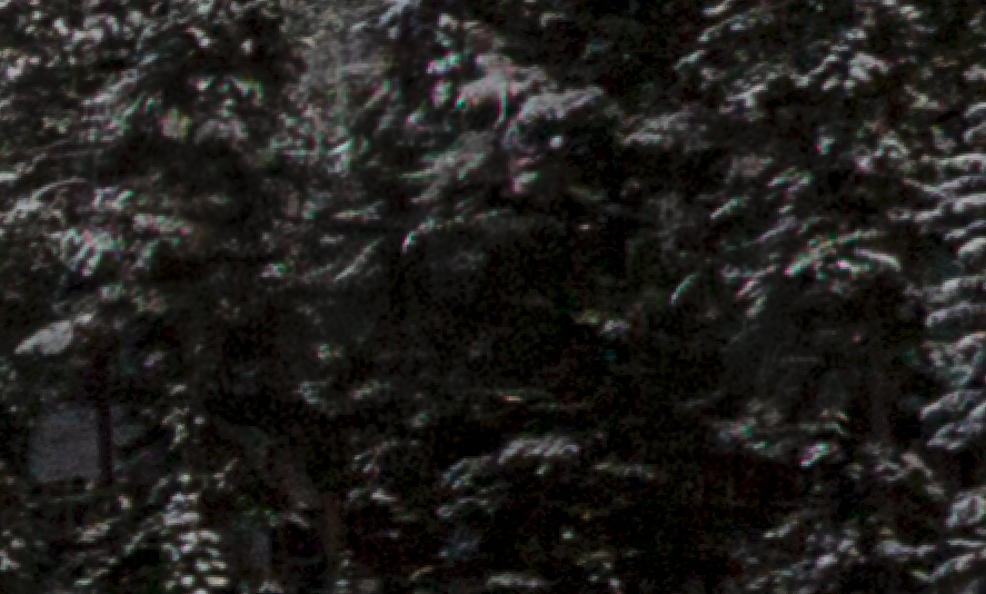
Version 4 with no rooftoop (please don’t say the patch in the trees is conspicuously dark, though I know it is):
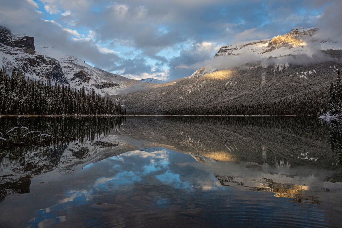
Version 3:
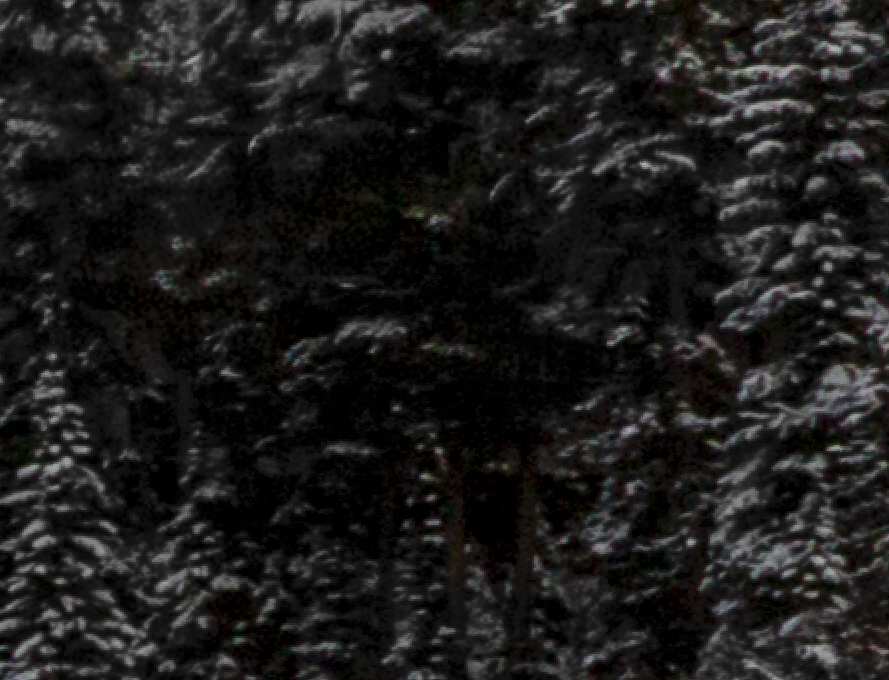
Fullest possible width, little yellow light removed, roof remains, vibrance reduced to eliminate the noisy colors in the snow on the trees (didn’t see that until really working on the roof). Screenshot for that area is posted as a reply down toward the bottom.

I also ever so slightly brightened the foreground, but I didn’t want the rocks to distract too much. I took at look at the clouds, and it doesn’t appear that I sharpened them at all, but I did reduce global texture just a hair.

Version 3

Version 1

Version 2


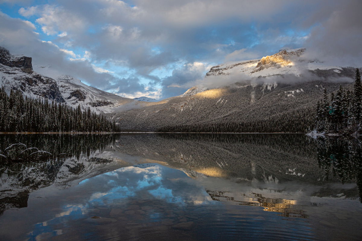
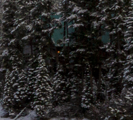
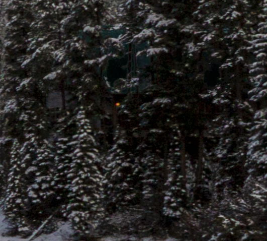
Original crop, but there is a bit of a rooftoop that’s been hard to “delete”

Critique Style Requested: Standard

The photographer is looking for generalized feedback about the aesthetic and technical qualities of their image.

Description

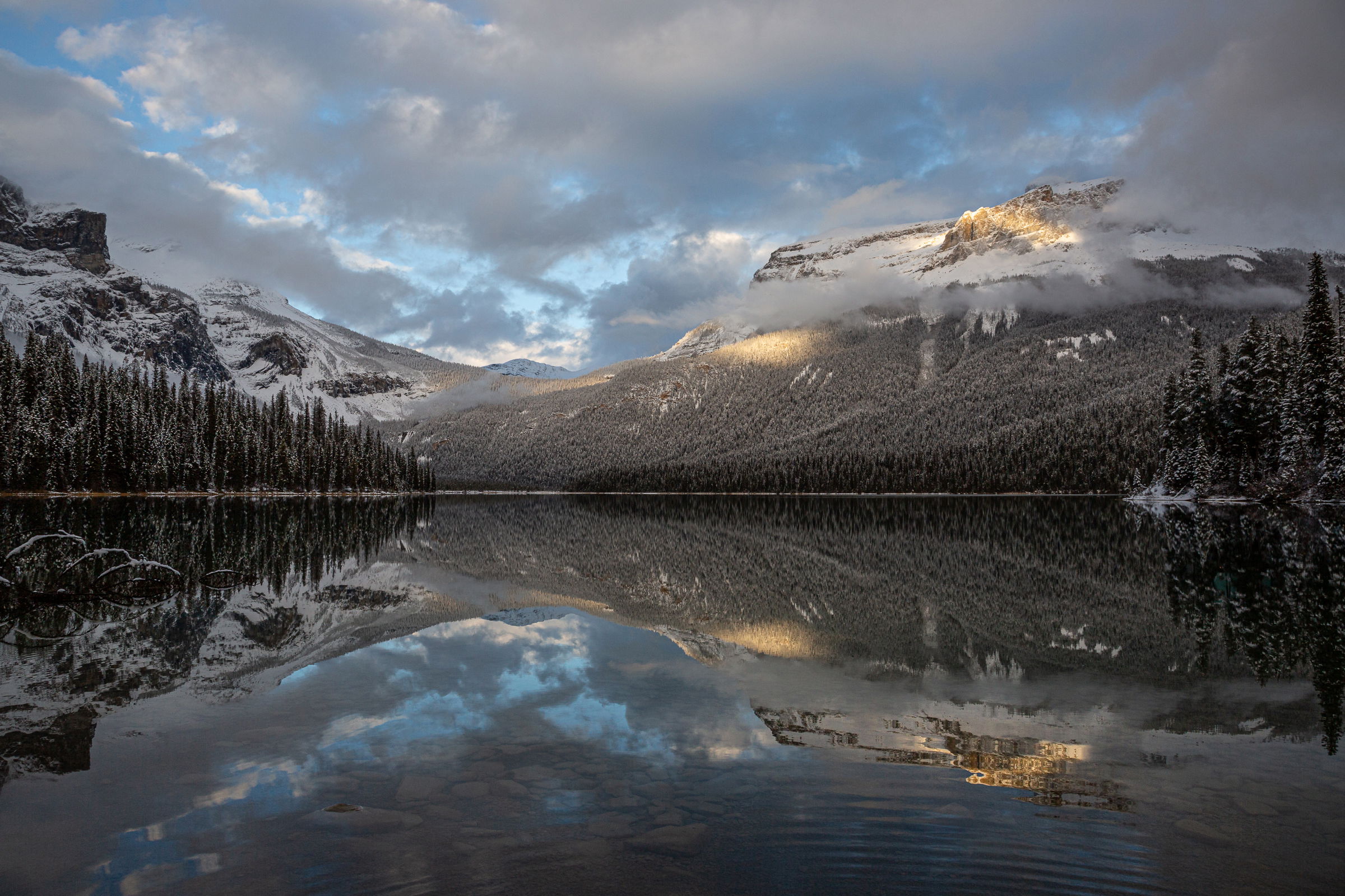
I shot this image at Emerald Lake in Yoho National Park (BC Canada) while on a workshop with Paul Zizka and Stacia Schmidt. I was drawn to the spot of light in an otherwise still somewhat stormy afternoon sky. The clarity of the reflection in the water was stunning,emphasized textto get beyond some foreground I didn’t love, I had to step in. I decided to shoot the ripples as well.

Specific Feedback

I am always up for whatever feedback y’all have to offer. I do have some specific questions:

  1. Do the ripples ruin it? Or do they add a human dimension that kind of works?
  2. I cropped off the right edge a bit (see the difference between the first and second image) to get rid of the rooftop and yellow light of one of the lodge buildings that sits along the lake, and it made the image more asymmetrical than I had originally intended. Is it better with the rooftop?
  3. Does the rooftop put it in “Everything Else” category, or is it incidental enough to still fit in the landscape category? I couldn’t remember the rules on that.

Technical Details

Canon 5D3 with 24-105mm at 24mm
ISO 160, f/11, 1/125sec


Critique Template

Use of the template is optional, but it can help spark ideas.

Vision and Purpose:
Conceptual:
Emotional Impact and Mood:
Composition:
Balance and Visual Weight:
Depth and Dimension:
Color:
Lighting:
Processing:
Technical:

Beautiful shot. I like the ripples. Don’t think it adds any kind of human element though. They could just as easily been made by the wind, a duck, beaver or some other animal. The viewer doesn’t know. I like the wider version with the roof. Not because of the roof, just I think a wider aspect ratio works better for this scene. I would probably went even a touch wider to move that tree and reflection away from the edge. Minor stuff. I wouldn’t crop. I’d just clone it out.
And it’s definitely small enough to keep in the Landscape category.

Very nice photograph Marylynne. The lighting and colors are just beautiful. Answering your questions.

  1. Do the ripples ruin it? Or do they add a human dimension that kind of works?

When I first saw the photograph my eye is drawn to the waterline and the mountains. I did not even notice the ripples until I saw your question. I would not worry about it much as I think the viewers eye is drawn to the light, mountains and reflections.

  1. I cropped off the right edge a bit (see the difference between the first and second image) to get rid of the rooftop and yellow light of one of the lodge buildings that sits along the lake, and it made the image more asymmetrical than I had originally intended. Is it better with the rooftop?

I don’t see the yellow rooftop… but to me the bottom image is a bit more balance as it has more trees on the right side. I see some green in there… is that the cabin? But either crop would work IMO.

One more thing… is it possible to soften the clouds a bit? The clouds on the left look like they may have been sharpened.

I do not have a problem with the ripples as they add to the dark area that has little detail without spoiling other reflections.

Re the roof. If you do not like it, simply burn it in till it disappears. Burning in can also apply to the light (that I could not find).

I might try to emphasise the foreground underwater rocks a bit more, perhaps as a focal point.

Nice image

I think the ripples add some natural-looking interest without drawing too much attention from the lovely scene. I don’t find a roof – maybe it is the green showing through some of the trees? Burn it down or clone it. I prefer the wider version – just feels more balanced and less forced. Absolutely lovely scene and light!!

Great photo. You captured beautiful clouds and yellow light. Good job! The ripples don’t bother me at all. I think I prefer the wider version, although I would crop away the taller tree on the right edge…I think it draws the eye there. I also didn’t notice a roof. Is it the green spots through the trees? If they bother you, I would’t just get rid of it with a remove tool.

Thanks, everyone. I really appreciate all the feedback. In trying to remove the green roof, the trees got weird, and in darkening it, things got weird, so I decided to leave it in but clone out the yellow light. Here is a screen shot of what all of that looks like at 200%.

At the top, I’m posting a re-touch

Hi Marylynne,
Stunning light and image! My personal preference is for your original crop because this is a scene that needs to be viewed wide. The ripples in the water do not bother me in the least and yes this is fine for landscape as the building is fairly small in the overall scene. I took a quick stab at it and was able to remove the roof using the remove tool. Here is the rework just to show you how it looks. This is a lovely wintertime scene.


Oops, I forgot to take care of the roof in the reflection.

1 Like

This is very, very nice, Marylynne. The roof doesn’t bother me at all, nor do the ripples in the water. I prefer the uncropped version w/ the roof over the cropped version as it just feels a touch too tight. Alternatively, as Ed has done, you could just clone out the roof if it really bothers you. I can’t think of anything I would do different here. Great image!

@Ed_Lowe – Yeah, that’s what I noticed when I tried it. You did a much better job of removing the roof without messing up the trees. I think I tried it before I reduced vibrance, so the trees that papered over the roof were noisy, and then I noticed the reflection and thought, ahhh, what a lovely roof nestled in trees. :innocent:

This is a beautiful area, and I took some stunning photographs. The lodge, the bridge to the little island-like peninsula, and the canoe rental boat house all kind of made it feel less like a nature photography landscape. You had to be pretty much on the bridge or facing away from the bigger mountains to eliminate the lodge buildings. I’ll post my favorite of the boat house in a few days in Everything Else.

I thought Selective Color might work to darken greens and cyans but it wasn’t strong enough, even with duplicated layers. Since the roof is an unusual color relative to the rest of the image, I tried a Select > Color Range (in PS) and sampled several areas until most of it was selected. I had to reduce the Fuzziness and Range to limit it to the roof. I got a little frustrated so made a composite layer and saturated green and cyan until the roof stood out even more but not enough to pick up too many areas in the trees. Then I clicked on an area of the color and shift-clicked on a few more until I had most of it. Back to some slider tweaking. Turned off the saturated layer and made a Curves layer, which incorporated the selected area as a mask. Darkened it and the roof was virtually gone. Then if needed I could flatten the curve layer with the composite layer and do some cloning of tiny areas. I didn’t get it all here but it can be repeated as needed.

For me, tweaking colors and tonalities is much more acceptable than cloning things. But getting masks right can be frustrating.

1 Like

Hi Diane,
Much better! It’s was harder than it seemed, wasn’t it? I only have LR, so it might have been beyond the software’s abilities or at least beyond mine. Everything I did made the area oddly noisy or oddly dark. So it took something undesirable and made it weird instead.

I don’t anticipate printing it or publishing it anywhere, so I’m okay letting green roofs have their place🤣.

Thanks for giving it a go!
ML

Marylynne, this is a lovely, peaceful scene. I do like the ripples as a subtle contrast to the near perfect reflection. The roof takes extra time looking to see so it’s only slightly intrusive. If you have the latest version of Lightroom Classic you may be able to use generative AI to replace it (via Remove, under the Tools menu).

I didn’t realize you are limited to LR. As wonderful as it is, PS adds a lot of capability.

@Diane_Miller and @Mark_Seaver
I have the latest LR Classic and tried several of the removal options including generative, and what replaced the roof always looked weird to me.

I’ve used PS a few times but there has always been something about its basic functions that seems overly complex and counterintuitive to me, so I just stick with what feels rewarding to use.

For the most part, I can do what I want in LR. This was a rare instance of using removal with Ai and having it look like a lit Christmas tree instead of rooftops,

I might give it another try. Maybe I’ll
Post a video of the process or at least the funky results.
ML

I took another stab at the generative removal tool. Once again, it created some ugly colorful artifacts…

But then I took the adjustment brush and reduced exposure and saturation on those until they looked okay…

So, now the final version is posted up top with the roof removed. It just took a couple processes, the first of which didn’t feel like an improvement if I ever were to print it (the chromatic aberrations swimming around like those little neon fish), and then treat it like a burning down of something ugly to hide it, and it worked. So there’s my lessen: replace, darken, and then replace and repeat if necessary. This time it wasn’t.

Thanks for the nudges everyone,
ML

Hi,

Just a crazy point. Sometimes my spectacles create chromatic aberrations on high contrast sharp edges. I have been known to end up tilting at windmills! Moving your head around changes them - a give away.

Rob

@Rob_Sykes I cannot wear polycarbonate glassses for that very reason. I see cas all the time in that lens material, They call me “poly non-adaptive” and tell me it’s a good thing I don’t need thick glasses.
ML

OK – you made it work! In my experience, all the AI tools leave imperfections, on close examination. But cloning or other tools can usually clean them well enough. Nothing is perfect – yet, anyway.

And congratulations of the EP! Well-deserved for this lovely image!