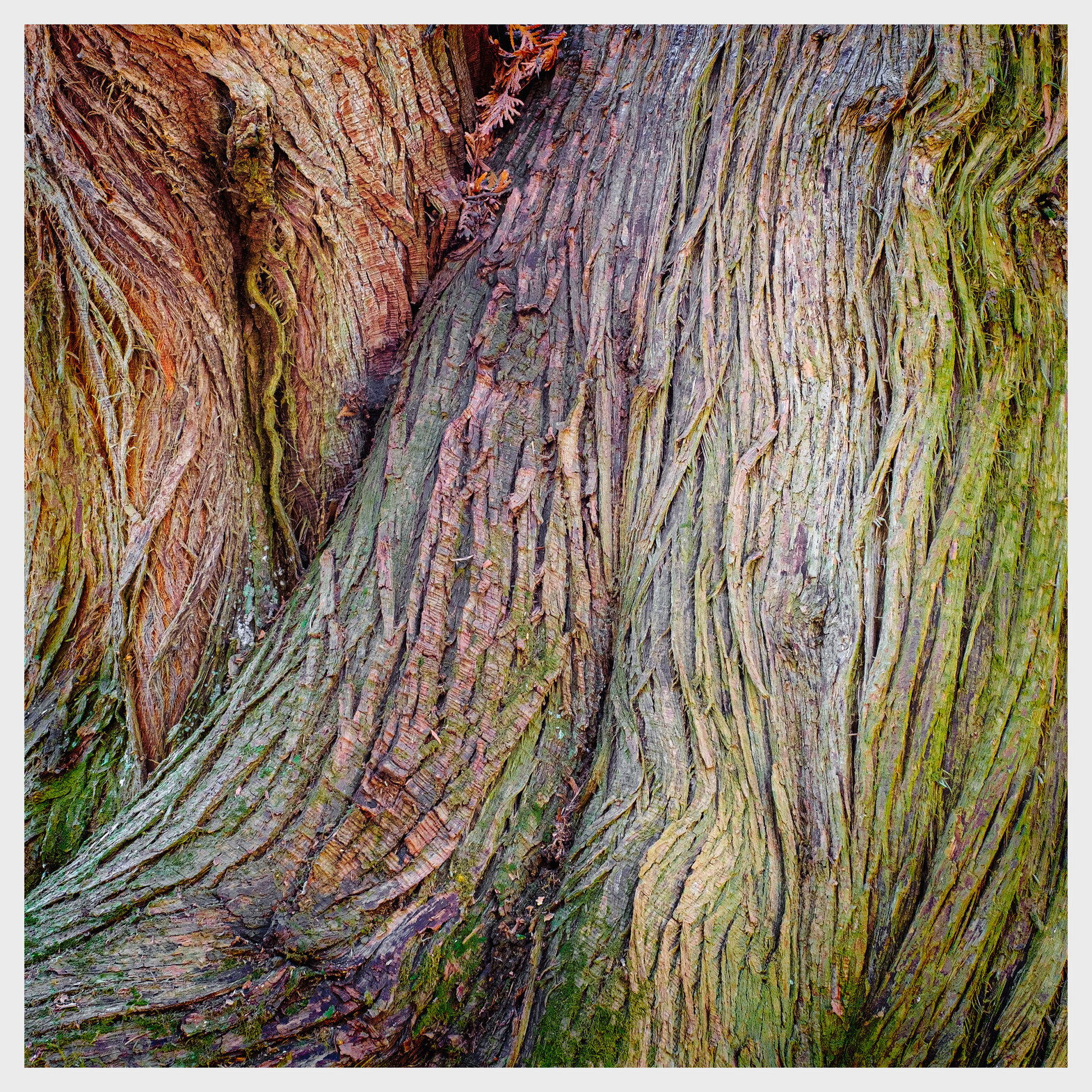
I loved the colours that my camera picked up even though I’d intended this to be black and white. It almost feels hand coloured, like an illustration for a slightly dark fairy tale. Does that storybook feel come across - something a bit magical with maybe just a touch of spooky?
3 Likes
I like this one very much, Kerry. The composition, texture, and colors all work well together. The pine(?) needles at the very top are a nice addition in my opinion. These barks often have a nice shine to them which translates really well to film and digital. This does remind me of a Weston and I can see why b&w would be a consideration. The bark on the left is particularly interesting. Little to suggest except to maybe drop the highlights ever so slightly on the bark on the right area, and I’m really not sure about that. I especially like the large version of this. You can explore those strands endlessly because they’re each unique. It’s rich in information yet not busy. Love it.
Very nice image - it conveys the sense of a flow of lines on the bark, of flowing life. I also like the delicate complementary colors and the texture…
Amazing colors, Kerry. I’ve seen the green tint before on trees, but never the other colors. I also love the texture and sharpness of the image.
A wonderful intimate study of color and texture Kerry. I think cedar trees can make outstanding subjects for these type of images, cedars can have some amazing colors. Again, green and magenta/red are your friend. I find the image more magical than spooky, but there is nothing wrong with that, magical works fine for me. To be spooky I think you would have to significantly decrease the luminosity overall, and only have a few splashes of light and color emerge.
In terms of tweaks, I would suggest slightly burning down the luminosity in the right 1/3 of the image, which is currently brighter than the rest of the scene. I think the image would benefit from a more even luminosity across the scene, since the colors and texture are evenly distributed across the image.
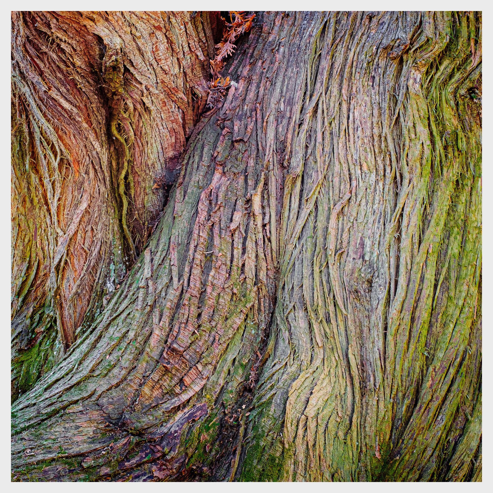
@Igor_Doncov, @Antonello_Provenzale, @Bill_Chambers - Thank you all for your kind words. Igor, I do plan a monochrome version and if it reminds you of Weston (even if you have to really squint,) then I am duly honoured. @Ed_McGuirk, yes, I love cedars. In most of the places I go to canoe there aren’t any but here in Southern Ontario where this picture was taken, they thrive. I have taken your advice and posted another version (above) which brings down the highlights. My only concern is that it flattens the image. You think.
Hi Kerry,
Fantastic texture here and I like the graphic form of the bark. I do look forward to seeing your monochrome version when its done. I do think the complimentary colours work here but I also think that B&W will make the image more of a departure from reality and more abstract.
As an alternative to burning the right side bright areas, maybe burn with a bit of green color or a little magenta in places.
As to Weston, I am a fan of Brett Weston, and the BW would fit nicely into Leaves and Lava.
@Dick_Knudson - Great idea.

1 Like