Critique Style Requested: Standard
The photographer is looking for generalized feedback about the aesthetic and technical qualities of their image.
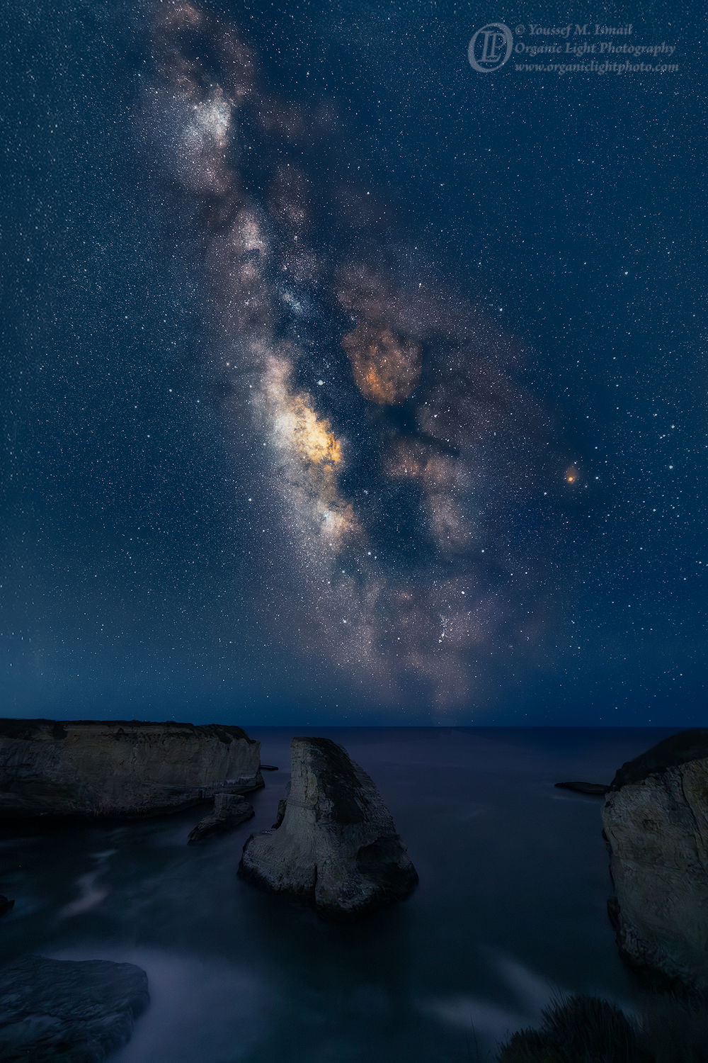
Description
Lately I am never happy with my processing and I spend hours trying to find the right feeling in the image. I was not happy with my previous renditions of the Milkyway, either due to the sky itself, or the overall composition. And, I don’t know if this rendition is any better, although I am more satisfied with the overall compositional balance.
Specific Feedback
Does this rendition come across as to overbaked?
Again I am trying to produce a companion photo to my Orion’s Tribe photo I made back in January, so I want the overall color balance to be similar.
Does this rendition match better?
Do I need to try again, that is another rendition?
Night photography is so subjective with regards to the colors, I am really struggling with that. We think the night sky is black, but its not, not really. I mean, spend time in the dark long enough and the sky does take on a blue essence, then turn on a light and then look at the sky and it will be pitch black for a short time before the eyes adjust again. So we think the night sky is black.
Technical Details
Nikon D850.
Rokinon 14mm f/2.8 at f2.8
Sky: 12 frames, at 30 sec each, ISO 1600
Land: 1 frame at 30 sec, ISO 1600
the 12 frames were stacked in Siril and then stretched. Color calibration was difficult. The entire resultant image needed to be rotated about 3 degrees to level out the horizon. It was then used as the image in sky replacement of the single land frame. Then PS and TK masks were used to finalize color and contrast.
Critique Template
Use of the template is optional, but it can help spark ideas.
- Vision and Purpose:
- Conceptual:
- Emotional Impact and Mood:
- Composition:
- Balance and Visual Weight:
- Depth and Dimension:
- Color:
- Lighting:
- Processing:
- Technical: