First
Second
Third
Critique Style Requested: In-depth
The photographer has shared comprehensive information about their intent and creative vision for this image. Please examine the details and offer feedback on how they can most effectively realize their vision.
Self Critique
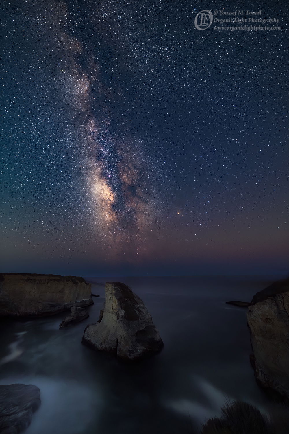
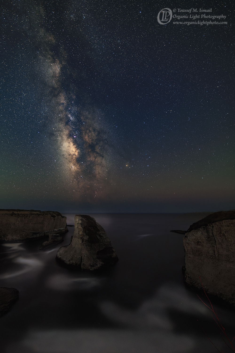
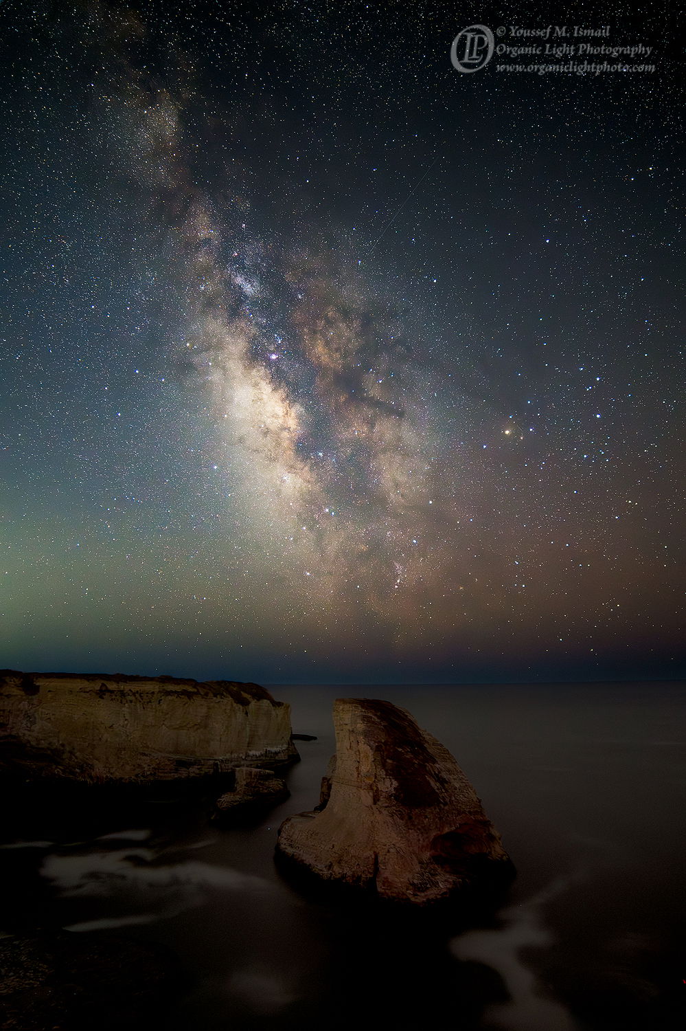
I am struggling with this composition. The first photo is the second attempt, the second photo the third attempt, and the third photo is the first attempt.
All were taken over two nights at Shark Fin Cove in Davenport, CA.
The first is a composite of a single 4 minute exposure for the FG and the sky is a stack of 15 frames all at 4 minutes long, full frame
The second photo is a composite of a single 30 second exposure for the FG and a stack of 40 frames each 30 seconds long, full frame
The third is a single frame, but with the camera using the crop mask bring the view to 21mm, 30 second exposure.
Creative direction
What I had intended with this photo was to have a companion piece to go with the Orion’s Tribe photo I made in January.
I think the composition of the third photo is what I had in mind, but the crop mask was a mistake that I realized about 20 minutes after I had started taking frames. The wider angle is more in like with Orion’s Tribe, but I feel like the Milky way being off center seems to throw off the composition, and even more so in the third photo.
Specific Feedback
Which composition sits better with you? Which color balance works better? I am tending towards the bluer color balance to match the color balance of Orion’s Tribe
Technical Details
Nikon D850, Rokinon 14mm f/2.8
First Photo: f4, 4min, ISO 800, 16 frames for the sky, 1 for the FG
Second Photo: f2.8, 30 sec, ISO 3200, 40 frames for the sky, 1 for the FG
Third Photo: f.28, 30 sec, ISO 3200 Single Frame
Processed in ACR and PS. I used a Median Stack on the sky.
The Orion’s Tribe photo is HERE
Description
Shark Fin Cove under the summer serenity of the Milky Way. A perfectly calm summer night with a slight breeze and the gentle sound of the tide splashing on the beach below. A screech owl, and coyotes in the distance serenaded to keep me company well into the night.
Critique Template
Use of the template is optional, but it can help spark ideas.
- Vision and Purpose:
- Conceptual:
- Emotional Impact and Mood:
- Composition:
- Balance and Visual Weight:
- Depth and Dimension:
- Color:
- Lighting:
- Processing:
- Technical: