Swift-Moving Kicking Horse River w/ 2nd Repost

Second Repost:
Re-jiggered the crop a bit, cloned out some snow, and played with foreground brightness:

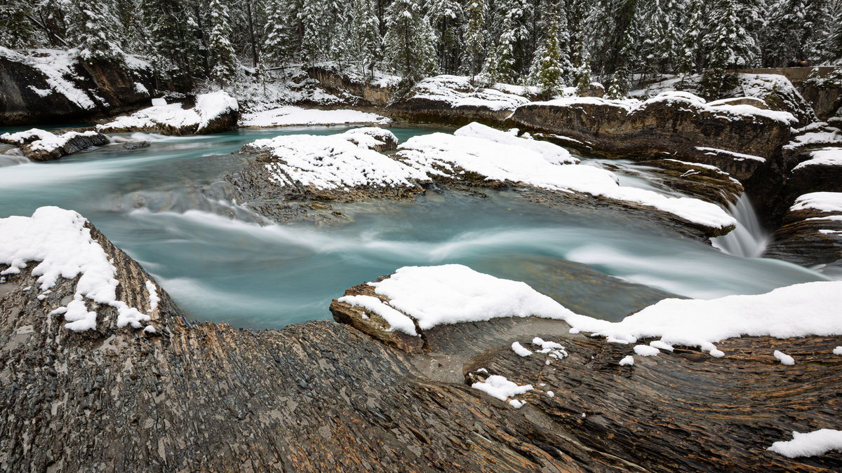
Repost: Some work on snow, crop, angle. Too much trees and sky on opposite bank?

Original Version/Post:

Critique Style Requested: Standard

The photographer is looking for generalized feedback about the aesthetic and technical qualities of their image.

Description

I’m going through a few remaining images from my week in the Canadian Rockies in Fall 2024. This was taken along Kicking Horse River, a few miles from a lodge in the Yoho National Park. I have a few mini-falls shots from the right hand side of this as well, but I’m still debating whether they are ready for prime time.

Here I was going for a sense of cool swiftness and accentuating that menthol blue color.

Specific Feedback

This was a really high contrast scene, and the light was very flat as we were under a uniformly gray sky. I didn’t want to emphasize the rocks too much, and I wanted the trees to just show context and provide a background with minimal eye grabbing interest but some kind of hedge on the scene.

As always, I’m eager for any kind of feedback you might have, including a yawn. In particular though, I’m wondering if the following:

  1. Is it interesting enough? Or just another picture of moving water in a river?
  2. Do the whites look good to your eyes? I second guess snow all the time.
  3. Should I bring up the shadows in the rock, or keep them in this mid-range for weight and to emphasize the water?
  4. Any suggestions for the water? I didn’t add texture or even much saturation, so there’s room for all sorts of adjustments there.
  5. Does it need a slight clockwise rotation? Curving banks mess with my head!

Technical Details

Canon 5DIII with 16-35mm at 17mm
ISO 50, f/18, 3.2 sec.


Critique Template

Use of the template is optional, but it can help spark ideas.

Vision and Purpose:
Conceptual:
Emotional Impact and Mood:
Composition:
Balance and Visual Weight:
Depth and Dimension:
Color:
Lighting:
Processing:
Technical:

1 Like

Oh wow! I love this! The color! You nailed the color! Your composition and shutter speed really highlight the water color as the focal point.

In answer to your specific questions:

  1. Definitely interesting enough. It stands out from most moving water shots and really grabs the attention.
  2. The whites seem a touch bright to my eye. It feels like the snow should have a wee bit of detail.
  3. I like the rocks as-is and definitely would not bring the shadows up any more.
  4. The water seems great to me. No idea how you would improve it.
  5. I would not have noticed the rotation on my own, but now that you mention it… yes, I think it needs a very slight rotation.

Great photo! Thanks for sharing it and your intentions for it.

1 Like

Marylynne, I really like this view, with the strongly shaped rocks and the turquoise water that says “glacial runoff”. I don’t see fine detail in the whites, where I was expecting to see the detailed “crinkly” texture, but the snow could be older and smoother… The trees at the top do set the stage well. The bit of falls on the right creates the expectation of more steps just outside the frame, which should be fun to explore. The darkest shadows might be dodged slightly, but they fit the view as presented. That artist’s discretion. There’s nothing in here that suggests any rotation is needed, since rivers flow downhill, there’s no expectation that the far bank should be level.

1 Like

Very nice composition Marylynne! I don’t think you need to do anything with the whites Or the darker areas, they seem very natural to my eye. It’s hard to say on the rotation, the trees in thee background are leaning all different directions, but maybe try a slight clockwise and see how it looks. My only suggestion might be to crop up from the bottom to lose some of the rock, to me there is too much rock and it takes the attention away from the water too much. The water looks great, nice exposure time and the color is very nice. Great work!

1 Like

Oooh! This is good. I love the feel that you’ve captured.

Here’s some of my thoughts;

  1. It’s very interesting
  2. . No. The whites look too bright for me. Having said that, I have never seen snow like that! But, there is a lot more detail there if you lower Highlights. You could add just a smidgen of texture as well.
  3. The rock in the foreground look good, but I’m not a fan of the ice/snow on the RHS corner…leading me off the frame.
  4. Water looks great.
  5. Yes. It need a slight CW rotation.
  6. I think I would like to see more of the trees?
1 Like

Oh, this is quite lovely!

  • Is it interesting enough? Or just another picture of moving water in a river?
    It is quite interesting. I love the way the curved structure of the foreground rocks mimics the curve of the water and also the way the rock’ bedding leads our eye into the frame.

  • Do the whites look good to your eyes? I second guess snow all the time.
    They seem a bit bright, but I’m no expert on snow photography.

  • Should I bring up the shadows in the rock, or keep them in this mid-range for weight and to emphasize the water?
    If anything, I might darken the foreground rocks a bit overall, to increase the contrast between them and the water.

  • Any suggestions for the water? I didn’t add texture or even much saturation, so there’s room for all sorts of adjustments there.
    To my eye, if you darken the foreground rocks, the water is good as is. The levels of saturation and texture are beautiful.

  • Does it need a slight clockwise rotation? Curving banks mess with my head!
    Looks good to me.

1 Like

I am late to the party here, but I do have some thoughts…

It’s a fine winter scene that has a nice feeling to it. I do think the snow needs to be tweaked as suggested above. You might consider a crop from the bottom to eliminate that bit of snow in LRC as well as to reduce the weight of the rock in the foreground.

The shadows look good to me, as does the water in both color and tonal values. I agree with Bonnie regarding darkening the foreground rock just a bit–not much, though.

Nicely done, Marylynne!
-P

Thank you for the feedback, everyone. I did a slight rotation, burned the whites and cropped higher to reduce the foreground rock and add to the trees on the far bank. I darkened the foreground rock and cloned out some edge snow, and I lifted the shadows in distant rocks just a tish.

I have a closer view of the waterfall to the right, which I’ll share in a few days. Repost is at the top momentarily.
ML

1 Like

Mmmm. I like the snow!

I’m now on the fence with the added treeline. I’m on the fence with the slice off the bottom. Would you consider losing that little lump of ice and then adding a very subtle gradient curve from the bottom..without cropping?

I’m pleased this is your image! There’s way too many variations of this great image for me to decide.

Hi Marylynn,
I missed this somehow on the first time around, but I am glad I caught it this time. For my tastes you pretty much nailed it with the second repost with the small tweaks. I think that struck the perfect balance with the FG rocks and the BG treeline. Even though it is obviously cold I find this to be a very inviting scene. BTW, I love the color of the water. I particularly love that little cascade hidden in the rocks along the right edge of the frame. Beautifully done.