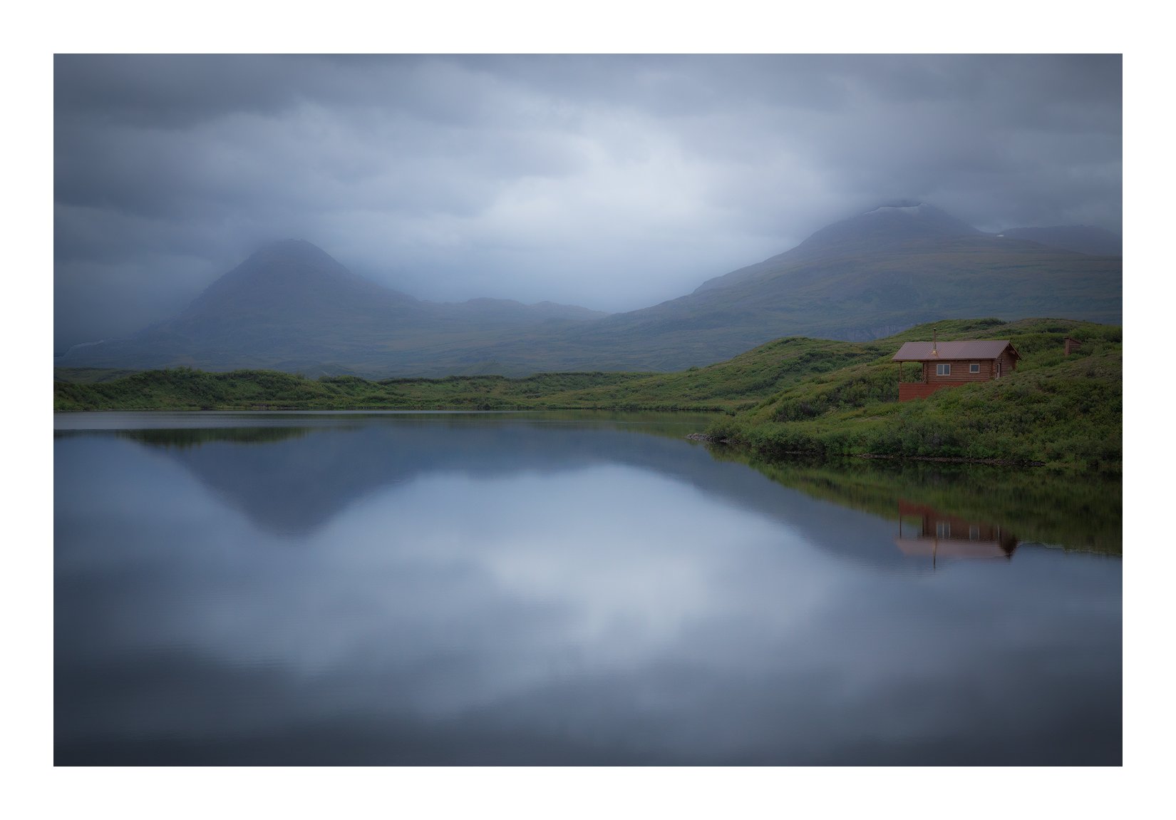
This was an image that was shot in 2014 and just sat on my computer because I could never render the image the way it looked. Until now. The camera just didn’t capture the sense of the place. I was pretty disappointed to see how it came. It was an exhilirating experience as I recall it. The clouds descended over these lakes to an even tone and a very slight drizzle came down on us. Thanks to the marvels of photoprocessing I am now sort of able to reproduce what it was like. Although, to be honest, 5 years is a long time to remember it all.
As I look at this image I could make the house colors pop out a big. The same could be said of the plants. I just think it might start to look fake. Fake, in a bad way.
Lovely calm scene. I would push the colours, it’s fine the way it’s is for me, maybe , and just maybe, up the luminosity of the reds on the house and the greens just a bit.
There’s some thing that could make the image more “imposing” but if this is the memory you have of the moment it’s a great one and it’s fine as it is.
Thanks for sharing,
Cheers
Igor, the impression I got at the first, was one I’m guessing that you intended. And it worked wonderfully. Having been in Alaska, and knowing personally the wonderful atmosphere it can have up there, I think you nailed it. To me, the subject is the overall impression you get…so I wouldn’t have brought the house forward with more color density or anything. If photography is about impacting the feelings of the viewer, I think you achieved it famously. Well done, IMHO.
The muted colours go really nicely with the soft light and the mistiness so I definitely wouldn’t suggest you made them more saturated.
Overall this is a beautifully tranquil image. The kind that stays with you and fills you (me anyways) with calm and peace. Nicely done!
This looks vaguely familiar, Igor… I think it looks great as presented. The muted colors are perfect for capturing the quiet, moody that so often accompanies fog.
Image looks great just as presented. No way would I increase color or contrast. Love the atmosphere. This image to me presents itself as very calming and theraputic. sp?
Of course I wasn’t there - but I can’t help but think that this is masterfully processed and expresses exactly (ok, well, at least pretty close) to what you experienced.
Agree with others leaving saturation as is - given the evenly distributed and dim lighting, the color/sat is excellent.
Love this as presented. An alternative suggestion would be to shave a little off the bottom - the symmetry is there and sometimes nothing wrong with going the 50/50 horizon route. No biggie, just a thought.
This is one of those images that as soon as I see the thumbnail, I go “oohh! So pretty”. I enjoy everything about the image. The texture in the sky, the reflection, the muted colors… very enjoyable.
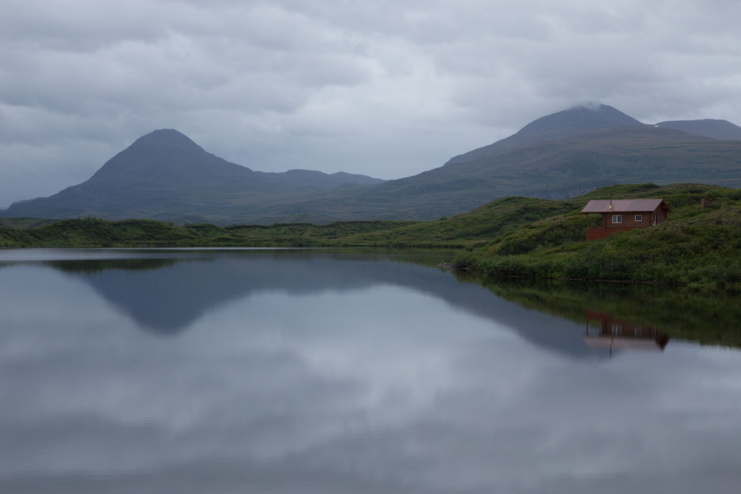
As an aside, if you could mention at least one technique that you have used in this image that you didn’t know back in 2014, what is it?
This looks great, Igor! I like the moody feeling of the scene. I can almost hear the stillness in the image. The composition works well and emphasizes the symmetry of the scene. Nicely done!
Very nice, Igor! The scene has a very tranquil and realistic mood that I love (especially when viewing large). The colors do look a little muted due to what must have been a fairly dark exposure. You did a good job of bringing out the colors but maybe just a tiny bit more saturation, particularly in the greens would be good. Being very familiar with wet scenes like this in Alaska, I can vouch that the greens can be quite strong, even on a wet foggy day! Excellent, simple but effective composition also. Well done!
I believe that I used Clarity in the opposite direction, ‘declarity’, which gave it a dreamier look. But then I lost definition in the clouds and reflections. I therefore used curves on both of those to raise the higher tones. It seems as though your subtracting tones and bringing them right back in but it doesn’t turn out that way when you see the results. I also vignetted this image, something I never do. But it works because it changes the light in the sky.
I was pretty much a straight photographer in 2014. My attitude was that you process an image for the lack of ability to shoot a good photo. I saw processing as a crutch more than a tool.
Great scene! Especially love the colors. There’s nothing wrong with the horizon at half way in some photos, and this is one of them. The symmetry gives an added sense of peace and stability.
Really nice, Igor. I know exactly where this is. For me, this does capture the feel of a soft, drizzling rain. I also like how the image is a bit darker around the edges, with a brighter spot in the middle, between the mountain peaks.
I do agree with Gary that even in the rain, green foliage in Alaska can be a pretty vivid green. It seems to more dependent on light than on whether or not it is raining.
I think this image capture the feel of Tangle Lakes very well.