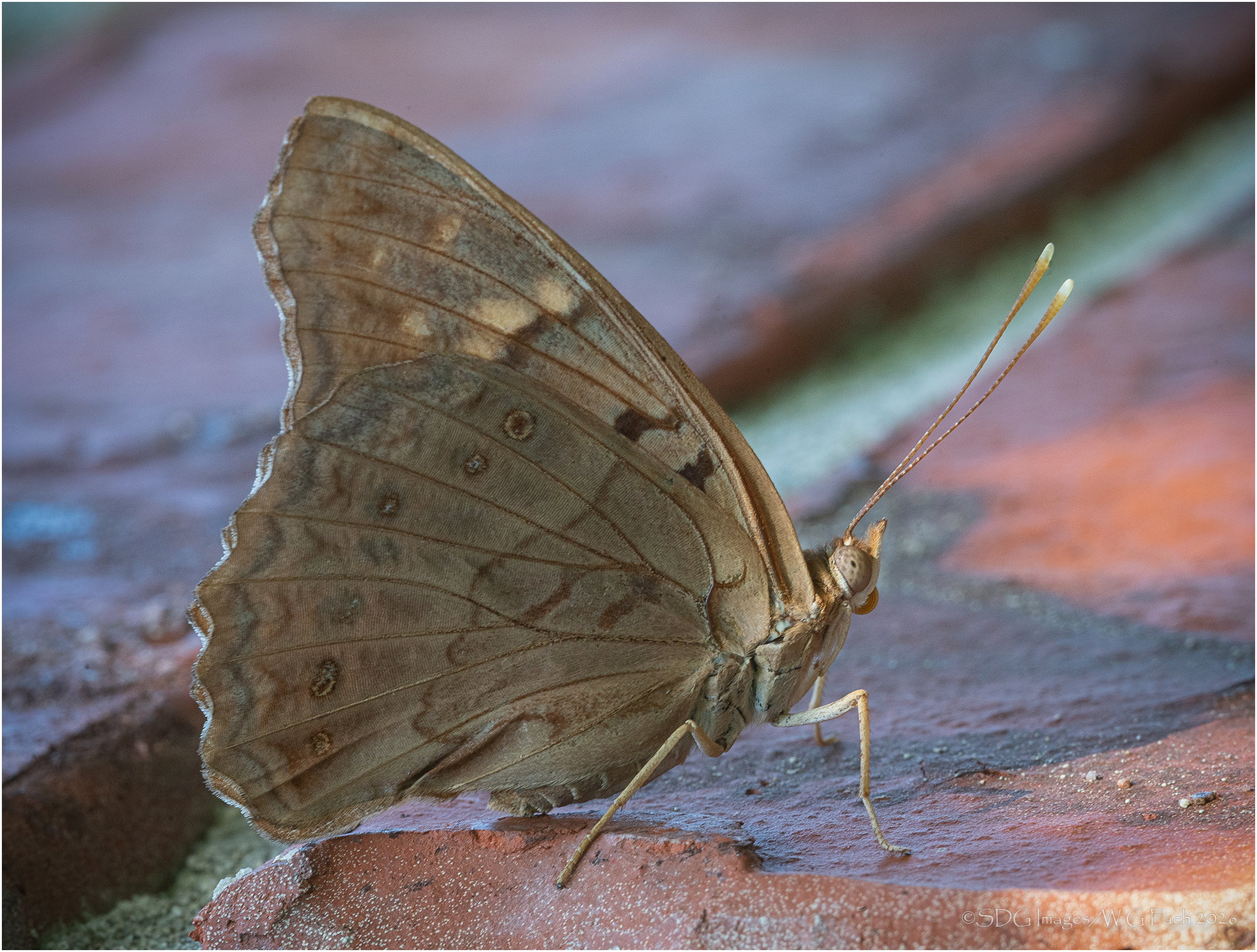
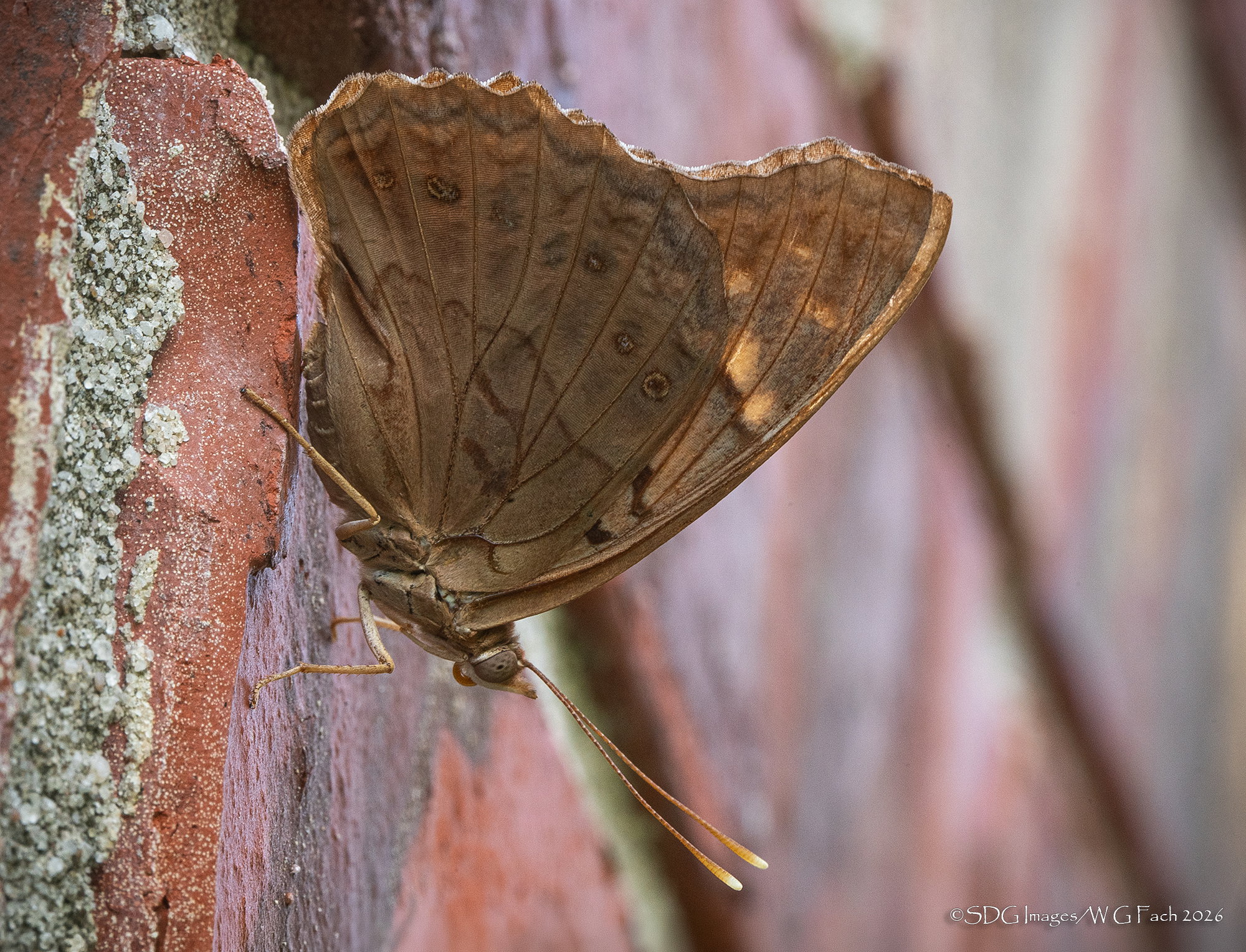
Actual orientation
The photographer is looking for thoughtful feedback on the image as a whole, especially around the areas noted below.
About This Image
Went on my normal garden tour this morning and scared up this little hackberry butterfly. I think it’s a female but can’t be sure. She flew up onto one of our crepe myrtle trees so I scurried back into the house and fetched the long lens rig. As I approached she took off but only went a few yards and landed on the side of the house. I got some record shots from a reasonable distance but was able to approach to my minimum focus distance using a 16mm extension tube. I also got the benefit of a small breeze moving the leaves in the trees behind me allowing little splashes of sunlight to pop through. The only problem was that same wind was jostling her just a little bit so motion blur fouled some of the shots but that’s why we have high frame rate cameras.
I decided to retrieve my 100mm macro and put the 2x on it with hopes she would let me get close enough for a tight portrait. The second shot was taken with the macro but since it only gave me 200mm of reach I couldn’t get close enough to get the full frame facial I was hoping for. So it goes.>=))>
Feedback Requested
The second shot was the actual orientation but I decided to flip the first 90° CCW so it looks like she is standing instead of hanging. I also much prefer the lighting on the first shot as there is just the hint of spotlighting on the face. The focus and detail with the macro lens is a bit finer but I had to crop more to get a similar proportion. Your preferences?
Technical Details
Sony A7rIII
Shot 1: Sony FE 70-200 f2.8 GM-II, 2x TC @ 400mm, 16mm XT
ISO 1600, 1/10 @ f22
Shot 2: Sony FE 100mm f2.8 GM Macro, 2xTC
ISO 1600, 1/13 @ f22