Critique Style Requested: Standard
The photographer is looking for generalized feedback about the aesthetic and technical qualities of their image.
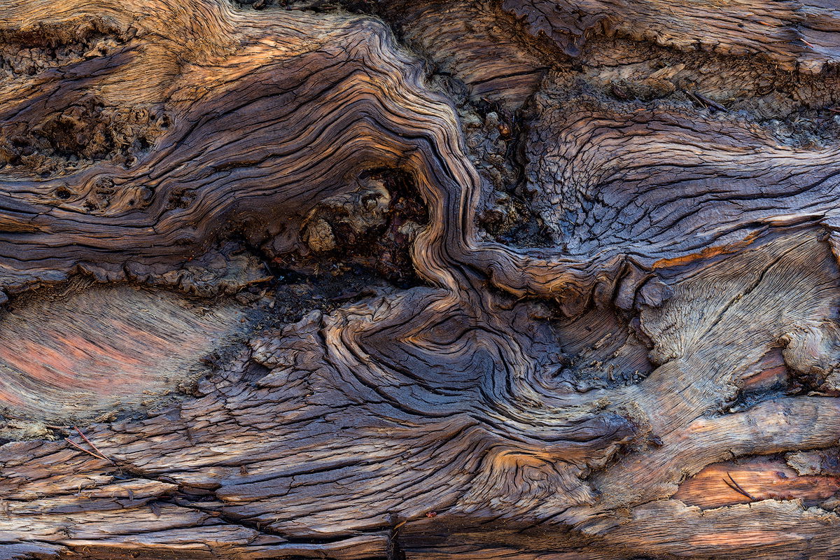
Description
This fallen old Lodgepole Pine log was still wet from a thunderstorm the evening before, which brought out the varied colors and accentuated the texture.
Taken near Sonora Pass several years ago.
Specific Feedback
I am interested in your overall reaction/perceptions of this image. I would also like to know how you feel about the saturation: Too much, about right, not enough?
Do you see the “Eagle”?
Thanks in advance for your comments.
-P
Technical Details
Nikon D-7100
Nikkor 18-140 @ 52mm
1/4s @ f16
ISO 125
ACR and Photo Shop CC
Critique Template
Use of the template is optional, but it can help spark ideas.
- Vision and Purpose:
- Conceptual:
- Emotional Impact and Mood:
- Composition:
- Balance and Visual Weight:
- Depth and Dimension:
- Color:
- Lighting:
- Processing:
- Technical:
1 Like
I really like this image Preston. The textures are great and the curves seem to all converge at that one point just right of center. The saturation is right on as far as I can see. I think the eagle appears just above the lower edge just right of the middle of the image. Let me know if that’s it.
Spectacular shapes and colors! The saturation is just right, for my taste. Weathered wood like this is rarely this colorful and it doesn’t feel forced or pushed at all. The blue-gray-tan-gold palette is so pleasing! Excellent job!
Well, I think the Eagle is in the eye of the beholder, Preston, but I love this image. All the complicated curves and swirls and all those lovely rich tones make this explorable for a long, long time.
Preston: Got a real nice  -meter spike for this one. What wonderful textures and colors. There is so much to explore and savor. Most excellent. >=))>
Preston,
This one I remember - since I was there that morning… 
Loved it then, love it know. The dew-damped and weathered log really shined this day and you composed a wonderful little section. Yup, the Eagle comes thru very well for me.
I think your processing is spot on. And I don’t have any nits! dang-it.
Not a nit, just a thought - you might consider a bit of a vignette to keep the eye central to the image.
Glad you shared this one!
I like this one as well. I guess what appears to be shadows is actually wet wood? It’s interesting in that parts of the image look like the dry washes, gullies, and badlands of Utah. I guess that’s what is so great about abstracts. Well, it’s not really an abstract but it does let your imagination run. There’s wonderful textures and colors here. I can see many sub compositions here as well. Don’t know if your lens could have focused in close enough for them though.
Looking at it again (just for the enjoyment!) I think the lighter oval-shaped area coming in from the left border pulls my eye a bit. I wonder if it could be darkened a little?
Preston, I love the shot. I don’t see an eagle but I don’t miss it.
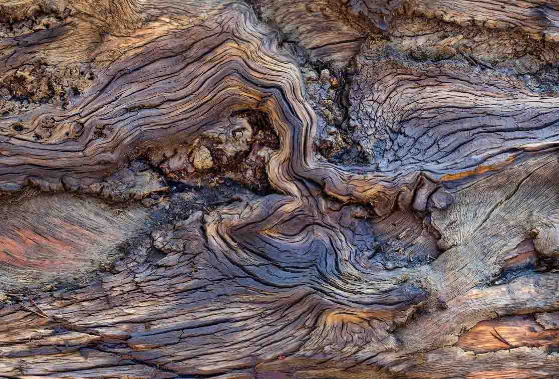
The top half of the image has a lot more dark tones than the lower half. There’s nothing wrong with that but I thought the image might be slightly improved if the distribution of tones were more even. Here’s a version with some local curves adjustments and a few other tweaks. Just a possibility to consider.
Thanks for your kind comments, everyone!
@Lon_Overacker . Adding a vignette is an interesting idea. Thanks, sir.
@Don_Peters. Meaning no disrespect, sir, but your rework looks a bit flat to me. In my OP, the lights and darks were pretty much as I saw them. There is very little in the way of post-processing.
-P