The Edge of Summer

Original Edit:

Revision 1 Edit:

Revision 2 Edit:

RAW:

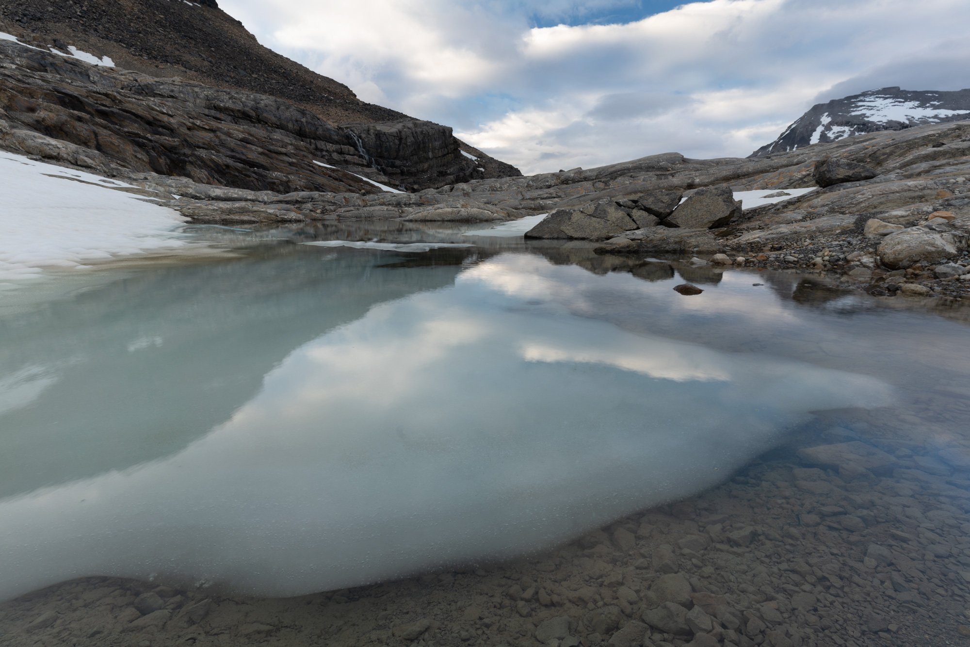
Summer is slowly making its way to the higher elevations of the Canadian Rockies. Here, a tarn on the edge of the Wapta Icefield is gradually being released from winter’s icy grip. In this image, I wanted to convey that transition, and to highlight the rich colors and textures of the transition from ice to water.

Specific Feedback Requested

This certainly isn’t my most dynamic composition. However, this image represents an attempt to leap forward a bit in my ability to use post-processing to emphasize the story by drawing your eye to the specific features of the image I want to you to notice most. However, I always worry that my post-processing is overdone or too sloppy, so honest feedback to that end is really appreciated. I’ve included a copy of the unaltered image for comparison.

Overall, I’m trying to figure out what I need to do to set my photography apart (aren’t we all!). Thanks for your feedback.

Technical Details

Sony A7RIII with Tamron 17-28 mm f2.8. 17 mm at f/13, 1/4 second at ISO 64.

Post-processing workflow:
1: (in LrC) White balance and minor tonal adjustments; +40 dehaze; lens corrections
2: (in PS with TK8) Luminosity mask to isolate mid-tones; then levels adjustment to improve mid-tone contrast
3: Dodge to lighten the ice/snow in the tarn and the limestone bedrock behind and above the tarn.
4: Luminosity mask to isolate mid-tones again; then curves adjustment to lighten mid-tones and slightly enhance contrast
5: Select sky and reduce saturation (-25) to draw eye to tarn and away from sky
6: Color mask to isolate light grey limestone bedrock; then color balance layer to reduce blue cast in this area (-20 towards yellow, +2 towards green; +5 towards red)
7: Vignette added to top half of image (removed from tarn area)
8: Luminosity mask to isolate brightest area of clouds; then burn to reduce highlights
9: Sharpening in Topaz Sharpen AI (“Out of Focus; Very Noisy” sharpen model)

Insofar as setting your images apart, your very subject matter does that so no worries there. And I like your approach to the subject - low and close! That is so engaging and exciting. Whenever I can’t quite get it right on site I remember that low and close usually works.

That said, I think you overdid the blues a bit. They are subtle in the original, but there and so bringing them out works, but I’d dial them back a bit. The sky looks too dark to be lighting this scene like that as well. Maybe take that exposure up a bit and then see about taking the mid-tones rocks down some. They look unnaturally bright - especially the layered stack bit about ⅓ from the left which was darker than the rest of the rock in the original, but is now the same level of brightness. There’s also a very dark rock or reflection at the top of the leading triangle that is an eye magnet.

But about the triangles - this is the strength of the composition. It’s what draws us in and ties it together. I’m not sure the processing has accentuated this strength. The sky and the ice with the reflection are two, but the wedges of rocky ledge are two more. They come together in the middle and wow…that’s what I’d work on in processing. This is a really striking photo and with a slightly different approach could be really something. Just a thought.

Thanks very much for those thoughtful suggestions, @Kris_Smith. I’ve applied each to the image below, some more modestly than others. Essentially, I reduced the opacity of the cliff band dodge (and reduced the area past the waterfall even more), shifted the ice/tarn a little further away from blue and reduced its saturation value, lightened the sky slightly, and spot healed the offending dark rock off the image. Is this closer to what you were envisioning?

Oh that’s so nice. I like the different darkness/hue values of the rock triangles and how much more natural the scene feels. And no more eye-magnet. I think it works, but more importantly, do you think it works? Is this anywhere close to what it was like to be there? I’ve never seen a glacier, and at this rate I probably never will, but I’ve seen photos and this just seems so like a land of change. Great job.

Hey Jeff!

I really like the icy alpine feel of this image, definitely not something most people will ever see in person. I also like that you chose to shoot this closer to the middle of the day, and not at sunrise or sunset as would probably be the conventional “wisdom” in landscape photography. Blues and whites do a better job of accentuating this subject.

I actually liked the midground rock dodging in the original, but I do agree it needed to be darkened near the edges, so rather than reducing its opacity globally I would consider just fading it out with a mask as it approaches the left and right sides of the frame.

Spot on removing that big dark rock in the water, I would also take out that little tiny one to the right of where it was. I’m not sure if you lightened the open blue sky at the top, but I would do so a bit more (probably dodge with a white color to simultaneously desaturate it) - not because I object to the color or darkness in principle, but it is a bit distracting as an island at the edge of the frame up there, surrounded by the lighter clouds.

Now, the main issue with this shot for me is also basically the cornerstone of the composition - the line of the ice below the water. I just feel like there’s not enough room at the bottom of the frame as-is to support such a large and contrasty division, especially since the line kind of follows along with the edge of the frame for the left half.

This can be mitigated with some adjustments though, I think! You could cool down the surface of the water where we’re now seeing through to the brown rocks, and lighten the dark shadow that the ice casts, effectively lowering the contrast between the ice and the lakebed. I know that division is kind of the point of your shot, I just feel like it’s too close to the edge of the frame and the whole image is supported by too thin a strip at the bottom.

When doing these adjustments, I would be careful about the apparent hue of blues shifting - for example, lightening the dark sky patch above, it ended up looking strangely cyan and I had to shift the hue back to blue and desaturate it. There’s also the blue strip of sky reflection in the water on the right edge - when you make adjustments to the water, watch out for the relative hue and saturation of this area. And I know it’s probably a glacial lake and you’d want that cyan color, but somewhat unifying the blues and cyans in the image makes it feel more cohesive to me.

So I took a stab at these suggestions myself:

1 Like

Jeff,

Wonderful alpine image. And I must say first, that I think yes, you’ve conveyed that message, or nature story of the transition between the grip of winter and emergence of summer. This works perfectly.

For me, my biggest reaction is how much that melting chunk of ice is trying real hard to be a cloud! And make this even more intriguing you have the real clouds reflection on the want-to-be clouds. I just think that interplay of the clouds, reflections and ice make for a very cool natural abstract - aside from telling the real story.

Color wise, the only suggestion I have is muting the blues at the very top patch of sky and the blue in the water right edge which Alex does a good job with that. For me though, I wouldn’t touch the rest ofthe colors in the water, pool, reflections. there are some nice hues from blue, to aqua, cyan and even hints of green in the left pool. I really like the original variation in hues.

Great image - and everything suggested I think are just tweaks, personal preferences - you’ve got a great image working.

Lon

1 Like

Thank you so much @Alex_Noriega for your very thoughtful and detailed feedback, and to you, @Lon_Overacker for your kind words. I have made some additional edits to incorporate some of what you suggested, Alex, though I do like the existing contrast between the ice and the lakebed, so I left that as is. Hopefull, this revision strikes the right balance. I have come to like this image quite a bit, so thanks to all of you for your thoughtful comments and suggestions.

2 Likes