Goodbye to Summer (+ two re-works)

ORIGINAL:

RE-WORK 1
Based on Alfredo and Dennis’ comments, I’ve cropped the image from the bottom with an eye to limit the rocks on the LLC. I also darkened the LRC.
I do like this crop version a lot!

RE-WORK 2
This adds a slight Gaussian blur (0.5) to the rock in the LLC. @Egídio suggested this. I’m not sure this is less distracting though…Hmmm…

Critique Style Requested: Standard

The photographer is looking for generalized feedback about the aesthetic and technical qualities of their image.

Description

This day felt that the beginning of the end of Summer, here in Southern California. There were many beachgoers as usual, and for some reason I seemed to see a lot of single subjects, both animate and inanimate, that reminded me of endings. Even this ICM wave action seems to be leaving the rocks and the scene behind…heading off to the right and a new place or season. Note: I did a 2-image multiple exposure. The rocks are coming though in the one more or less “stills” image, while the second panning shot comes through for the water.

Specific Feedback

I tried to keep the whites from being blown out. The histogram looks ok, but wondering if you think the whites are too bright or ok.

I like the white splashes here and there…adding some sparkle.

Technical Details

1/10 second, f/7.1, 100mm (35mm equivalent), ISO 100. Nikon D500 with 40-70mm lens.

I used the “Dark” blend mode to combine the two images in-camera. One image was mostly a still with maybe only a slight movement, creating more sharpness in the rocks. The second image was panning left to right.

In Lightroom I cropped out the bright white sky, and then added some warmth as well as contrast. Then a trip to Photoshop for a levels adjustment, a slight “Glow” filter, and a light blending in of another orange/blue abstract image taken at another time to add a little more warmth overall.
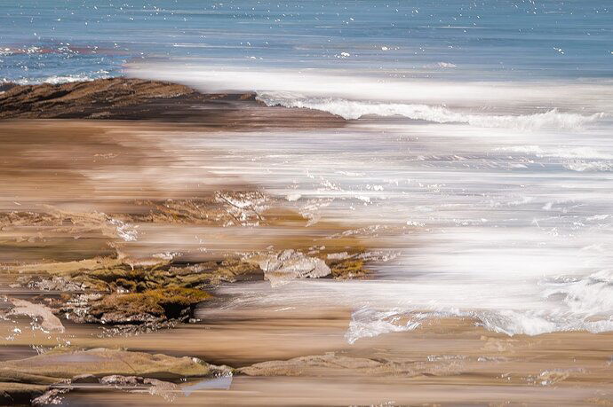
Mark, the highlights generally look ok to me. I was unable to import the image into Lightroom to check the histogram. The one area that could be darkened is that lower section on the right.

I like the title of the image and how you used ICM to express the story of summer leaving. The center section almost looks like a multiple exposure. The rocks in the bottom left corner draw my eye too much so perhaps you may consider cropping in to focus more on the waves.

1 Like

The whites look fine to me, Mark. The lowest rocks don’t bother me, but the second one up that looks like it might have seaweed or something on it has a texture that doesn’t seem to fit with the rest of the image for me. The image also confuses me a little because I can see the ICM in some places, but it looks like the rocks were more or less exempt from it-how did that work? Did you pan the camera in from the waves and then hold it still for a tiny bit? In any case, I like the mood of this image.

1 Like

@Dennis_Plank and @Alfredo_Mora , you are very, very observant! I forgot/neglected to say in the Technical section that this is also a 2-image multiple exposure. I will edit the Technical section to include this.
As I recall, I took one image almost as a still, with very little movement. That probably accounts for that more clear rock with seaweed. The second image was a pan from left to right. I don’t mind some
Clarity combined with blur, I actually kind of like it. But I understand how it can create a confusing look.
I believe I used “Dark” blend to combine them in-camera.

I’ll try a re-work with a tighter crop and post

Mark, the re-edited version seems more pleasing to my eyes. I will say, though, that the in-focus rock on the LLC still distracts me. I love the diagonal the waves created from the LRC to the ULC along with the contrast between the water and the sand. It is as if the waves are creating a clear separation between the two textures. I think that blurring (Gaussian blur?) the rocks on the LLC might decrease the tension in that area. It is a beautiful photo, and I especially like the blue ocean on the top. It stops my eyes from leaving the frame.

1 Like

Marc,

This is quite the mind bender actually. Before reading any comments I was wondering if a couple images were combined - even more impressed to learn that this was completed in camera:

Thank your re-working and posting the edited version. I agree with the others with the LLC, but for me it was really the dark spot in the corner that was drawing the eye. the crop most certainly simplifies things.

I do really like the combo of implied motion and still in same photograph. When I first opened this up, I too thought of “sparkles” up top; now I’m not sure if those white sparkles were part of the second “still” image, of if they’re blurred birds, or what. Speaking of the birds, I was thinking whether or not to clone the obvious gull near the top right edge; can’t decide.

The only other spot that draws my attention, is in the UL area where the still transitions to the motion. If it were mine, I might add some blurring to the ocean still part to create a smoother transition to the motion . Not a huge deal though, just an observation.

Cool stuff - gives me ideas that I’ll keep in my back pocket… :slight_smile:
Lon

1 Like

@Egídio Thank you very much for your comments! I’m glad you like the overall image. I posted a second re-work with Gaussian Blur added to that rock…very little blur at 0.5. To me it is more distracting than a sharp rock, but that is just me! Story-wise, I like the allegory of sharpness vs. blurriness for this story. The sharper rock representing a Summer still sharp in our minds, then moving to a less sharp near future (the waves). Maybe this is grasping at straws to justify the sharp rock, but what the heck…

@Lon_Overacker Thank you very much! I’m glad you like the combination of a still with a motion image. I’ve been playing with this combo for some time now and really enjoy the different look. It’s not for everyone, I know, but it is super fun and I’m glad you can have this in your back pocket. I hadn’t even seen the gull up there! We have lots of artists on NPN that have very keen eyes!

Mark, thanks for trying the blur. I agree with you that it really does not add anything. The textures are so different that just the blur didnt do anything to improve the image. I appreciated your indulging in the attempt. Thank you.

1 Like

Mark, You have made a most successful abstract with your ICM. I prefer the first unedited image. It provides more real estate on the bottom to give the image breathing space. Also the white water is better composed IMHO with the beach at bottom as in your original. Most effective image.

1 Like

Nice jobs on the reposts, Mark. Of the three, #2 would be my favorite. Putting that rock in the corner removed it’s disturbing influence for me and it then fit with the rest of the composition.

1 Like

Hello Mark, I saw this image on my iPhone earlier today and wanted to wait until I could see it on the computer before giving a critique. First of all, I love it! ICM is so much fun, but this image surpasses so much of what I see in ICM world.

I’m not in favor of cropping a composition that really works. So I downloaded your image and played with it in Photoshop. A dodge/burn layer allowed me to lighten the tones of those rocks and slightly darken other areas so those lovely diagonals would hold. I also slightly increased the contrast.

Anyway, it’s a little rough, and you can probably refine your original more effectively, but I wanted to give you an alternative to cropping.

PS There are a couple of dark areas, one in the LLC, the other to the right, and above it. I tried to open them up, but not successfully. If you can lighten them up a little without turning them gray, they’ll be less distracting.

Hope this is helpful!

Thank you @Larry_Greenbaum, @Dennis_Plank, and @Susanna_Euston. I appreciate your comments!
Larry, it’s always interesting to me how different we all see things. Most of the comments here were for a tighter crop. I appreciate your point of view about the larger expanse of real estate and the white water. There’s no “right” in art, eh?!

Dennis, thanks for your further feedback. It’s fun to see alternative images and compare.

Susanna, I appreciate very much your feedback. I like the idea of dodging and burning to maintain or emphasize the diagonals…I hadn’t thought of that! I’ll go back to the TIF file and see if those dark areas can be lightened somewhat without turning them gray as you said. Thanks again.

1 Like