The Little Willow that Could +alt

Edit: Thanks for the valuable feedback! Funny, I was concerned about the top edge and did some work; crop, etc. However, I wasn’t really so much concerned about the darker, longer, wider streak of dark. But I certainly see it now. Every frame I captured contained the standing wave up top and some form of the darker water. I ended up blending in the top of a different frame, did some dodging, burning and color painting to reduce the darkness. I think there is a better balance of tones. At least I’m hoping.

What do you think?

also - I significantly reduced the greens in the same re-worked color version, but not posting. Thanks for the feedback!


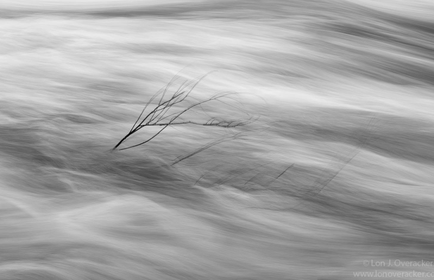
You might recognize this as the same willow in my previous post. I’m intrigued by the story of the willow struggling against the currents of the river. Of course the tree and small branches are moving which I think accentuates the story of motion.

Your thoughts, critiques and suggestions welcome.

You may only download this image to demonstrate post-processing techniques.

What technical feedback would you like if any?

Processing, colors, b&w treatment

What artistic feedback would you like if any?

This do anything for you? Which do you favor, color or b&w?

Pertinent technical details or techniques:

(If this is a composite, etc. please be honest with your techniques to help others learn)

This is a single image, no blends from any other frame. Minimal processing, my standard ACR adjustments and a little dodging and burning.

With the b&w, I kept the contrast fairly neutral since I wanted to show texture and motion. Very easy to get heavy handed here, but wanted to keep it simple.

Nikon D800E, 28-300mm @62mm, f/20 1/2s, iso 200.

Thanks for looking!

Put me down for the B&W. I find the green in the color version rather intense. I also would consider either a crop below the top dark horizontal or adding space of white above it. I find the dark area along the upper edge to be an eye magnet. The more I look, the more I prefer the B&W.

Lon, I think the colored one is good as it is. The B&W has more drama in it. I like the colored one most. Maybe the colors can be still a bit less saturated ( softer) to get the drama in this one to.

Lon, I definitely prefer the B&W and really like this abstract scene. I kept being drawn to the dark horizontal band on the top of the scene so I took the liberty of offering an alternate crop. It may not fit your vision but it was easier than me describing my suggestion. I see @Harley_Goldman suggested a crop and am not sure if this is what he had in mind as well.

I do like this dynamic scene very much!

You are an expert at finding the perfect shutter speed for rushing rivers. I really like these wispy textures.

Since it’s all about texture and contrast, I prefer the black-and-white version.

I agree with @Harley_Goldman that the dark line along the upper edge of the frame is distracting. Since it’s an area of relatively high contrast, it draws the eye away from the willow branch – the dark tones rivaling those that run along the center of the photo.

I did a subtle rework to decrease contrast along the upper edge. I also made a slight crop to remove the sliver of darkness on the edge. Whether this is an improvement is, of course, very subjective. Otherwise, I find this an excellent photo and a great concept.

2 Likes

Thanks @Harley_Goldman, @Alan_Kreyger and @atli for your feedback and suggestions. The crops work well and take care of the issue of the dark band up top. See my description above as I completely reworked.

Thanks @Ben_van_der_Sande thanks for your comment as well. I’m glad you like the color version. I just love the greens in the water.

1 Like

Lon, I actually prefer the color version, for the reason you stated which is the green color in the darker sections of the water. While B&W does a better job of emphasizing shape and textures, I think the green color adds more vitality to the scene. While this is very subjective on my part, I think the whites in the color version are a little too warm. I think cooling the whites would put even more emphasis on the green water. From some of your prior posts, it seems like you generally prefer a warmer white balance for some things than I usually do. And that is fine in terms of what style you are seeking, and I respect that. But in this specific case I think purer whites would further enhance the wonderful greens in the water. Here is my stab at this change in white balance…

I am late to the party, Lon but I really like the last B&W. The somewhat higher contrast line at the top of the first B&W (second picture of three) is a little too strong to be that close to the edge. I think the B&W accentuates the shape and texture better than the color. Very lovely!!

I find @atli’s b&w version to be the most artistic and emotionally charged image that has so far been offered. For raw emotion it’s hard to beat b&w.

Strangely, I like the color version best. I would usually choose B&W in this situation but I just like the overall “feel” of the color version best. The B&W have a harshness about them that just doesn’t appeal to me whereas I fins the color version way more inviting. I think I like Alan’s crop best.

1 Like