The photographer is looking for thoughtful feedback on the image as a whole, especially around the areas noted below.
Feedback Focus: Artistic + Technical
About This Image
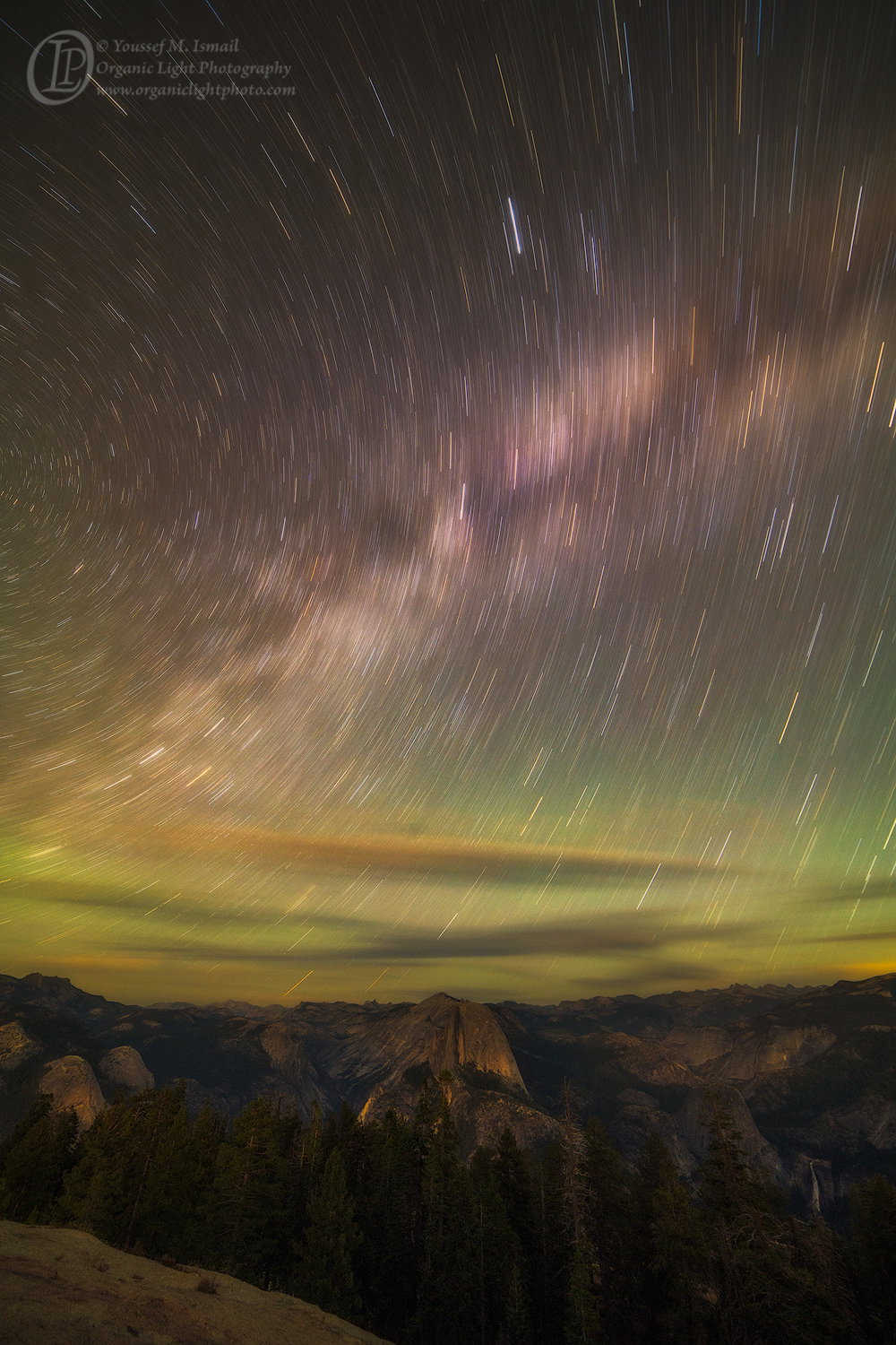
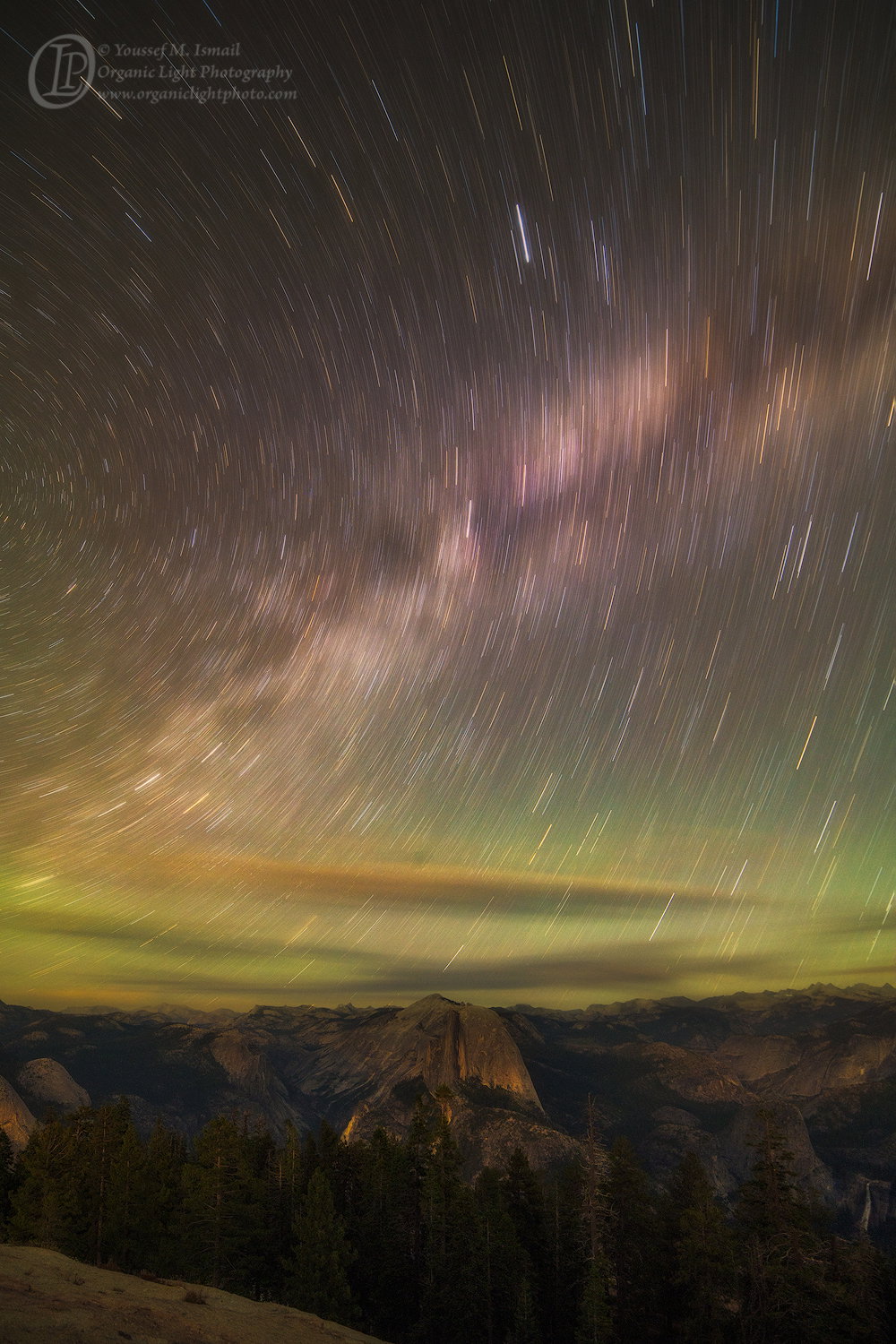
After photographing all the frames needed for all the panoramas of the Milky Way over Half Dome and before heading back I decided to do a 20 minute star trail over Half Dome. I failed to level out the camera and this produced a serious key stoning of the trees. I tired to do a perspective crop on the whole photo in PS but it stretched out the photo vertically so bad that the original, even with the key stoned trees still looked better.
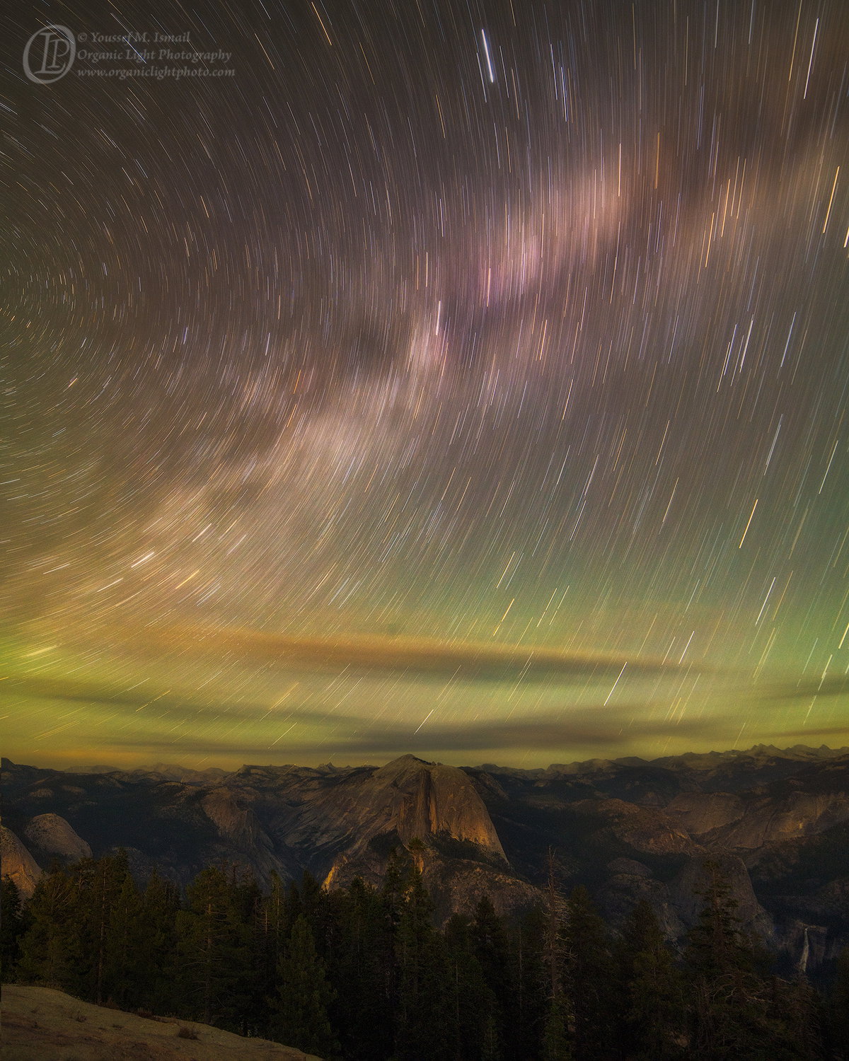
So I did the following. I selected the sky then inverted it. I copied that selection and pasted it in a new image. I performed the perspective crop on the trees and then copied the corrected portion back onto the original file. However, in the perspective crop, the width was enlarged and the the height was reduced slightly. I positioned the corrected tree layer such that it covered the original horizon line. This left gap at the bottom of the frame showing the original. So I made two additional images with regular crops to eliminate the bottom. The first is in the original 2x3 ratio and the second is in the 4x5 ratio.
I wanted to show how time passes over entities like Half Dome that seem to never change as time goes on. The resulting photo has an element of surrealism in that the star trails appear to be in front of the clouds, which of course is impossible, as well as going through the clouds - disappearing and reappearing. The Milky Way also creates a wonderful swath of blurred color in the sky. All set with a vivid sky glow and the celestial pole on the left edge giving clock-like motion to the stars.
Feedback Requested
Any feedback is appreciated, but I am looking for some specific feedback about the following:
Is the Key Stoning of the trees in the original uncropped frame distracting or are the trees to dark to notice it?
Which of the two cropped version is more appealing?
@Mark_Seaver asked in my Project Post what the land would have looked like without any moonlight falling on it. This photo was made just as the moon was setting so most of the light on the land is from the stars and Milky Way. Is the lighting on the land sufficient, or do you think it needs to be lighter?
If you have any idea as to how or why the stars appear in front of the clouds please share. I am still puzzled by how that happened.
Technical Details
Original
Camera: NIKON D850
Lens: 14.0 mm f/2.8
Focal length: 14mm
Shutter speed: 1200s
Aperture: f/5.6
ISO: 100
Perspective Correction Original Ratio
Camera: NIKON D850
Lens: 14.0 mm f/2.8
Focal length: 14mm
Shutter speed: 1200s
Aperture: f/5.6
ISO: 100
Youssef, first I’d like to say that you achieved a very striking image. It is obvious you put a lot of effort into achieving it and you arrived at a fantastic result.
To answer your questions:
It isn’t particularly noticeable until you get to the larger view, meaning it would be noticeable if you printed this image at any decent size. Is it so much that it ruins the image? In my opinion no it is not. That being said, I do prefer the perspective corrected version (s).
I prefer the original aspect ratio, I think the slimmer version places more emphasis on the sky, which is a major part of the subject. Perhaps it is better to say that it suggests the expanse of the sky better than the squarer version.
Regarding the stars appearing to be in front of the clouds I would offer this. I think it is an optical illusion of sorts. The clouds appear to be translucent. The tracks themselves are basically overexposed streaks. The clouds are just not opaque enough to hide those strong lines, so they are visible through them. To the eye that appears as if they could be in front of the clouds themselves.
I love the image, and I love the light in the foreground. I think you did a great job (technique will be noted) to achieve a perspective corrected image. I love the white balance for the image, as well as the overall composition. The only think I MIGHT do would be to burn the LLC foreground just a tad. It isn’t bad, but I think it catches the eye a bit more than it would ideally.
Youssef, I’d say you’ve succeeded in telling the story that you set out to capture. Your processing is pretty amazing. The land looks right for a night view, showing a thorough amount of detail. I do notice all of the “brighter” spots in the land, presumably due to local lighting (campgrounds, hotels, etc.). I think @Jonathan_Cothron has it right about the stars showing through the clouds. You’ve got interesting color in the sky, with much of the lower sky showing “air glow”. I too think that the ridge in the lower left corner should be burned-in a bit.
Wow! This is amazing and wonderful! The clouds are a very cool element and I don’t recall seeing an image with that effect of the stars. I love the colors – the airglow is almost eerie-- and the MW is smeared-out just the right amount. The wonderful lighting on the FG has natural-appearing detail and I love discovering Nevada Fall way back there. I second burning down the LL corner. A fantastic image!!
A big wow on this one as this is totally amazing! My favorite is the 4 x 5 as everything seems to be perfectly balanced within the frame. The light on the landscape is perfect for my tastes and sorry I can not help you with why the stars appear in front of the clouds. I do notice the key stoning of the trees in the original so I do like the correction in the 4 x 5. This sounds like a lot of planning and work on your part, but the end result is so worth the effort you put into it. Great imagination here as the image does show the passage of time beautifully.
Yeah, this is totally amazing. You’ve done a lot of work and it’s paid off. This is a spectacular image. I can’t say anything negative about it. I’m really impressed!
Dear Youssef, what a wonderful shot. No comment, no improvement possible for me. Since you asked, I prefer the original format, but don’t ask me why, just feeling. As for the clouds, I think the explanation is simple: they move. So the stars sometimes are visible, and sometimes not. If you look closely, some trails that lay ‘over’ the clouds, are visibly dotted lines.
Very nice work. Thank you also for the explanation.
Xavier
I just might like this better than your recent project images although they are very different. I much prefer the prospective correction and the longer portrait version. The colors in the sky particularly along the horizon are just eye candy. Sensational. The clouds make a huge difference to me. Terrific of you to grab this image after all of the work you put in to getting the project images. That was great thinking. I just love this one.
Those rich colors made me think the Northern Lights were involved; they are beautiful. This sounds like a lot of processing challenges, so well done. My favorite is the 4x5 for the reasons @Ed_Lowe notes.
Diane_Miller
(Diane Miller)
selected this as an Editor's Pick
10
An exceptional image with successful planning and wonderful vision!
Thank you all for your feedback and for choosing this photo as the Editor’s Pick this week. That means a lot.
Sentinel Dome is one of the easily accessible areas in Yosemite that gives such an exceptional 360 degree view. Only about 700 feet lower in elevation than Half Dome gives the impression of almost being above it. At sunset the view west is just as amazing as the Sierra skyline with the ability to see the Sierra foothills, the Altamira Range, and the Diablo Range; and particular Diablo Mountain show prominently. Which means in a clear day from Mount Diablo we should be able to see Sentinel Dome.
If you ever come to Yosemite National Park, Sentinel Dome needs to be on your itinerary.
Again thank for the feedback. I am still debating which format to print, but by next week it will be ready to hang.