The photographer is looking for thoughtful feedback on the image as a whole, especially around the areas noted below.
Feedback Focus: Artistic / Expressive
About This Image
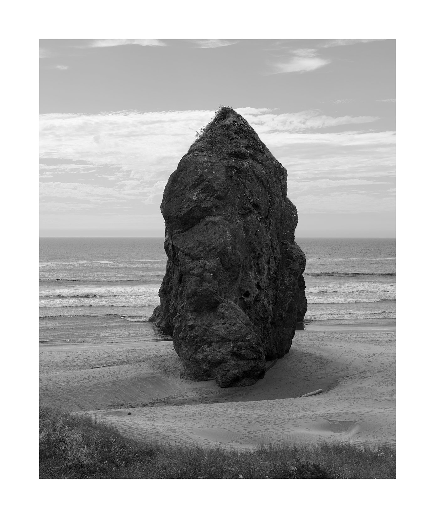
After looking at these stacks for a while I’ve decided that the spirit that captures Bandon the best is in b&w. I’ve seen many fine colored images of Bandon using the sky for that purpose but they don’t move me quite the same way as the stark boldness of b&w. So, I’m trying again with this approach
Feedback Requested
I’m wondering whether the mood or feeling I was aiming for comes through.
I’d appreciate feedback on the composition — whether the balance, framing, or spacing is working. The rock is pretty much centered.
This image shouts at you. The dark stack contrasts so much with the lighter surroundings you can’t help but lock on to it. I like the bit of vegetation at the top of the stack as well. The composition is interesting, and I feel like I want to move it one direction or another. I’m not sure where I would move it however, and I’m not sure that it would be an improvement if I did.
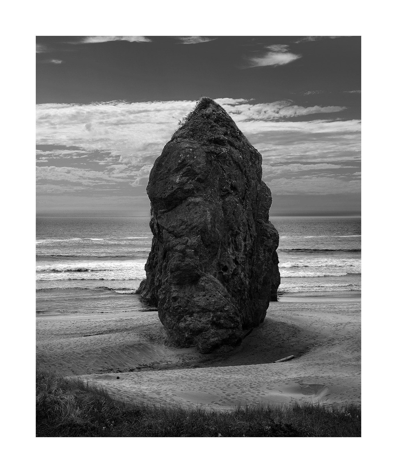
I’m not sure how much information you have to work with, but I would also love to see this with a little more detail in the stack itself. Perhaps a touch of clarity? texture?. It’s great as is, but I would find myself experimenting with that.
Hi Igor,
This was my favorite rock from the images shared in your previous post from Bandon. I like it’s solitary presence and the eddies of sand around it, which make it appear to be floating a bit, both solid and levitating. Quite the contradictory impression, but that’s what I like about it.
I like Jonathan’s treatment of the rock, and yet it makes it feel less like it’s floating. Maybe somewhere in between the two would be the sweet spot. I definitely like it centered. I know that’s unconventional, but it’s a monolith, a kind of monument to time. It feels like it should be center stage.
The only other thing I might play with, if it’s possible, is the top edge. I do find my eyes getting pulled up to the clouds touching the frame, and if there were either a) more space up there or b) no clouds along that edge, I think the image would have a more focused impact on the viewer. That could just be me, of course.
Well done on this beach! I increasingly find beach scenes really hard to compose, and you did wonderfully here.
ML
For me, the rock looks a bit odd, tonally speaking, in that setting. I think it requires more drama in the background, as well as some detail in its shadows. I’d move more in this direction, but (again) that’s just the way I roll. (No, it’s not a tidy edit, just a quick demonstration of intent.)
For me, the word “bold” jumped into my mind. Such a monolith, standing the test of time against the forces that batter. The composition looks spot on for that mood; well done.
I do like @Jonathan_Cothron’s idea, but otherwise love the lower contrast that let’s the rock sing out.
Although I’ve only been once, I would agree with the statement. Color has it’s place for sure - mostly in the grandiose sunset images where color dominates the scene and the challenge becomes what and how to inlclude the rocks… Of course b&w boils a scene down to basics like shapes and tones.
I’m really hung up now on “Ma” and minimalism… (in a good way.) In that vein, the question becomes, is this a photograph of a “thing” - a rock, OR is this image about mood or presence?
Interesting because I really like Jonathan’s edit. I think though, it makes the image more about the thing, the rock. Your less contrasty processing is more about the mood and the space.
In both cases, one of the things I really like about this scene is the depression of sand in front of the stack. It’s like the coming and going of the tide, along with the rock blocking the waves have created this erosion. I’d be real curious to see this same scene at high tide?
I think this is beautifully seen. And in classic Igor fashion, bucking the paradigms. Well done.
Thank you all. I have placed all 3 versions next to one another and I have to say that Johnathan’s version is clearly better than the original. So thank you very much @Jonathan_Cothron. I thought adding more detail in the darkness would make the rock less weight but it still has that quality and is more beautiful at the same time.
It is a rock but that’s just a vehicle to express something else. What that is I have a hard time putting into words. Because no matter what I say there is more to be said. There is gloominess to it. There is power. There is boldness. There is threat. There is weight. There is a sense of being overwhelmed. The reactions put into words are never ending.
I am glad that you have had a positive reaction to Ma. That it has perked your interest. As I look at my work I now think there is a lot of Ma in it. I first encountered the idea a couple of years ago and found it interesting. But I never fully understood it nor did I consciously pursue it in my images. However, subconsciously it appears that I did. And that seems to be how I often learn. On one level I don’t know it but on another level I very much do.