The photographer is looking for thoughtful feedback on the image as a whole, especially around the areas noted below.
Feedback Focus: Artistic + Technical
About This Image
Here’s yet another one from our gathering in Yosemite nearly 2 months ago now! Still sitting on a few more.
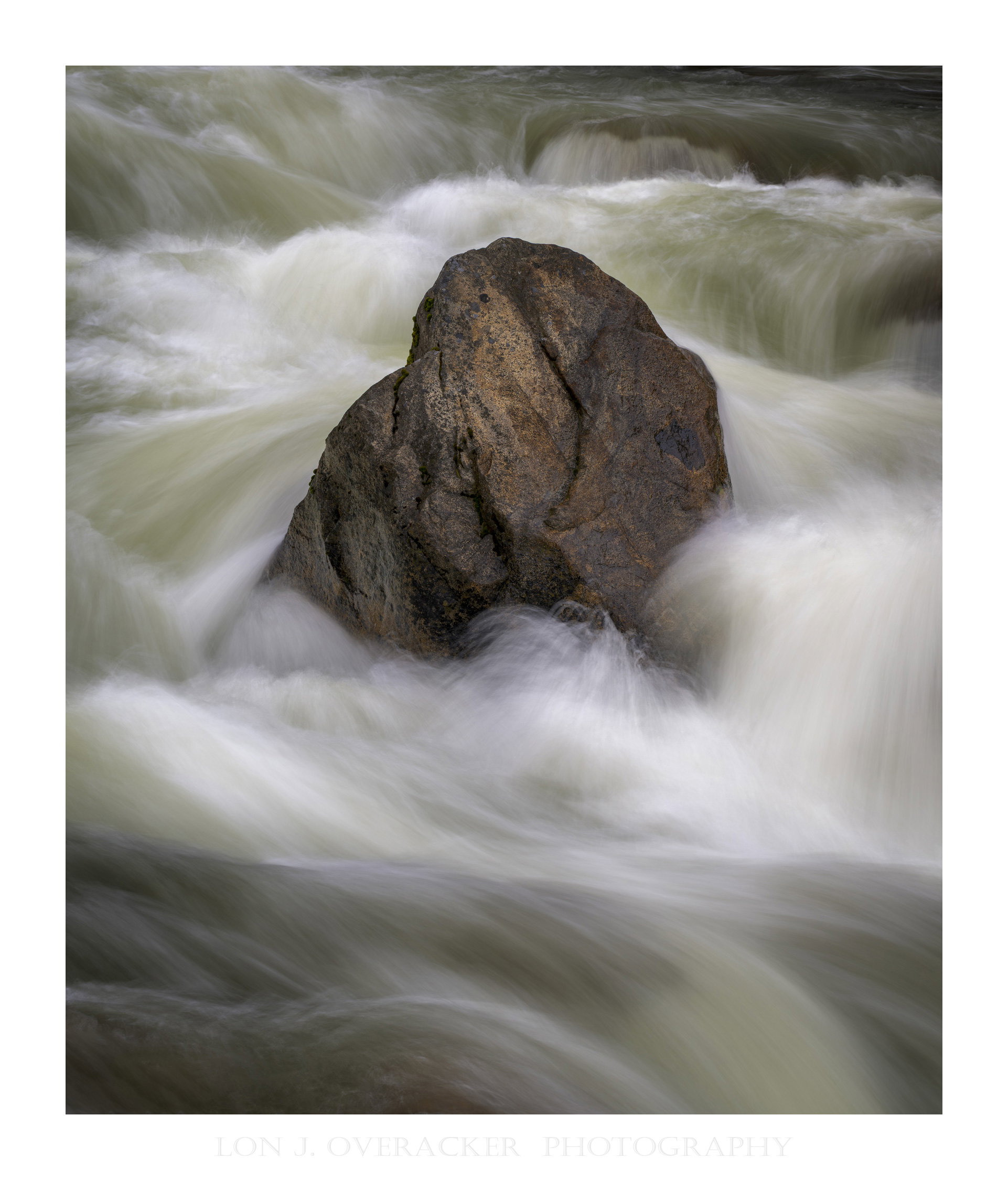
I believe this is technically inide the border of the Naitonal Park just outside the Arch Rock entrance near El Portal. Some of you who have been around a while will recognize this rock. I’ve posted myself a few times over the years. I always stop here and while the rock itself never changes, what changes constantly is the water and flow. I’ve seen this rock sitting above where not a drop of water is touching it… to the opposite extreme I’ve seen the rock buried beneath spring run off…
Nothing special here, but I get pretty excited when I come to this scene and find such a great balance between the spring flow and the sentinel of a rock standing against the forces.
Feedback Requested
Your comments and suggestions are always welcome.
I’m always curious if you think there are some processing tweaks or changes that can be made. Also, how is the water texture, flow? too fast, too slow? just right?
Any other thoughts or impressions appreciated!
Thank You!
Technical Details
Camera: NIKON Z 8
Lens: NIKKOR Z 24-120mm f/4 S
Focal length: 110mm
Shutter speed: 1/3s
Aperture: f/16
ISO: 32
First of all I have to say that I really like this image. It was confusing at first because part of the image is ‘Lonesque’ and part is not. The water is Lonesque but the dark rock? Well, that’s something else. The resulting image has pathos. And I think it’s due to the dark rock coming out of white foam (which isn’t foam). It almost seems as though it’s struggling to get out. The interplay between the two is interesting and engaging. I don’t know if you dodged the highlight on the rock or not. If I imagine it without that highlight than I think it does improve the scene. As for the treatment of the water, it’s fine. It’s the way you typically render moving water. There isn’t much color in this image and I think that works well because it would steal some of the drama. The rock has some nice cracks in it and the contrast between the sharp and the veiled works well also. IMO this is your best image from your regional outing.
I love this image. The flow of the water is very nice and the exposure on the rock is perfect. I can see why you keep going back to it. I have a few rocks like that in the streams near me.
I know that rock! I like the treatment here, Lon. The water has a nice range of tone and subtle color that is very appealing. Shutter speed was perfect for this. The rock also has a subtle (for lack of a better word) ‘glow’ that fits right in with the water. No nits or suggestions: This works nicely as-is.
-P
I like all the various directions the water appears to take as it heads towards the rock, around it and away from it. Great shutter speed giving the sense of movement and retaining detail in the water. Nice title also.
The composition is classic and perfect: the central subject is surrounded by lighter tones to draw the eye, while the “background” is darker and more distant.
The exposure time seems just right to me, creating the desired effect while still preserving some detail—which is always nice.
Well done.
Hi Lon,
I never tire of these rock and water images. Like you say, it’s never the same. This one has a particularly nice framing (tight, but we have a sense of the background) with lots of active water and that lovely shade of green. The rock itself has a lot of personality in this view. It’s almost as though it is stretching or bracing against the water. It feels both strong and relieved by the force of the water.
This may be nothing special, but it is so well composed and processed that I think it is special. I absolutely love the processing of the water as it gushes around the large boulder. There is so much texture and detail in the water to savor and enjoy in this scene. The soft subtle light on the boulder; as well as a couple of areas of water; is a nice touch as well. I could see bringing up the darkness in the URC, but that is just my personal preference rather than a nit. This has me wondering if your other images from this location would work out in a triptych. Anyway, beautifully done.
Lon, yes, there is some familiarity in this view ( ). This is an excellent rendition, with a fine look at the solid rock set off very well by the mix of fast and slower water. Having the rock surrounded by fast water that is itself contrasted with slower flow at the frame top and bottom creates a nicely contemplative view.
Keen observation Igor. Actually I did not target the highlight area, but in fact I
did dodge the entire rock, as well as tweaking(increasing) the Sat/Vibrance of the rock. That lighter area is natural, but by globally lightening the rock, that lighter area also got lighter. I definitely was trying to separate the rock a bit by luminosity and color, from the surrounding flow of water. Thank you for your kind words!
Thank you Marylynne, another good observation. This is a crop and the original showed rock both at the top and bottom of the frame. The bottom actually had a nice shape and worked with the flow, but I chose to exclude those to give the main rock more presence and a sense it was surrounded, if not engulfed in the spring flow. Yes, tight, almost concise framing, but hopefully a good balance between rock and water.
Our last full day! I’ll never forget it. What a trip. I think you nailed this composition, Lon. The rock itself is quite beautiful with it’s rusty browns and cracks. But the water enveloping the rock on all sides and in different ways is what is so intriguing about this image. My favorite area is in front of the rock where there are whisps of water curving and splashing around. I also love the bottom of the image where the water is textured perfectly and yet it’s darker than the rest of the image making for a perfect stage for the rock to present itself. I have no nits at all on this one.
This is great! Love the light on the rock and the dark water at the bottom of the frame. It’s acting as a pedestal, lifting the whole thing up. I love it.
 I like the treatment here, Lon. The water has a nice range of tone and subtle color that is very appealing. Shutter speed was perfect for this. The rock also has a subtle (for lack of a better word) ‘glow’ that fits right in with the water. No nits or suggestions: This works nicely as-is.
 ). This is an excellent rendition, with a fine look at the solid rock set off very well by the mix of fast and slower water. Having the rock surrounded by fast water that is itself contrasted with slower flow at the frame top and bottom creates a nicely contemplative view.