The photographer is looking for thoughtful feedback on the image as a whole, especially around the areas noted below.
Feedback Focus: Artistic / Expressive
About This Image
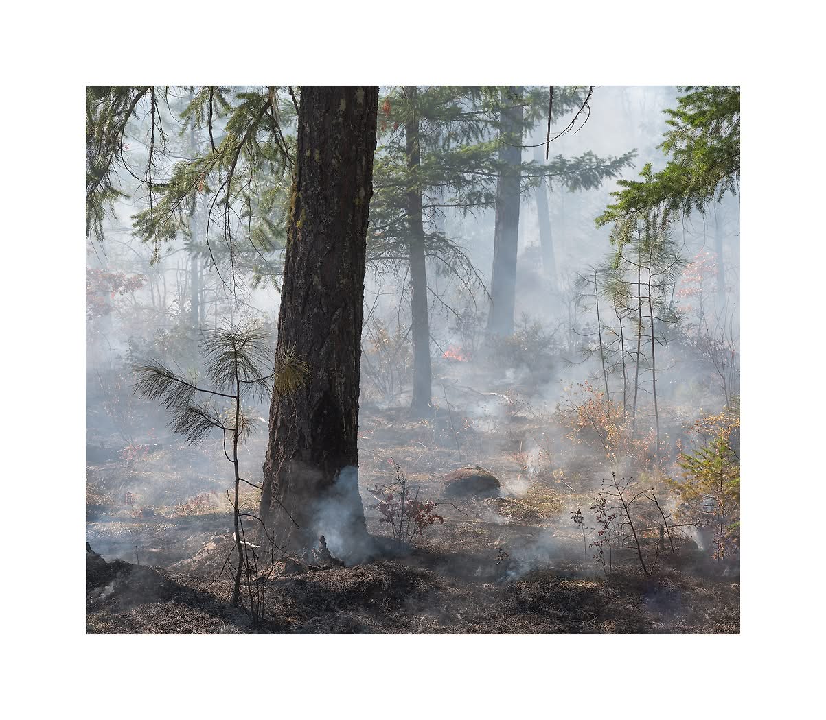
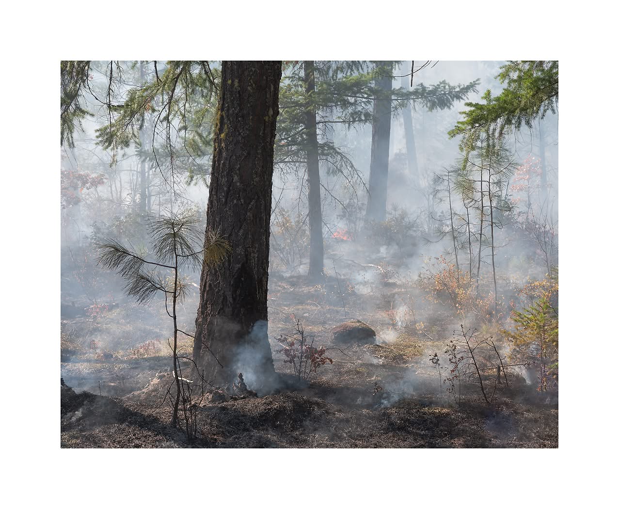
In this image of the series I tried to direct attention to the forest floor itself. I was attracted to the many puffs of smoke that rose up through the area. I also added some foreground subjects for interest.
Feedback Requested
Any suggestion is welcome. The challenge as I see it is to get the tonal range right by preventing the darks to get too dark and the smoke to be light and still not lose information. Did I get that right? There is also the question of color. Would a cooler color cast be better for the smoke? Should this be more saturated in general?
Regarding the processing, I think you got it just right, But I am not as enthralled with this photo as your others in this series. To me, it’s too literal. It looks like what it is, a smoldering forest floor. Not that that’s a bad thing. Just that the others have more mystery to them.
This photograph works for me, Igor. I like the composition, especially the small pine at the base of the big fir, showing succession in forest fire (prescribed or not). Maybe that’s geeky of me. Maybe that’s part of what could make it feel literal. But for me, what makes this one special compared to the others is the depth: the trees getting smaller and more diffused as we go into the back of the frame, the “battleground” effect of lots of hot spots add to this. The sun coming in from the left gives this a ambiguous mood for me: Is it a new day and hopeful or is it sun and heat creating the conditions for fire and requiring prescribed burns to mitigate it?
As for the color cast issue, I don’t think I would go more blue. I hope you get more feedback on that question, but to me, the warm palette is appropriate for fire, fire season, climate commentary, all of the things this image could be about.
One thing, and you might have done this intentionally, but to me, the thin branches coming in along the top of the frame (right half) distract me a bit. Easy enough to remove if that’s something you want to do.
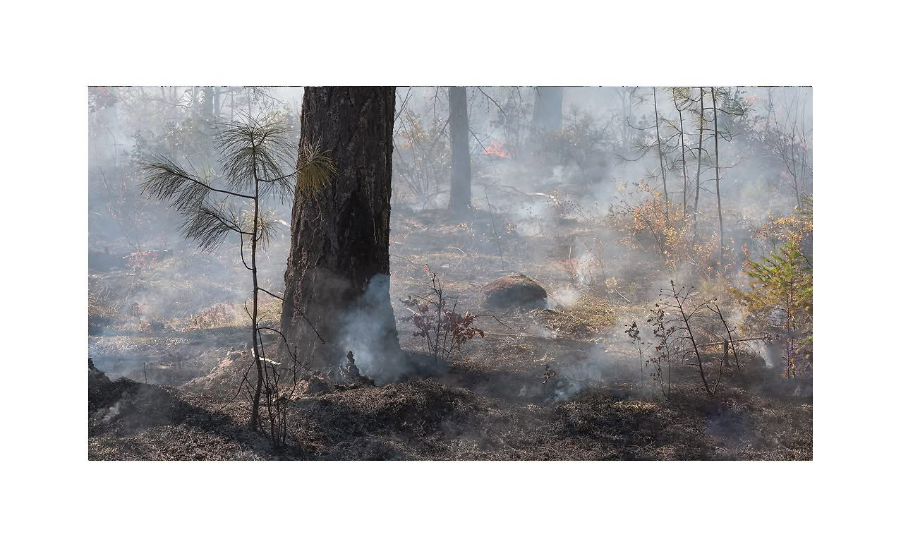
The color balance looks realistic to me, Igor as does the saturation. With all that smoke, colors aren’t going to be too saturated. Since you mentioned that you wanted to concentrate on the forest floor itself in this image, I got to wondering what it would look like cropped way down from the top, so I tried it. I can’t say I like it better, but it’s different.
It’s interesting that you suggest this crop because the image I posted is a crop of an image where the ground was even less prominent. So we’re all going in the same direction. I can see why you suggested that crop. I captures all the essentials and removes the more supportive content. I have to say that whenever I crop it’s just an eyeball approximation of where I would like the image to go and is not perfect. It just feels right at the time. It might be useful to put all 3 together and see what others think. Although viewership has been limited recently.
An amazing series. I dont think there is much to choose between a and B (I prefer A) - but if your aim is to tell the story of the floor and the smouldering surface, for me, it has to be the landscape format C by some margin
Best wishes
The only issue with C is that those 4 bush stalks on the right rise up out of the frame. Some may not find that objectionable though. To be honest I didn’t think of the image that way. I never think of images as statements when I shoot, as stories. I just move about and react without knowing why. That’s why coming up with titles is so difficult. I never thought of ‘a brave oak’ when I made that image. I did get tired of the evanescent smoke images and did willfully turn to other points of view though. If people find that to be realistic so be it. Personally I find this image poetic.
Hi - I’m never one for titles as essential items. They are much less important for series than single images so you shouldn’t frett . The poetry and the story of the composition stands out. All you can do is work the idea as fully as you can. A step to the right or left changes so much that you can end up shooting 36+ shots with minimal differences - but these differences matter so much when one is striving to elevate one’s compositions to the highest level.
I love the whole smoke series and I hope you find an image or three that you are proud of. Its a spectacular piece of photographic work
I’m hoping to make a project out of this. For now I’m posting individual images because I don’t expect to get the same feedback when they’re part of a series. There might be about 7 to the entire series.
I like the light in B the most, Igor. For some reason, when I open it it feels like it’s letting more light in than the other two. Should you decide to try C or a variation thereof, I’d definitely look at playing with the light as it has a bit to dark a feel to my eye. I do see what you mean about those four spindly trees disappearing into the top, though they don’t particularly bother me, I can see some people would have an issue with them.
I can definitely see a series from the images you’ve posted thus far of this area. I’m looking forward to seeing more of it.