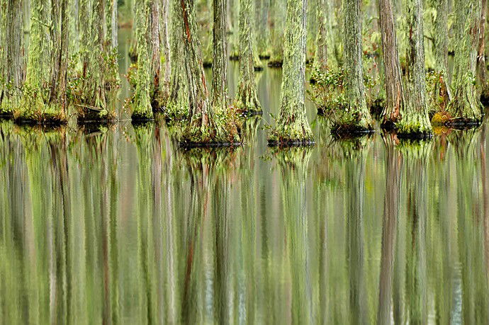
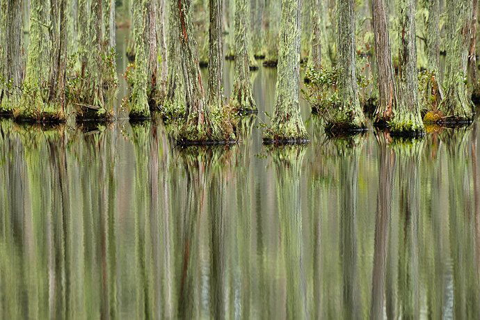
Lightroom version before editing in Photoshop/Radiant Photo
Critique Style Requested: Standard
The photographer is looking for generalized feedback about the aesthetic and technical qualities of their image.
Description
This was taken on NY day 2023 at Campbells Lake in South Carolina. It was a grey day and I took several versions of this, but I loved the abstract look of the reflections.
Specific Feedback
Thoughts on composition, color, brightness, crop, or whatever are most welcome. Do you like the lightroom lightly edited version or the Photoshop/Radiant Photo version? Are the trees too bright? Should I add a vignette? Since it’s the reflections I love, should I crop down to the bottom of the trees so you mostly see the reflections?
Technical Details
Fuji X-T4, ISO 500, 70-300 lens at 231 mm, 1/70 sec at f7.1. Developed in Photoshop with Radiant Photo layer to add some brightness and contrast, and Topaz denoise.
1 Like
Oh boy do I like this, Roberta! Regarding the crop, I think it could be done, but I don’t think it is wrong the way you have it. Maybe getting rid of the top 1/4 of the trees, still leaving most of them would pull the eye further down into the ripples. I think the trees are a bit of a “magnet” because of their sharpness and contrast compared to the water (naturally) but I find myself running my eyes up and down this image over and over. If you just had the ripples I think you would lose some of that.
If you aren’t opposed to it (I know some are) I would think about cloning the orange/brown moss on the far right side. It breaks up the green tones a bit in my opinion.
A vignette just in the bottom half of the image could be interesting, again to keep the eye bouncing back and forth between the trees and the ripples.
Personally, I enjoy the darker version at the top. It emphasizes the green patterns which I love more-so than the other.
I’m a fan!
Interesting image. The rework is an improvement. I would compose it so that the image shows more above the knee than below the knee, or I would make them equal. The trees above the knee are tonally dominant so giving them a smaller portion of space feels awkward.
Wow, Roberta, this is lovely! My eyes go up and down taking in all the details and I really like the balance of the composition. I agree with @David_Wallace about that orange area of moss would help a lot. I too like the top version - more vibrant and more ‘punch’. Great job of seeing this and composing it!
Ooooh, gorgeous! This is one of the best bayou scenes I’ve ever seen. That orange moss doesn’t bother me too much. What strikes me is the brown reflection right next to the right side frame. That catches my eye more than the brown moss. Those are nit, though. This is super.
@brenda_tharp @David_Wallace @Bonnie_Lampley @Igor_Doncov Thank you all so much for your very thoughtful and really lovely feedback! I agree that the top version is better, but really looked at it so long, I couldn’t be impartial anymore.
I will take out the orange moss, and I will try cloning out the brown reflection on the right and see what it does. And I will try a vignette on the bottom.
@David_Wallace thank you for your very detailed feedback. I’m honored that you are “a fan”!!
@Igor_Doncov thank you for your feedback, and although I don’t think I have a photo of the trees and reflections where they are equal, I will definitely keep it in mind.
@Bonnie_Lampley - wow, I love that you think “this is one of the best bayou scenes”!!
Roberta,
This is gorgeous. I’m with Bonnie on this, and additionally I find this to be quite the unique cypress/swamp image. MOre typically we see either the larger, singular trees, OR focused on the knees. But I just love the concentration of the trees and of course more importantly their abstract reflection. This is just awesome!
The orange moss doesn’t bother me either, in fact there are hints of the moss throughout and so not an issue for me. If anything, I would crop the right edge slightly to remove the tree/reflection on that far right edge.
Of the two versions, I prefer the slightly less saturated version. I think given the abstract nature of the reflections, that extra saturation is not needed to keep this one an impressive capture!
Maybe, maybe, you could crop/shave off the top to keep the eye more towards the abstract reflection - OR, maybe even just a slight burn along the top edge would do the trick.
Very little tweaking needed on this one. Beautiful!
Lon
@Lon_Overacker Thank you Lon for your insightful feedback! I am going to crop the right edge a bit and maybe find a happy medium between the top and bottom saturation.

