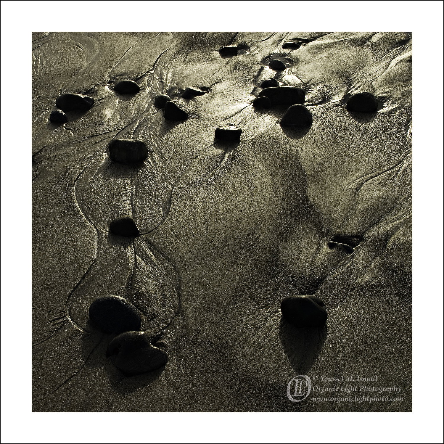
The photographer is looking for thoughtful feedback on the image as a whole, especially around the areas noted below.
Feedback Focus: Artistic / Expressive
About This Image
Taken one afternoon while strolling on the beach back in 2011 when I had still been primarily photographing with the 4x5, but I had a Canon D60. I come back to this every once in a while. I have printed it and its a great print but maybe because it is square in format and somewhat sepia in tone, it does not garner much attention and sits in the print bin at the show for a very long time. So I do not print it anymore.
Youssef, this is striking and I like it a lot. The backlighting is very effective. The stones and shadows grabbed my attention first but then I noticed the intriguing patterns in the sand. It’s simple and very effective. The crop is just right.
Some of the rocks at the top don’t add much but they don’t bother me, either, and they were there.
Youssef, I agree with @Don_Peters that this is a striking pattern with it’s swirling gold tones and the scattered nearly black rocks. The strong black on gold pattern makes it fairly abstract, which mean that it appeals to a small number of people. I wonder about a bit of mid-tone dodging in the bottom 1/4 to add a bit more interest there, although that might reduce the top to bottom eye flow.
I love the patterns in the sand, Youssef, and the array of rocks works in the frame very nicely. I do wonder if lifting the shadows just a trifle, particularly on the rocks, to give just a hint of detail might make a difference. However, it might destroy the whole feel of the image as well.
I’ve never dabbled in shows, but I’ve often wondered if there is a Catch-22 for images like this. It is best appreciated by the refined photographic eye, but most photographers who would truly appreciate this are “rolling their own” and unlikely to purchase a print?
Anyway, I love it. The swirls are a wonderful flow through the image, leading from darker to lighter, and the rocks match that flow and add a lot of interest. The color is beautiful, almost like a strong monotone. Everything comes together for a very strong image.
I like this idea, but if you do I would be subtle and restrict it to the darkest of the darks. (You don’t want to lose those nice shadows.)
I love looking for these intimate beach scenes whenever I can. This image actually brings me there. And what strikes me really is the light and the impression of the time of day, the conditions. The slightly dark approac and higher contrast really add to that impression I have.
No details in the shadows really, but in this presentation, I think it really works. The detail and texture in the wet sand is especially nice.
Sorry it didn’t sell well for you, but I think perhaps like John’s thinking, it’s the photographer’s who might be the ones understand and appreciate these scenes.
I wouldn’t change anything. Beautifully seen Youssef.