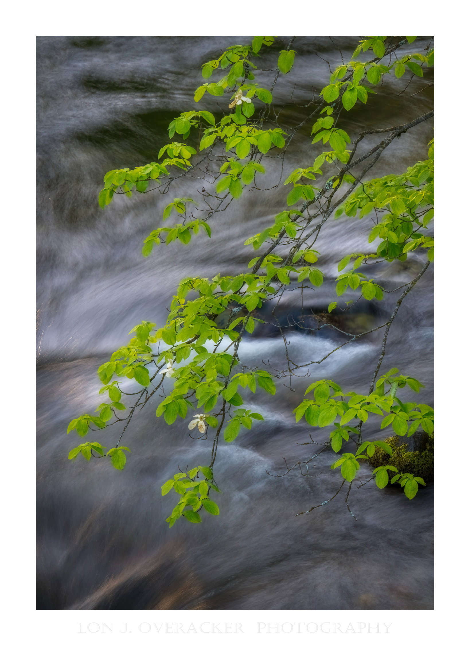
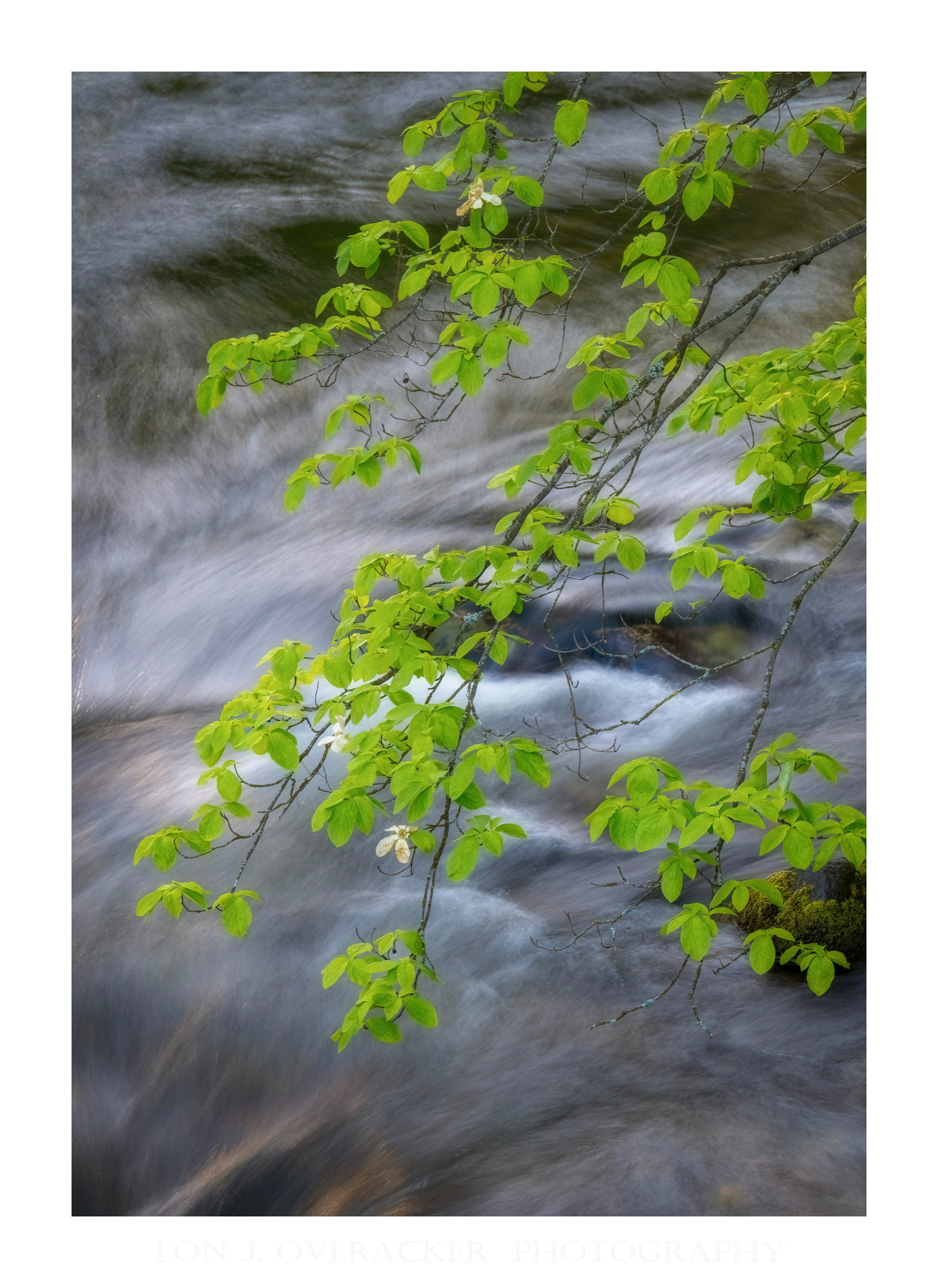
What changed: Greet feedback! I did a color selection in ACR on the greens, inverted to select the background, then adjusted the whites/highlights down. Then a 2nd mask with just the leaves selected to increase brightness. Yet another mask for the leaves, adding linear gradient to adjust just the upper leaves… whew… then back in PS, selected the blossoms to brighten slightly…
Added after receiving feedback from the community.
The photographer is looking for thoughtful feedback on the image as a whole, especially around the areas noted below.
Feedback Focus: Artistic + Technical
About This Image
One of the few bucket list items from our trip to Yosemite back in May was the Pacific Dogwood bloom. For the most part, we missed it, especially for those scenes where we were hoping for dogwood over the Merced… Oh Well, not to be this year.
Because I’m a creature of habit, I photographed the scene anyway. Of course I’ve photographed this before during prime conditions… but still I wonder if this stands on it’s own merits. This was captured just 10 minutes prior to my previous post, and from the other side of the Pahono Bridge looking up river.
Feedback Requested
There are just 3 wilted blossoms left - Are they enough to tell a story? Or too insignificant and the spring greens of the new leaves over the river dominate?
As always, I would love your feedback and suggestions? Processing? WB, saturation? Composition? Thanks for any thoughts.
Technical Details
Camera: NIKON Z 8
Lens: NIKKOR Z 28-400mm f/4-8 VR
Focal length: 140mm
Shutter speed: 1s
Aperture: f/16
ISO: 80
As a stand alone photo I think it was composed wonderfully. The arc of the main branch creates a nice flow from URC to LLC. The two other accompanying branches follow along as well. The dynamic water action in the Merced gives the photo some life, if that makes sense. I don’t think the wilted blossoms have enough draw to make a point, and might not be very noticeable. But I like the color palette that sets a calm mood.
The composition is great with the branches in a nice curve, entering the image in a good way and filling the frame. I also like how you have captured the water, letting it have a dynamic feel not becoming too smooth. There are enough blossoms left, but maybe they could be emphasized a little bit more (maybe increased brightness/whiteness and contrast?), so they stand out more as compared to the green leaves. With this in mind, the whiteness of the brightest part of the water also compete somewhat with the blossoms, drawing some attention away from them. Maybe the brightest parts of the water could be darkened somewhat? Anyhow, the image is very good as it is!
Yes, this is clearly a Lon Overacher, “branches in front of the Merced” view. I like the action in the water behind the branches and the nice “green glow” in the leaves at the lower left. My thought would be for some mid-tone dodging (or maybe some green dodging) on the rest of the leaves to fill the frame with those glowing leaves. Here’s a look where I did “green dodging” on the darker leaves and also some lights dodging of the water in the upper left and lower right. Looking at the post, I think I’d dodge the greens near the top even more…
One of the great things here at NPN is that I’m always learning something new… or at least trying technicques I’ve not really used before. In this case, I took the feedback of the whites/highlights in the river and attempting to tone them down. I thought that was a keen observation. What I had never done before was a color selection in ACR, then inverting so basically selecting the water only. It was fortunate the greens were mostly the same tone/color that the selection was pretty straight forward. Anyway, once the water was selected, you could use the slides, Curves whatever to bring down the whites. I did the same selection only not inverted to deal with the leaves.
The only question now is, did I take the leaves too far?
This was great feedback. Once the water/bg was selected, I really did a global adjustment, but also attempted to bring down the highlights more, but also the highlights throughout the rest of the river were also darkened some.
Another keen observation Mark, and I agree. In fact I wondered if this would be noticed before posted. I attempted to address with a gradient mask in ACR and address the upper leaves. This adjustment was trickier trying to pick the right balance and remain natural looking. I’m sure I could do some additional tweaking.
Thank you again for the comments and valuable feedback!
This does indeed look like an Overlacker image. I had the same reaction about the leaves and you’ve redone that. I also think this image is slightly underexposed. I guess that’s subjective though. But this subject needs the vitality of Spring in my opinion. Well, now the greens look oversaturated a bit. There’s a fine line in there somehow.
Great image
Your revised image with the dodging is now globally a little dark for me.
I hadn’t realised how much the brightness in the water just behind the leaves were making the leaves “pop”
This tweaking business is really hard - but if you compare your image with @Mark_Seaver 's you’ll see the leaves have a little more local “pop”
Dont drown in the level of critique though … the reason you’re getting so much feedback is it a wonderful simple intimate landscape Eliot Porter might have produced. What you like is always of prime importance!
Eliot Porter is a magnificent photographer is worth an in depth investigation
You might also look at Landscape Beyond - by David Ward
Indeed! I’m pretty sure I would waste tons of paper and ink if I were to print an image like this. I agree with all your points about underexposure, slight saturation, etc. But then where does one draw the line, and then leads to Huw’s comment:
I try not to! (drown in critiques,) but certainly I value and I learn from them. Thank you for the references!
Lon, I’ve been on a trip for over a month with my wife and dogs and I’m just now seeing this. I’m glad you took this image. It’s actually quite unique. Most wouldn’t bother to shoot something like this because the blooms were way past prime and starting to turn brown but therein lies the story. Spring with the onset of summer approaching. I too photographed many of these “way past prime” dogwoods on our trip and I like most of them.
Your composition is terrific. I love the long bending central branch going through the bright ripple of the Merced while the other two branches play a secondary framing role. The upper left corner with the darker textured water ads interest for me.
Your revision looks great to me even though it does look a little underexposed, but I think that’s what I like about it. Understated. As we’ve talked about before, the greens on this trip were, in your own words, Preposterous. I’d agree. I don’t think I’ve ever seen greens as vivid as we saw on this trip and I’m just getting back from the Pacific Northwest for comparison’s sake. I think softer greens with the wilted blooms makes sense. Well done. Only 3 1/2 months till Fall in Yosemite Valley.
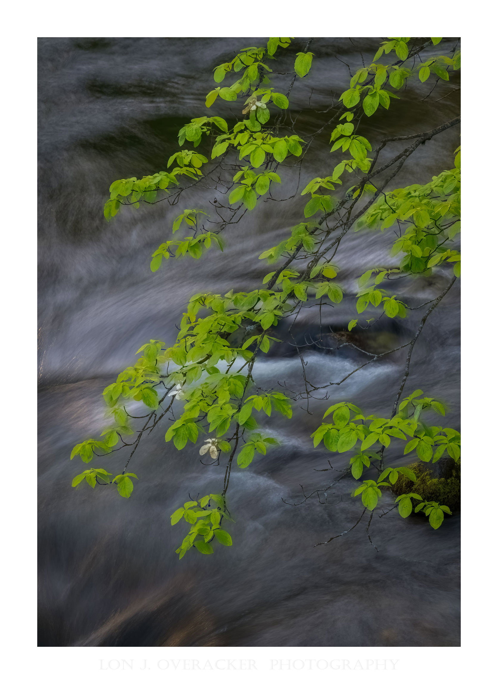
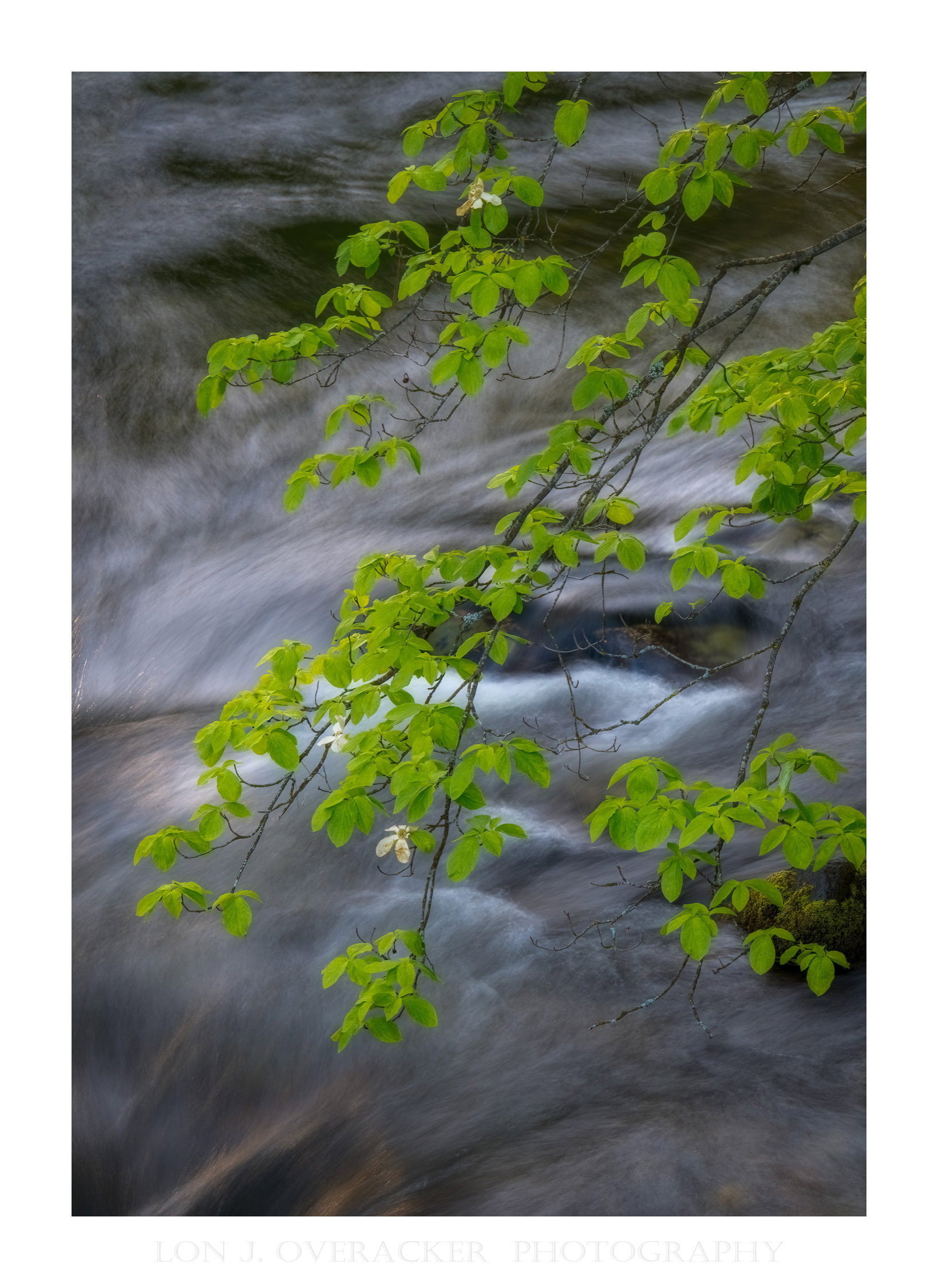
 I like the action in the water behind the branches and the nice “green glow” in the leaves at the lower left. My thought would be for some mid-tone dodging (or maybe some green dodging) on the rest of the leaves to fill the frame with those glowing leaves. Here’s a look where I did “green dodging” on the darker leaves and also some lights dodging of the water in the upper left and lower right. Looking at the post, I think I’d dodge the greens near the top even more…