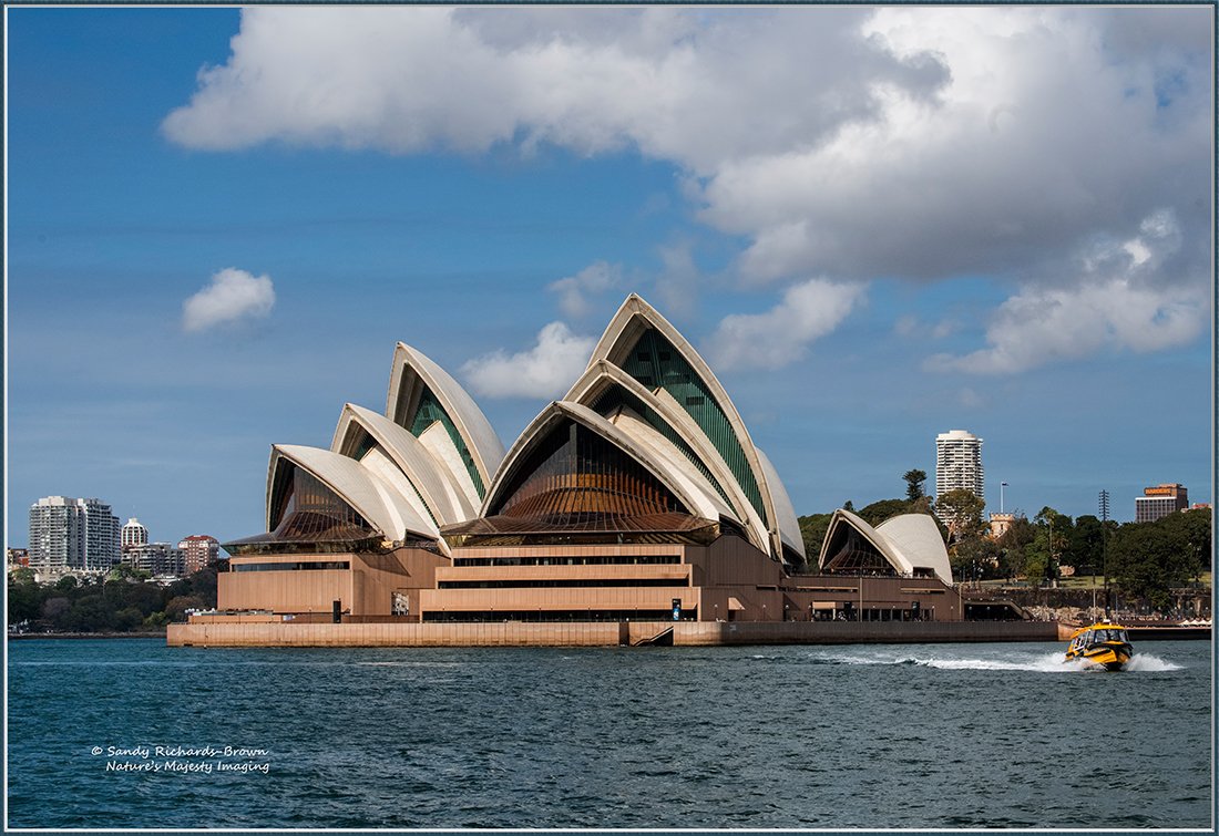
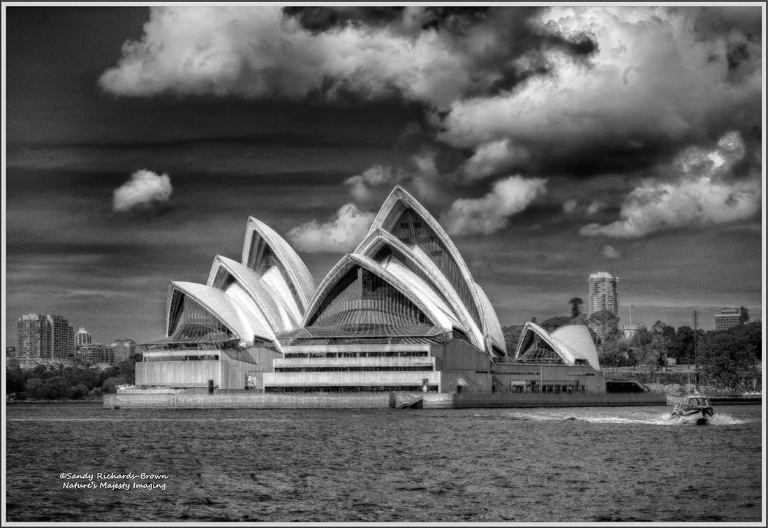
Sydney, Australia Opera House from our boat
Lots of great icons already posted, so I thought I’d do something different.
Converted original image to B&W, then played with HDR.
I’d be interested in thoughts on both images - the original is below.
Sandy
Sandy, this is a good look at this icon. The tour boat is a nice extra. I like the high contrast in the clouds of the b&w version but feel like the opera house stands out a bit more in the color version. Adding some extra contrast/brightening the “domes” would probably fix that.
Mark, thank you for the Always-welcome suggestions.
Here is the implimentation - bright enough?
Sandy