… Alvord.
A scene from the Alvord Desert in east Oregon. Actually, it’s two scenes from the desert. Which do you prefer?

or

less yellow, more luminosity:
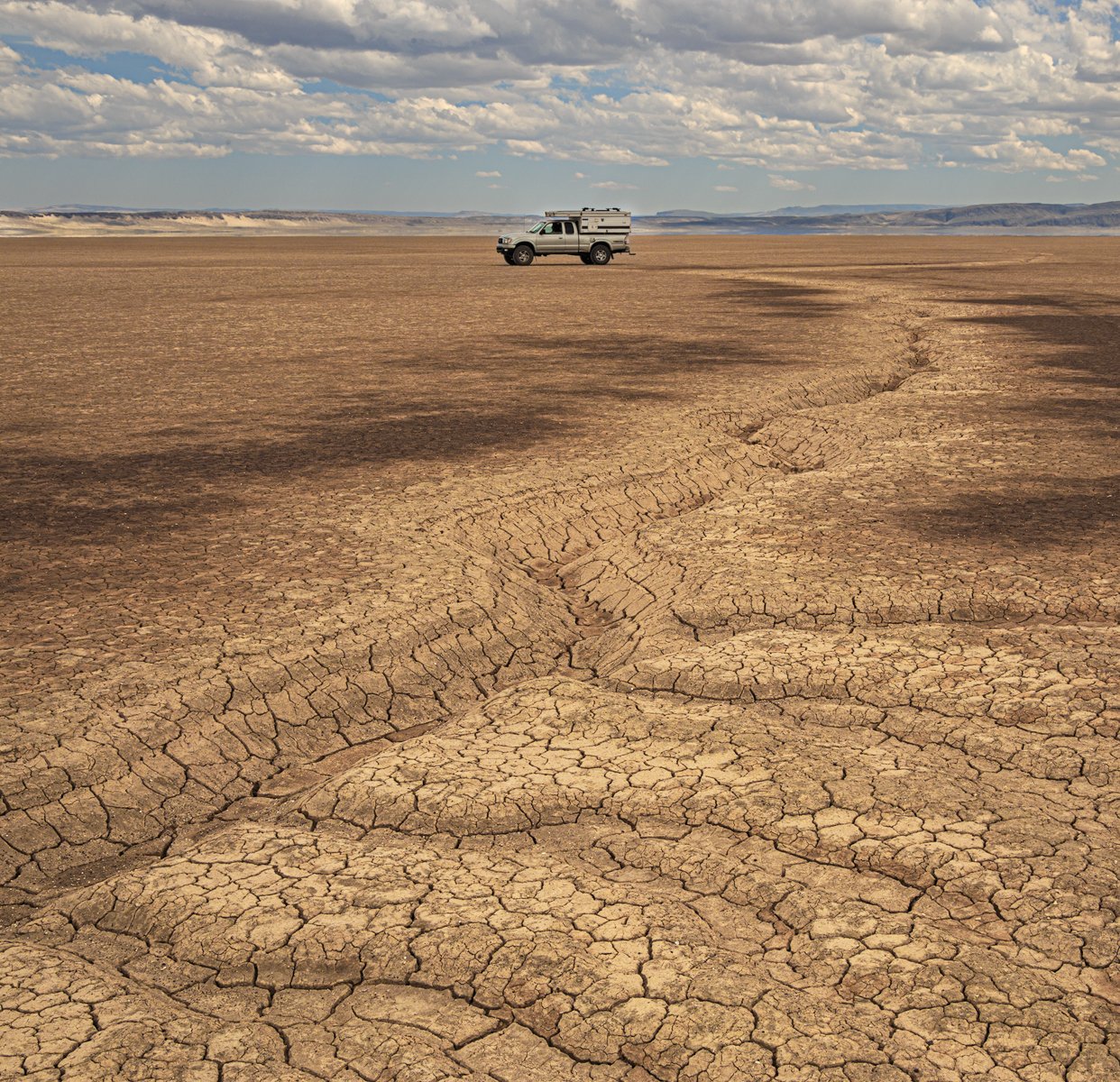
… Alvord.
A scene from the Alvord Desert in east Oregon. Actually, it’s two scenes from the desert. Which do you prefer?
or
less yellow, more luminosity:
It’s an intriguing comparison, Igor. Overall, I slightly prefer the uncropped version because of the extra “sweep” and stronger sense of vastness. I will say, that the cropped version puts more emphasis on the curve of the gulley.
Igor, cast my vote for the wider version, because I love the wide open spaces. However your square crop eliminates most of the more noticeable tire track. The darker, wetter patches nicely support the lead of the gully. Looks like it could be a slippery mess out there.
Oh yeah, I didn’t notice those tracks in the picture. They were everywhere, which made compositions difficult at times.
I think the yellows are a bit too strong. Do you agree? See above for comparison.
Hmmm. Now I’m not sure. I kinda like that level of saturation even though it’s less natural
Igor,
I’m with Mark in that I prefer the wider horizontal, precisely for the context and the presentation of the vastness of the area. The smaller presence of the vehicle enhances that feeling of that vastness. The little gully of course works perfectly as that lead-in line - especially how it curves at the end leading to the vehicle.
The color was fine, but your repost I can see the difference. I don’t think it’s a huge difference. I thin I prefer the original colors; but it’s quite subtle and not an issue I would have noticed.
Oh, and quite the complimentary sky. I like the minimal inclusion of the sky - a very effective amount.
No nits or other suggestions. Great job envisioning this.
Lon
This image was shot for a personal memory. A recording of a great trip with no interest in sharing on a photography website. But I’m thinking in the long run. Will this be more meaningful to me years from now than a more artsy one?
I also prefer the first post. Very pleasing color and detail.
I much prefer the composition in the first and the processing in the last one. Great view of your rig in “it’s environment”. Great playa and sky, too. This one works really well for me.
Think I prefer the landscape version, Igor, mainly because, with the vehicle there a bit off centre, it seems to suggest movement across the plain; the portrait versions emphasize it to the point of making it the prime subject of the image ( which might be your intention of course ?? ). The tones seem fine in the first version too.
I prefer the first one too, it has a good sense of being out in the open, vastness. The colors look good in that one, maybe remove a tad of yellow from the sky only? That big line to the vehicle is great!
I’ll be the black sheep here and cast a vote for the last image of the three. Even though there is a vehicle in the shot, I find the tire tracks distracting and taking away from the wild sense of the place. I think the vertical crop accentuates a lovely connection between the brighter foreground as it recedes, following the texture of the gully and seemingly pointing to the vehicle.
In any case, they’re all pretty cool. Great example of leading lines.