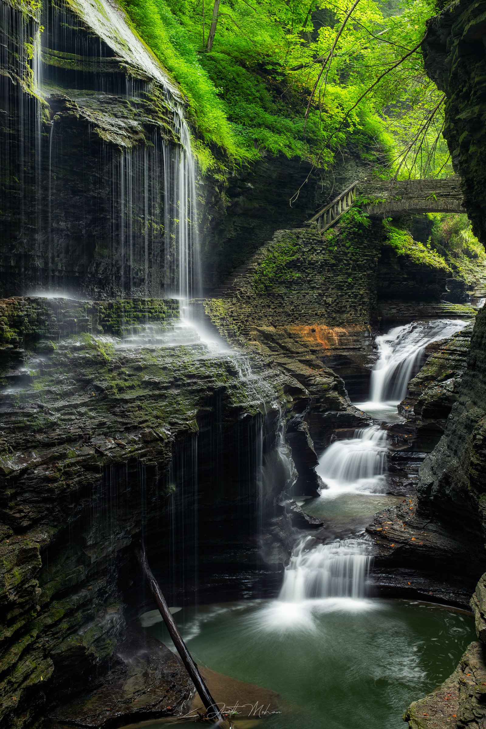
Hello Amith. Watkins Glen is a location on my must visit list as well. I really like the photo you created. Technically I think this is wonderful. Nice color (maybe a little oversatured greens?) and I like how my eye moves to many areas in the photo. Just great. What would have made this even more interesting for me is if you were able to move a little more to your left and capture more of the bridge to the right. The dark edge in the UR corner really adds nothing to the pic (maybe a little framing) but if more of the bridge could be seen to the right that would be great and create more interest. One more item, strictly an opinion. Regarding the stick in the lower center of the frame. I can’t decide if I like it there or if it should be cloned out. Maybe post a pic with it out and see what others feel? Again wonderful capture Amith. Hope this gets hung up in a prominent place!
Nice picture but I think it could have been improved. I feel you’ve cut too much of the bridge off and you should have included more or none at all of the rock faces on the right. The ss for the water is great and I like the saturated greens.
I think this image is gorgeous as presented, I wouldn’t change a thing about it. Really well thought out and executed compositon. The shutter speed has done a marvelous job with the water a well. Very nicely done.
I think this is lovely as well. Tremendous image that has so many fun places to explore! I think the white balance and saturation is just fine. The revealed aspect of the bridge gives a sense of intrigue as to what is behind the rock…so I actually think the amount of bridge present is just fine.
The only advice I can offer on this shot is to try and manage the right border a bit…there are 3 different brightness values for the rocks on the right side - from dark on top, medium in middle and light on bottom. To minimize the distraction of these aspects, I would be tempted to unify them in to one similar tone by lightening the upper rock and darkening the lower rock with an effort to create more harmony/less contrast among them.
I think this is a beautiful image…really enjoying it. Thanks for sharing!
Amith,
It has been years since I last visited Watkins Glen, but seeing this has made me want to go back. I love the lighting in the image as it has helped even out the shadows and really highlights those greens beautifully. I agree with my brother @Michael_Lowe about the right side being a little cut off as I would like to see a little more of the rock formations on the right side of the frame. BTW, great choice on the SS for the water.
Thanks a lot all for your wonderful feedback. Gives me reason to go there again, hopefully, in the fall and try out some of the composition suggestions metioned in your feedbacks. Appreciate all the guidance here