Why images lose color when they are brighter?

This is a response to a question @Vanessa_Hill asked in Landscape Critique regarding one of her images, histograms, and how color is reduced when an image is brightened. I replied here, because her post is no longer new and I thought it important that others could weigh in. Here’s my thoughts, please add your wisdom as well:

The answer to this is much of the time yes, but as with most rules of photography some very powerful images come from breaking the rules.

This gets a bit wonkish, but what you may be noting is a result of the way that that the rgb colorspace works. I’ll try to explain, but I’m no expert and so hopefully others on NPN more experienced than I can point out the parts that are complete hogwash :grinning:.

In rgb, luminosity (brightness) is defined on a scale of 0 to 255. When all three of red, green, and blue have the same value there is no color, only shades of gray. For example, when red, green, and blue all equal zero you have pure black. When they all are 255, you have pure white. How dark or light the gray is, is determined by how high or low the numbers are; a medium gray is when all three colors are set to 128.

Color happens when the numbers are set to different levels. For example, the pure and brightest red that is possible in rgb is when the red is set to 255, and green and blue are set to zero.

Here’s the interesting part though. As you brighten you get closer and closer to white, which has no color. If we take that brightest pure red I defined above and we raise the green and blue values to say 128 (instead of zero) the color becomes brighter but not so red; the “redness” has now been diluted because the green and blue are stronger. If I take it even further and raise the green and blue to 244, the image becomes only a tiny bit red; it is now almost a pure white even though red still has a value of 255.

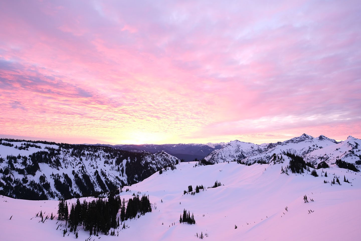
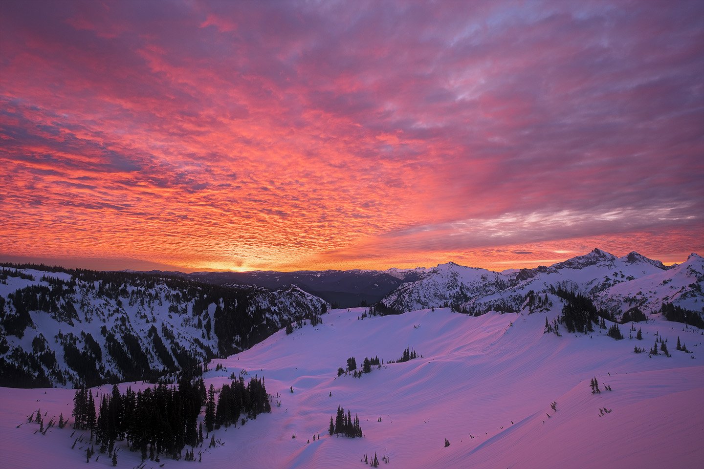
To illustrate this, take a look at these three images. I was bracketing, so each time I pushed the shutter the camera took three images: dark, medium, and bright. They were taken almost at the same time, so the color in the sky didn’t change, but notice how the richness of the color changes in each. In the darker version, the sky is very red, and in the lighter version it is almost washed out. Again, that’s because in rgb the brighter you get, the closer you get to white and white has no color.

Software that edits images takes this into account, and so it assumes that the brighter an image is the less color it should have. That’s another reason why the image loses color when you brighten it in post-processing.

To get around the dilemma, there are two options that I know of. One is to increase saturation when you brighten. That works against the assumption the software makes that brighter images should be less colorful. That can work as long as the color you are editing is not too bright, but it is limited as a color gets brighter because once the value hits 255 you can’t go any higher. (To have the color red, red’s value has to be a higher value than green and blue. If green and blue are close to 255, you just don’t have the room to make the image redder.) The second option is to not brighten as much. While that allows you to keep rich colors, you sometimes sacrifice the wonderful textures that come from luminosity contrast.

With processing software that lets you edit selectively, to a great extent you can have your cake and eat it too. In those images above, if you didn’t have the middle image you could brighten the ground in the first image, or darken the sky in the final image, to get something closer to the more pleasing middle image. In addition, you could selectively increase the contrast in the sky, which would let the brightest parts be very bright but hold the color in the parts that are darker and richer.

Again, hopefully others can add their wisdom and correct the error of my ways!

3 Likes

For a final comparison of processing, and the points above, here is the middle image above (a jpg straight out of the camera) and the final version after I processed. I tried to maximize the color that was there when I photographed it, but to also maximize the luminosity contrast as much as possible because that’s what my eye was seeing as I viewed the scene in real time. It’s not a huge difference, but I prefer the processed image. (There not exactly the same since I cropped the processed version a little.)

Camera jpg:

Processed image:

3 Likes

Hi John, thank you for all your time to put this little tutorial together about color. I think I really wanted to know if it’s okay to break the rules and not always go for the perfect histogram. I think I know the answer is yes and the histogram is really just a tool and a guide to help you see what’s going on technically with the image and trying to tweak it but not to the point of ruining the image or making it look different from what it really was? Maybe I need to change my ways, but I never even have a histogram showing on the back of my camera. I just take a shot and then chimp the image itself and adjust from there. That’s how I was taught in the courses I took from Joel Sartore. And also I’ve learned a lot from Tony and Chelsea Northrup. Not that they don’t t talk about histograms but I’ve never understood it to be a hard and fast rule. Which I think is what I’m gathering from all your knowledge. Correct me if I’m wrong… Thank you, so much, again for all your help!

Hi Folks!

My two cents on the topic. While I find everything that John mentioned to be true, I also find an RGB color representation a bit misleading, and I usually use HSB/HSL translation of a color.

With RGB notation we know that most saturated red is R=255, G=0 & B=0. Same goes for every other primary channel. And, as John mentioned, if we start adding brightness tu pure red, we will start introducing values in other channels as well. So, one could make an assumption, that one most saturated channel is at “one third” possible brightness. After all, we have one channel at its maximum value already, and we only have two other left to make our adjustments.

I find it misleading , because it can obscure the fact that the most saturated colors (even prime ones, like red or green) has different lightness / brightness value. That’s why I prefer using HSB/HSL model. I’ll make a use of a Granger chart, which I found first in Tony Kuyper’s materials on saturation masks. For some reason I cannot upload it directly in the post, so I’ll put a link here: Granger Chart.

It’s basically a chart of all hues (on x axis) vs luminosity (from black to white on y axis). It shows that different hues have their most saturated points on a different brightness / value level. For instance - yellows are most saturated towards the top of the chart - meaning with their brightness right next to white. While blues are most saturated in the dark parts, right next to the blacks.

During sunset we mostly deal with colors like oranges and reds, and after sunset with purples and deep blues. While oranges can be highly saturated toward upper midtones, all other colors are more vivid in the range from midtones to deep shadows. Brightening the very saturated reds (which are in the lower midtones) will wash them out and make less prominent.

I find these hues (deep reddish oranges and reddish-purples) very tricky to post-process, as they don’t work well as “bright” highlights. Instead, they have to be placed somewhere in the midtones and act as highlights just by contrast with other, darker parts of the image.

To answer question about histogram - it’s a tool, and it can help you tremendously. For instance - when I’m shooting I’m always checking two things:

  1. my “blinkies” - if I don’t see any blown highlights
  2. and even if I don’t, I go to my RGB histogram to see each channel and evaluate, if none of these touches my right hand side of the histogram

Even one blown channel can make some problems as that pixel will always have one of the RGB values set to 255 from the start, which can hinder my ability to work with it in post-processing.

Histogram also helps with evaluating overall exposure. I fooled myself at least few times when looking only at the back screen of my camera, especially when its brightness level was set to “auto”. Everything looked great. But in the Lightroom panel I saw heavily underexposed photo, with most pixels on the left side.

And that brings me to the last part - I don’t think there’s a proper histogram you should look for with every photo. If the photo is meant to be dark (like a night shot), obviously most pixels will be on the left. If it’s a high-key photo - most will be on the right side, without any pure blacks or deep shadows. For starters - I would use it only to evaluate overall exposure and possible blown highlights. In post, you can check it from time to time, but don’t try to make it look more “even” or “from left to right” just for the sake of it. We’re not making photos for the sake of a pleased histogram. :wink:

Hope that make sense - if I wrote something that’s unclear, please let me know. :slight_smile:

3 Likes

I focused too much on your comment about “there is no sunrise!” and skimmed over the question about “should the histogram always be filled?”

For me, the histogram is only a tool and a minor one at that. In the field, I use it exactly the same way that @Andrzej_Muzaj does; I only use it to make sure I’m not blowing the highlights. In processing, I always use what the image looks like, not what the histogram says. When I’m using a curves adjustment in Photoshop, I find the histogram helpful to know where to place points on the curve, but that’s about the only thing I regularly use it for.

With that said, it can be a way to illustrate a point, which is what I used it for in the original thread. I apologize for not being clearer; it is only a tool with information. In the end, it’s the image and how it looks that counts!

Thanks for adding to the conversation @Andrzej_Muzaj ! I was unaware of the Granger Chart; that’s great information.

I’ve always been intrigued by what happens in an image if I add saturation with an HSL layer in Photoshop. Some colors get darker, and some get lighter (yellows are a great example of that). That Granger chart explains why if I’m understanding it correctly; if my yellow is darker than the peak point of saturation, it makes sense that Photoshop would brighten the yellow so that it can reach toward the most saturated color level that rgb can display yellow at.

1 Like

@Andrzej_Muzaj Thanks so much for chiming in! Thank you for all your time in sharing that very useful information!

1 Like

I’m no color theory scientist (however the Granger chart and its implications are interesting though). But these are my day to day observations. increase brightness and it generally decreases contrast. Decrease contrast and it generally reduces color saturation. The reverse is also true, increase contrast and you increase color saturation. There are sophisticated ways around this by using blending modes in Photoshop, Luminosity Blend mode lets you adjust luminosity (brightness) wihout affecting color. But I know Vanessa does not use Photoshop.

So generally whenever I increased brighness, I try to do a partially offsetting increase to contrast by adding Lightroom clarity (midtone contrast proxy). A good example is shadow lifting in Lighhtroom with the shadows slider, when you do too much of this you risk reducing contrast and getting the dreaded bad HDR look. So I try to offset it by increasing contrast/clarity to maintain a more natural looking level of contrast. And whenever an image requires significantly increasing contrast to look better, I often have to reduce saturation to offset the natural increase in saturation from added contrast. A common example of this is blue skies, when people add too much contrast to them, the blues get too dark and saturated which does not look natural. So when I add contrast to skies, I often offset it partially by increasing blue luminosity, and reducing blue saturation. The added contrast can make white clouds look better, but it is easy to overdo it in the blue sky itself.

The key point is to be aware of these relationships, and make offsetting adjustments to counter balance what you do with luminosity and contrast.

3 Likes

@Ed_McGuirk Hi Ed! I just wanted to let you know, because you had recommended it to me a little while ago. Just yesterday I got an offer from Adobe to try PS/LR again so I started looking into it a bit more and LR for iPad has some recent updates, like just in the past few weeks! Which makes it way easier for me to use. I can do everything I need to, for now anyway, right in that 1 app! So I can’t wait to start working with it and seeing if I’ll be able to start doing more things with it! And start being able to do what you and others are guiding me to do. Thanks for the encouragement!

3 Likes