Thank you @Mark_Seaver , @Diane_Miller , @Lon_Overacker , @Bret_Edge , and @Youssef_Ismail ! Thanks for the crop and color suggestions!
To give a better idea of what I was working from, here’s the sidecar jpg the camera took with the raw file that I used. (It’s purposefully underexposed a bit, since I was trying to avoid blowing those bright spots on the mountain. I also forgot to add in the original post that I had removed some snowshoe prints from the foreground.)
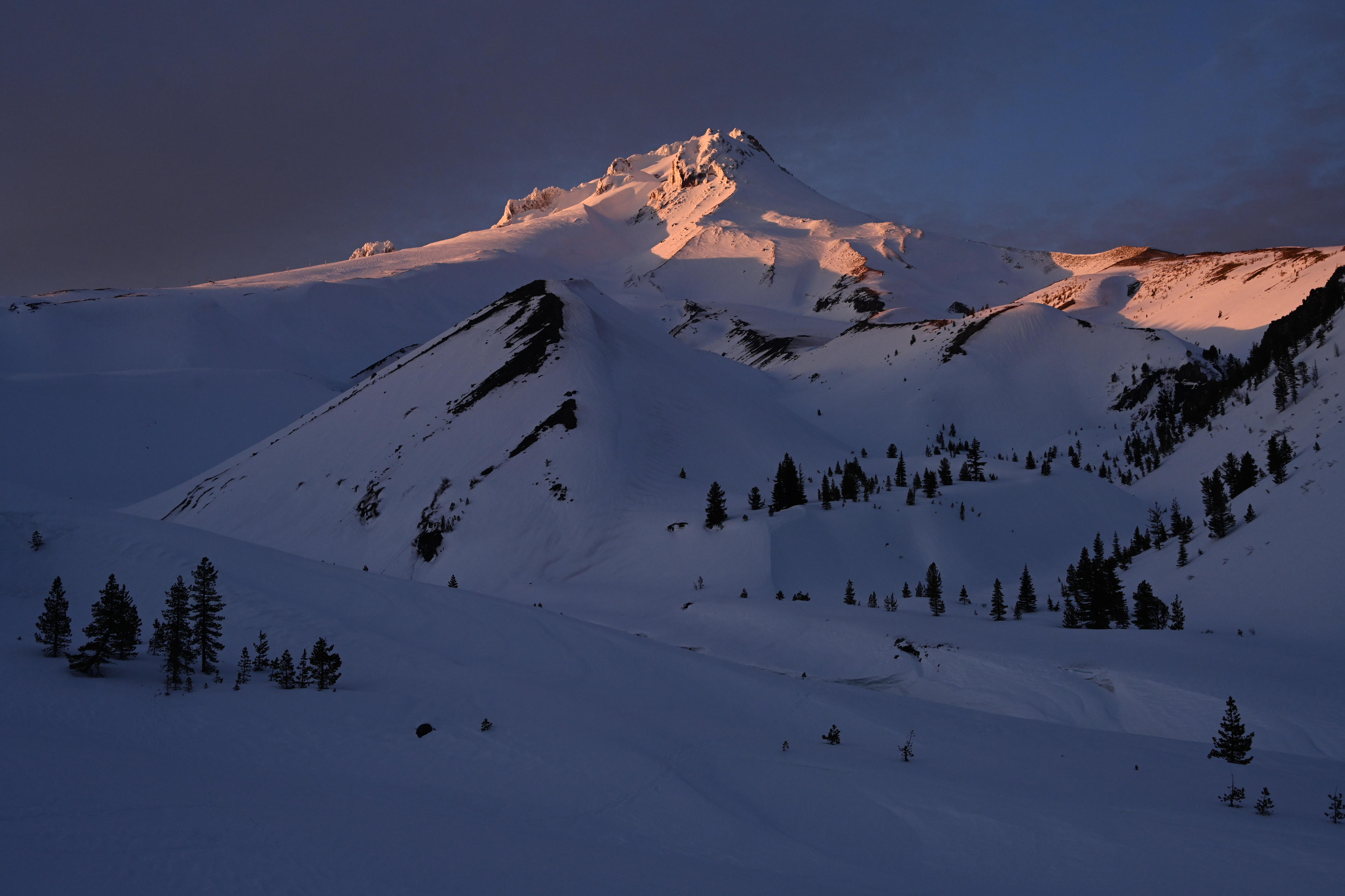
It was building. I hope to next post an image from the same location that shows the peak color.
I think some of the battle here is that peak saturation for yellow is brighter than other colors. (I’ve learned a lot from NPN over the years, and one of those lessons was @Andrzej_Muzaj post about the Granger Chart ) I’ve increased brightness and saturation there, and that was enough to bring out that yellow. I didn’t do any significant color shifting other than to already reduce the yellow saturation and slightly shift to blue in those very brightest areas some. Sounds like I should do even more. The image I took about 5 minutes later loses a lot of that yellow and has a more magenta; I may be better off tossing this one and sticking with that one. I’ll post that next when able.
I agree. I’ve tried on several trips to include a closer foreground tree to help with that, but never been as happy as the more open view. Here’s a couple of crude examples from 2017:


I backed those down a little when increasing saturation overall; I’ll play with dropping them even more.
Thanks for the counterbalance Youssef. It’s always tricky to thread the needle between enough and too much, so all the opinions here on NPN are very helpful.