The photographer is looking for generalized feedback about the aesthetic and technical qualities of their image.
Description
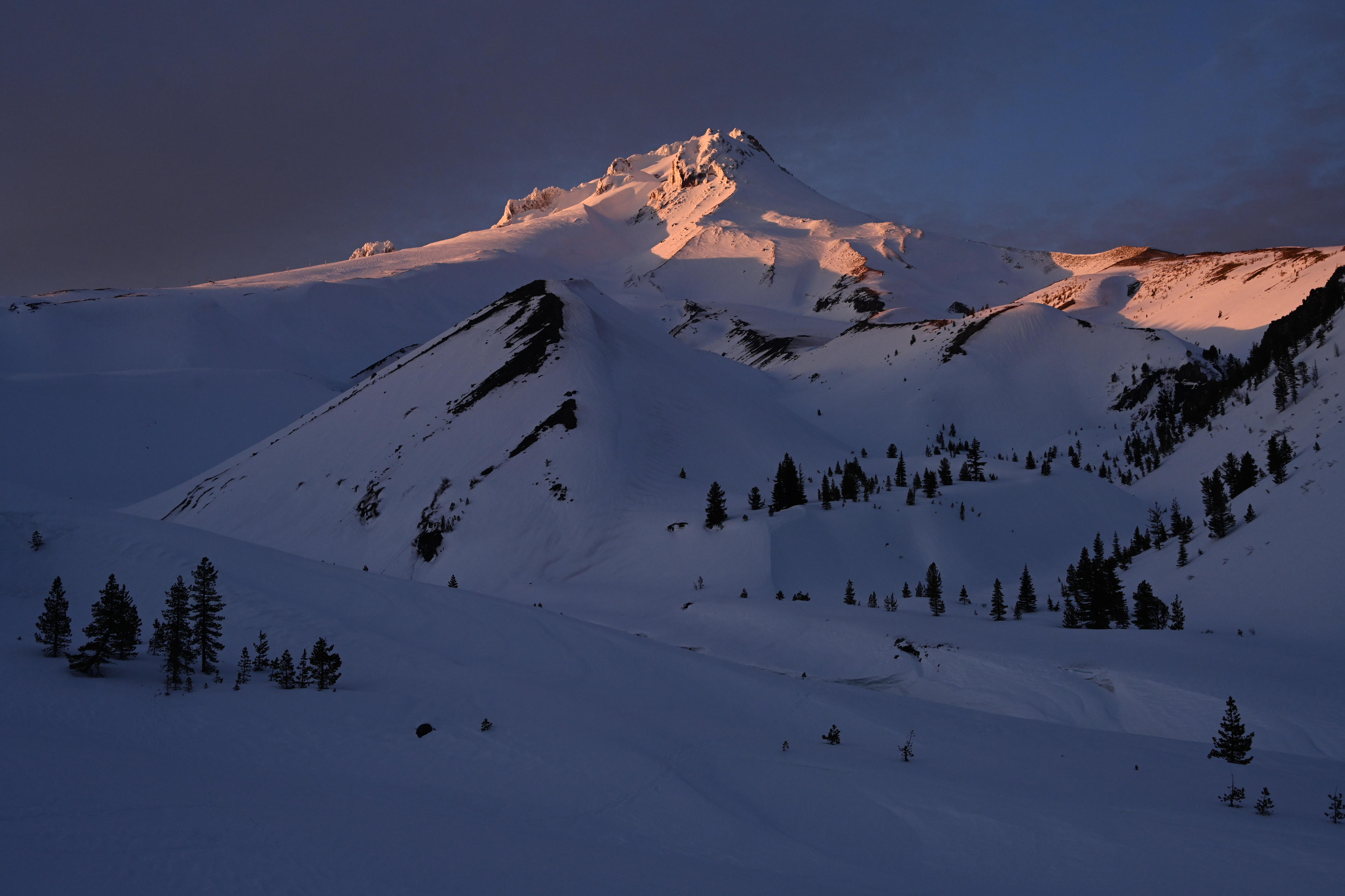
The first night we spent on Mt. Hood last month there was some nice light on the mountain at the end of the day.
Specific Feedback
Most folks shoot this angle of Hood from closer to the highway, about a mile and a half south of this, so they can include the White River in the image. I prefer this view (from our campsite), but there’s not a lot of choices for composition from here. How does this one work for you?
It’s hard to keep the golden yellow from going nuclear in the brightest areas this time of day, and I’ve fought to keep them subdued. Does that look okay from your viewpoint?
Technical Details
NIKON Z 7II
NIKKOR Z 24-200 f/4-6.3 VR at 43 mm
1/400 sec. at f/8.0 and ISO 800
Critique Template
Use of the template is optional, but it can help spark ideas.
John, the end-of-day spot lighting, the paired peaks and the big V of ridges all look great. I am struggling a bit with the colors, as the bright bits are distinctly yellow, the magenta/pink of the brighter parts and the slight overall magenta in the darker shadows. Was there a colorful sunset off to the west??
What a spectacular vantage point for this sunset! I find the magentas pleasing and possibly not surprising given the alpenglow at this altitude. The more yellowish tones are something I notice and wonder if they could be tweaked a little. Colors can shift quite a bit in raw tonal corrections. Maybe a bit of Selctive Color after the fact is worth a look, but not a big deal.
I wondered about a crop from the right, as the snow field there pulls my eye a little. Or maybe subdue its brightness??
When you first posted, I thought, “Stop it, you’re killing me!”. Next thought, Epic. What a glorious scene - captured beautifully.
Then I started thinking if this could be improved - an after first pass, I would say not. Epic. Light. Gorgeous.
But upon reading the previous comments, I would agree that the brightest face seems almost out of place and I can’t unsee. I wasn’t there and of course the camera captures in RAW, so it all boils down to how one processes, I guess. I’m with Diane in thinking you could easily target that bright yellow area and almost bring it back in line with the magenta/lavendar colors of the surrounding glow. I know this is a tiny part of the frame, but that glow to the immediate left of the bright yellow face - is gorgeous.
Here’s a rough attempt. I basically create an ACR smart object in PS. Then I adjusted various sliders to taste. One thing I noticed the highlights in that bright area are a little blown, but at size wasn’t really a concern. I mostly wanted to mitigate the yellow, which I did from several directions; whites/highlights, yellow channel saturation and also under color grading for highlights.
Not sure if this is your vision, but it’s always a learning exercise to try and work on some images.
I feel the bottom is a litle empty. On the other hand, it helps emphasize the epic nature and graduer of the landscape.
Here’s my .02. I’ve included screenshots of the ACR adjustments
Proof that simple compositions can be quite effective. It’s almost like a portrait of this beautiful mountain, and the light is fantastic. I’m not bothered by the light on the ridge on the right. The blues in the shadows might be just a touch too saturated, but that could also just be a personal preference.
I think it is a fine composition and the color on the peaks with that golden light is perfect, not over blown or to saturated or gone nuclear. I don’t think the brighter face needs to be toned down as it is receiving more direct light rather than just getting glancing light reflecting off of it, so it makes sense to me that it should be brighter. Since it is not blown out, I can’t see a need for it to be toned down.
To give a better idea of what I was working from, here’s the sidecar jpg the camera took with the raw file that I used. (It’s purposefully underexposed a bit, since I was trying to avoid blowing those bright spots on the mountain. I also forgot to add in the original post that I had removed some snowshoe prints from the foreground.)
It was building. I hope to next post an image from the same location that shows the peak color.
I think some of the battle here is that peak saturation for yellow is brighter than other colors. (I’ve learned a lot from NPN over the years, and one of those lessons was @Andrzej_Muzaj post about the Granger Chart ) I’ve increased brightness and saturation there, and that was enough to bring out that yellow. I didn’t do any significant color shifting other than to already reduce the yellow saturation and slightly shift to blue in those very brightest areas some. Sounds like I should do even more. The image I took about 5 minutes later loses a lot of that yellow and has a more magenta; I may be better off tossing this one and sticking with that one. I’ll post that next when able.
I agree. I’ve tried on several trips to include a closer foreground tree to help with that, but never been as happy as the more open view. Here’s a couple of crude examples from 2017:
I backed those down a little when increasing saturation overall; I’ll play with dropping them even more.
Thanks for the counterbalance Youssef. It’s always tricky to thread the needle between enough and too much, so all the opinions here on NPN are very helpful.
All has already been said but I felt I needed to comment just to tell you how much I am enjoying the light in this image. Awesome! I actually like the softer glow on the right portion of the mountain peak and wouldn’t crop that out but mostly, I have to say that I think @Lon_Overacker nailed the colors on that peak. The peach tones instead of the yellows are yummy-licious. I also really love that grouping of trees in the LLC. Gorgeous image, John!